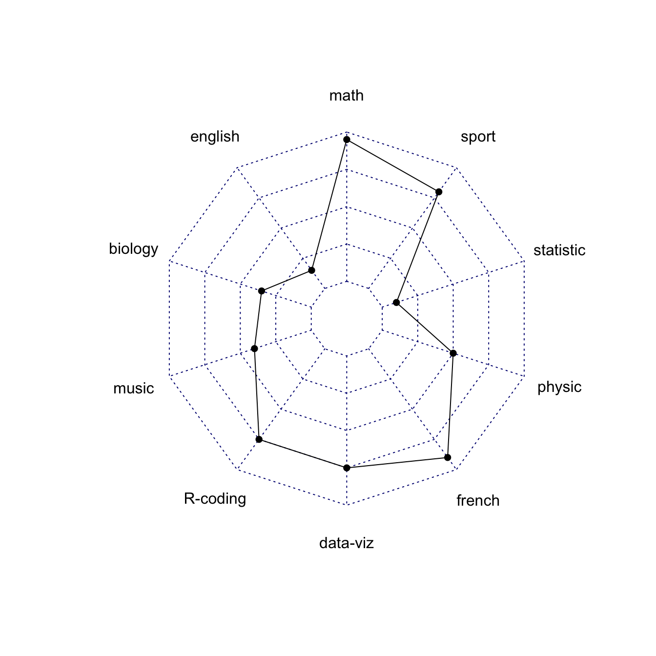
Most basic radar chart with the fmsb package
Radar charts are also
called Spider or Web or Polar charts. They are drawn in
R using the
fmsb library.
Input data format is very specific. Each row must be an entity. Each column is a quantitative variable. First 2 rows provide the min and the max that will be used for each variable.
Once you have this format, the radarchart() function
makes all the job for you.
# Library
library(fmsb)
# Create data: note in High school for Jonathan:
data <- as.data.frame(matrix( sample( 2:20 , 10 , replace=T) , ncol=10))
colnames(data) <- c("math" , "english" , "biology" , "music" , "R-coding", "data-viz" , "french" , "physic", "statistic", "sport" )
# To use the fmsb package, I have to add 2 lines to the dataframe: the max and min of each topic to show on the plot!
data <- rbind(rep(20,10) , rep(0,10) , data)
# Check your data, it has to look like this!
# head(data)
# The default radar chart
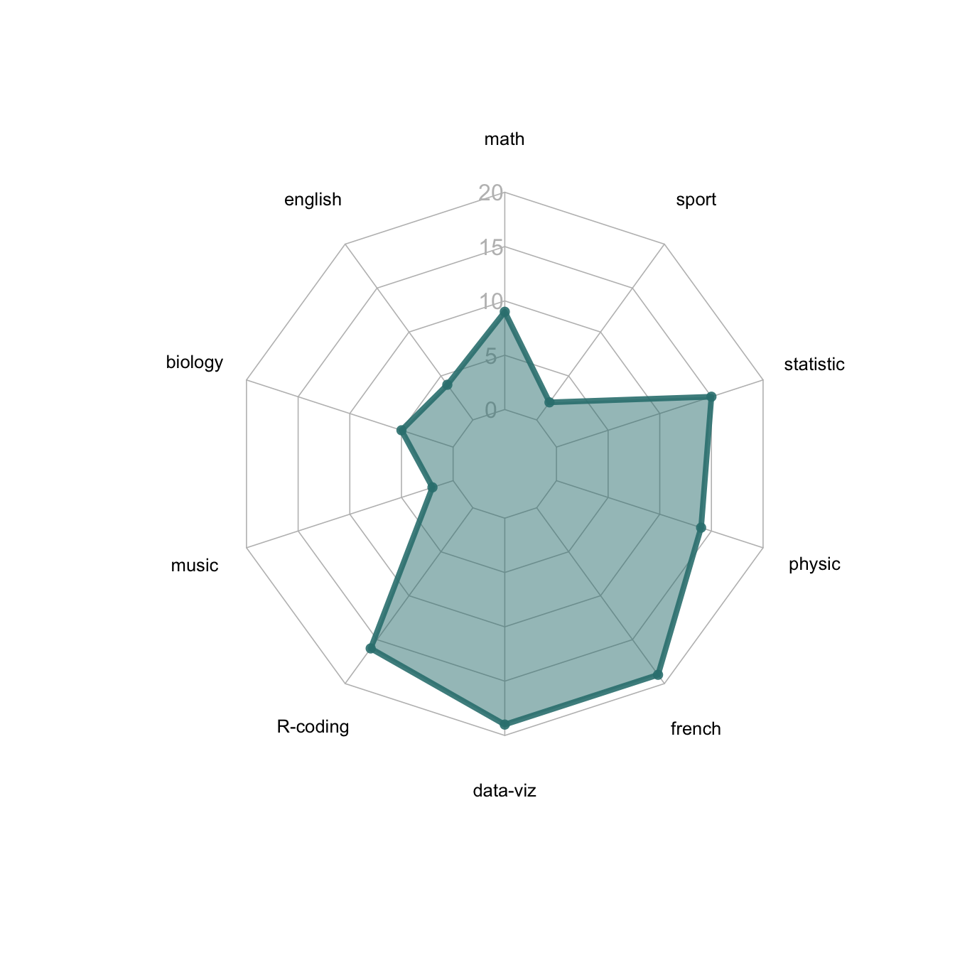
radarchart(data)Customization
The radarchart() function offers several options to
customize the chart:
-
Polygon features:
pcol→ line colorpfcol→ fill colorplwd→ line width
-
Grid features:
cglcol→ color of the net-
cglty→ net line type (see possibilities) axislabcol→ color of axis labels-
caxislabels→ vector of axis labels to display cglwd→ net width
-
Labels:
vlcex→ group labels size
# Library
library(fmsb)

# Create data: note in High school for Jonathan:
data <- as.data.frame(matrix( sample( 2:20 , 10 , replace=T) , ncol=10))
colnames(data) <- c("math" , "english" , "biology" , "music" , "R-coding", "data-viz" , "french" , "physic", "statistic", "sport" )

# To use the fmsb package, I have to add 2 lines to the dataframe: the max and min of each topic to show on the plot!
data <- rbind(rep(20,10) , rep(0,10) , data)

# Check your data, it has to look like this!
# head(data)

# Custom the radarChart !
radarchart( data  , axistype=1 ,

    #custom polygon
    pcol=rgb(0.2,0.5,0.5,0.9) , pfcol=rgb(0.2,0.5,0.5,0.5) , plwd=4 ,

    #custom the grid
    cglcol="grey", cglty=1, axislabcol="grey", caxislabels=seq(0,20,5), cglwd=0.8,

    #custom labels
    vlcex=0.8
    )
Next step
This page showed the basics of
polar chart with
R and the fmsb package.
Next example
describes a few more customization and show how to proceed to visualize
several groups on the same chart.