Dataset
The dataset has three columns:
-
Date: This column contains dates starting from January 1, 2020, and continuing for 100 days. -
Value: This column holds numbers. These numbers are created by adding random amounts to each other in a cumulative way. It’s like keeping a running total of random values. -
Type: This column categorizes each row with one of three labels:a,b, orc.
# dataset with 3 lines named "a", "b" and "c"
set.seed(1)
period = 100
df = data.frame(Date = seq(as.Date("2020-01-01"),
                           by = "day",
                           length.out = period),
                Value = c(cumsum(rnorm(period)),
                          cumsum(rnorm(period)),
                          cumsum(rnorm(period))),
                Type = c(rep("a", period),
                         rep("b", period),
rep("c", period)))Default line chart in ggplot2
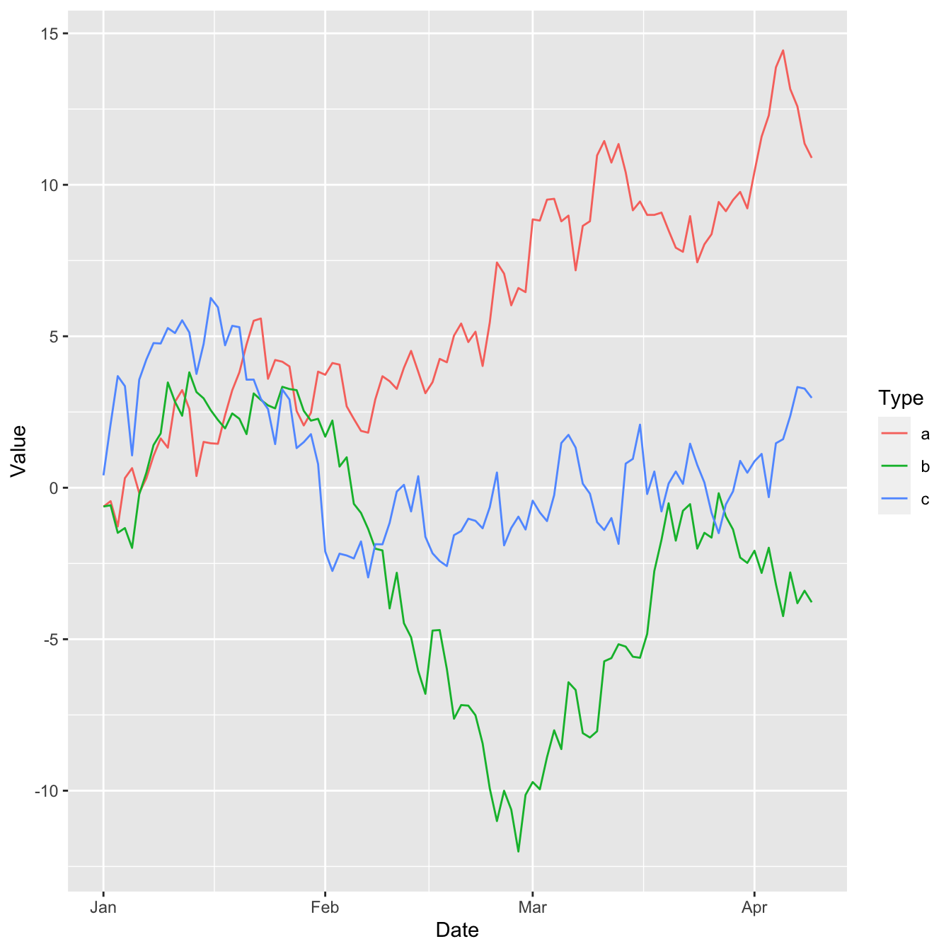
Here’s what the default line chart output looks like with
ggplot2:
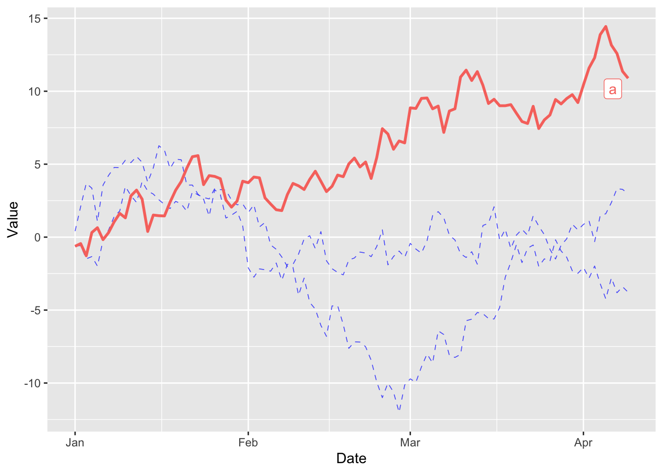
Highlight specific lines
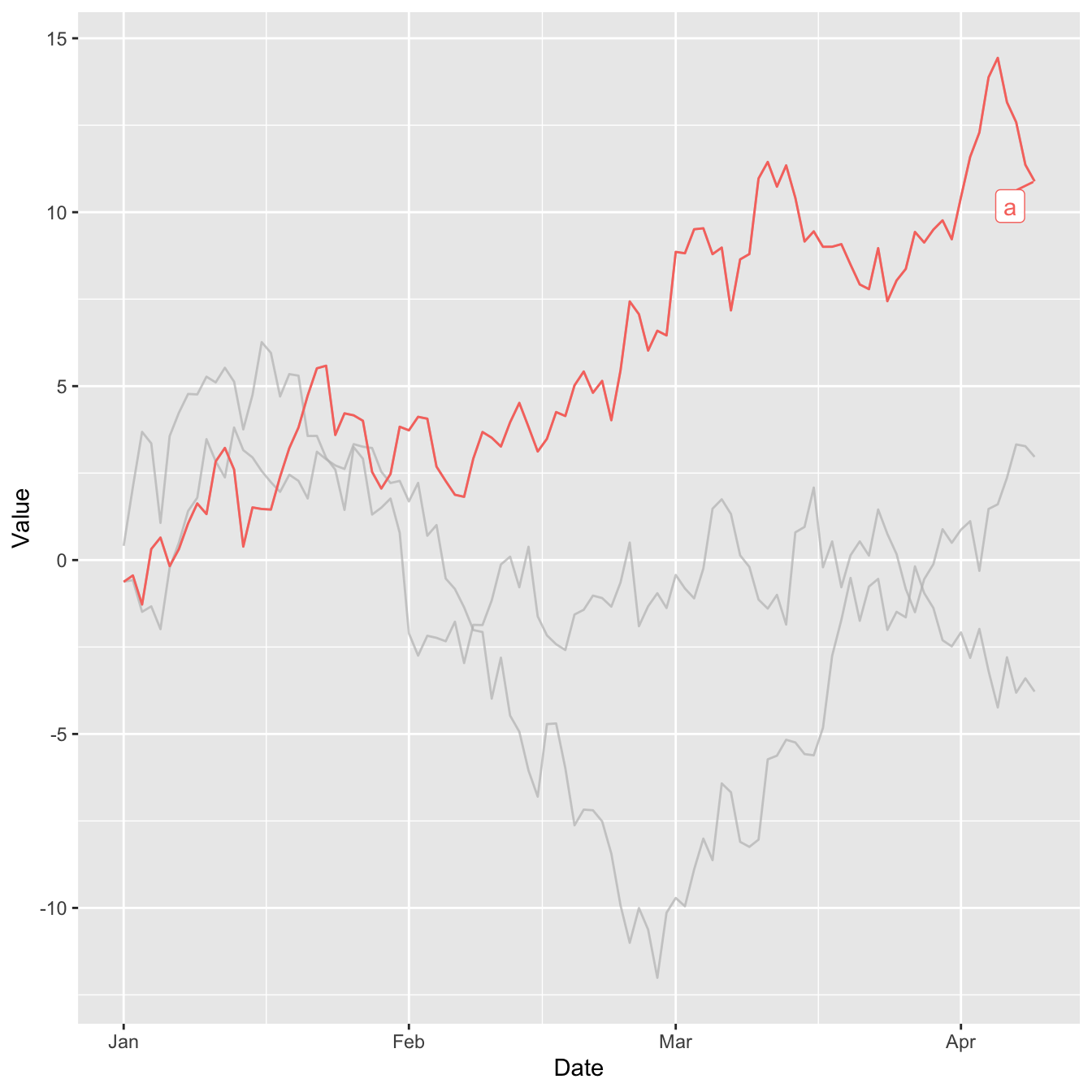
Properties of faded out lines
The gghighlight() function has an argument named
unhighlighted_params that allows us to define
what are the properties to use for the lines that does not meet
our criterion.
In this case, we reduce the line width, change the color to blue
and lower the opacity (alpha). We also change the
line to dashed.
A more complex example
The gghighlight package is also very useful when
combined with other packages such as
hrbrthemes
and
patchwork.
In this example we use the power of gghighlight with
the simplicity of patchwork for stacking graphs and
hrbrthemes' beautiful themes.
library(hrbrthemes)
library(patchwork)

plot1 = ggplot(df) +
  geom_line(aes(Date, Value, colour = Type), linewidth=0.4, color='#4393C3') +
  gghighlight(max(Value) > 10,
              unhighlighted_params = list(linewidth = 0.3,
                                          colour = alpha("darkred", 0.7),
                                          linetype = "dotted"),
              use_direct_label = FALSE) +
  theme_bw() + xlab("") + ylab("")

plot2 = ggplot(df) +
  geom_line(aes(Date, Value, colour = Type), linewidth=0.4, color='#4393C3') +
  gghighlight(min(Value) < -10,
              unhighlighted_params = list(linewidth = 0.3,
                                          colour = alpha("darkred", 0.7),
                                          linetype = "dotted"),
              use_direct_label = FALSE) +
  theme_bw()

plot1 / plot2 + plot_annotation(title = 'This chart is built with gghighlight')
Conclusion
In this post, we look at how to use the gghighlight package to highlight specific elements of a multi-part line chart. To find out more about how to customize a line chart, see the dedicated section.