About
This page showcases the work of Claus O. Wilke in his R package practicalgg that contains step-by-step examples demonstrating how to get the most out of ggplot2. You can find the original code for this example here.
Thanks to him for accepting sharing his work here! Thanks also to Tomás Capretto who split the original code into this step-by-step guide! 🙏🙏
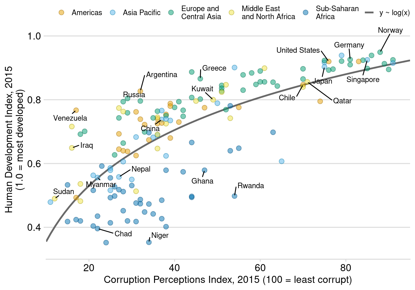
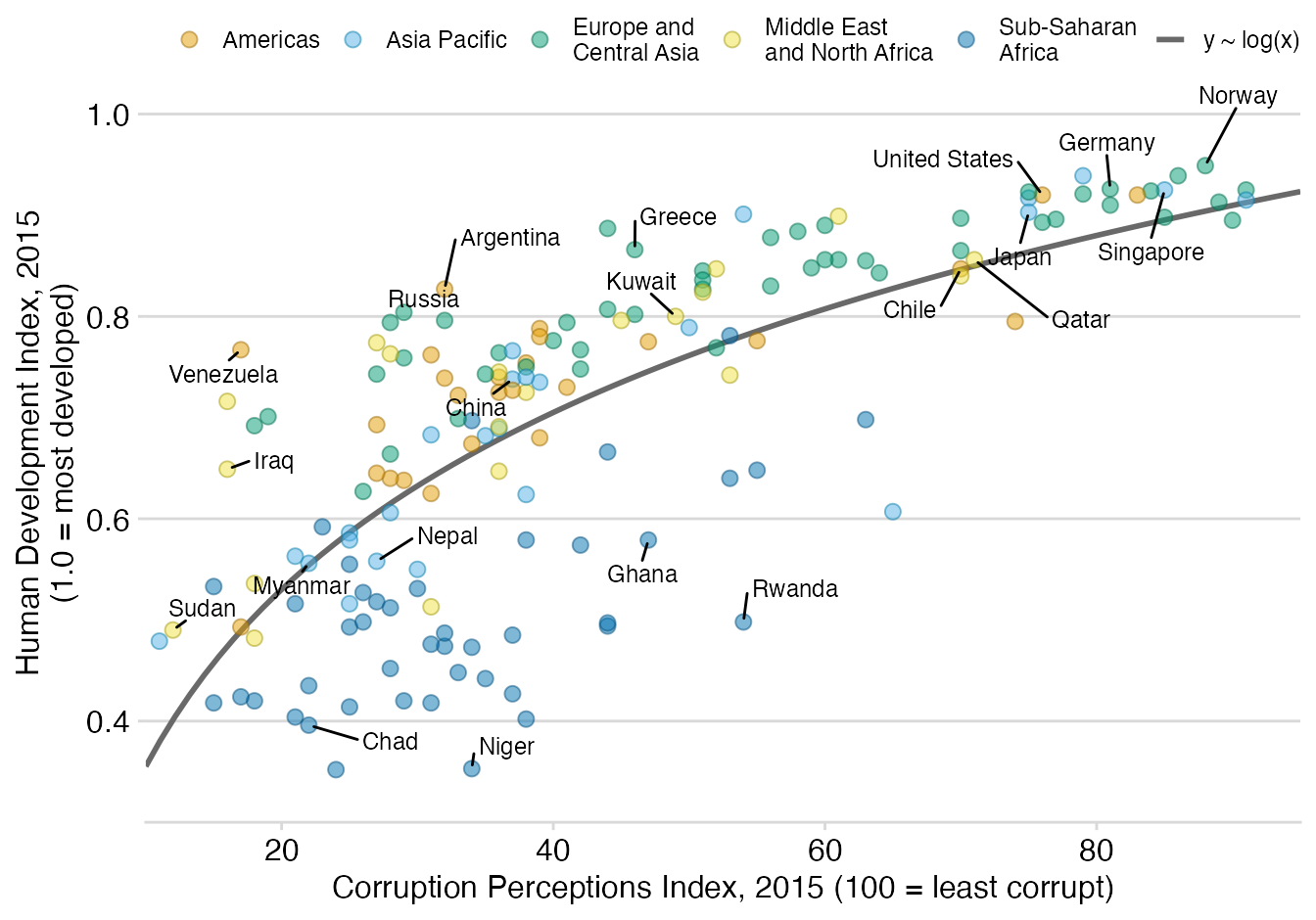
As a teaser, here is the plot we’re building today:
Load packages
As usual, it is first necessary to load some packages before building
the figure.
ggrepel
provides geoms for ggplot2 to repel overlapping text
labels. Text labels repel away from each other, away from data points,
and away from edges of the plotting area in an automatic fashion.
Also,
colorspace
is loaded to use its function darken(), and
cowplot
contributes its theme_minimal_hgrid() built-in theme.
library(tidyverse)
library(cowplot)
library(colorspace)
library(ggrepel)
Load and prepare the dataset
Today’s chart uses the
corruption
dataset in the
practicalgg
package. This data contains information about Corruption Perceptions
Index (CPI) and Human Development Index (HDI) for 176 countries, from
2012 to 2015.
The original source are the
Corruption Perceptions Index 2016
released by
Transparency International and
the
Human Development Index
made available in the
Human Development Reports by the
United Nations Development Programme. These datasets were merged and made available by
Claus O. Wilke as the
corruption dataset in his
practicalgg package. Thanks to Claus for all the work and
making this possible!
The following chunk loads the data, keeps only observations for the 2015 year, and drops any row that contains a missing value.
corrupt <- practicalgg::corruption %>%
  filter(year == 2015) %>%
  na.omit()
Next, longer region names are split into multiple lines so they fit better in the legend that goes on the top region of the plot.
corrupt <- corrupt %>%
  mutate(
    region = case_when(
      region == "Middle East and North Africa" ~ "Middle East\nand North Africa",
      region == "Europe and Central Asia" ~ "Europe and\nCentral Asia",
      region == "Sub Saharan Africa" ~ "Sub-Saharan\nAfrica",
      TRUE ~ region # All the other remain the same
    )
  )
And finally, we add a new variable, label, that contains
the name of some selected countries. These countries are going to be
added to the plot with the geom_text_repel() function
from the ggrepel package that is going to automatically
adjust their positions to avoid overlap.
country_highlight <- c(
  "Germany", "Norway", "United States", "Greece", "Singapore", "Rwanda",
  "Russia", "Venezuela", "Sudan", "Iraq", "Ghana", "Niger", "Chad", "Kuwait",
  "Qatar", "Myanmar", "Nepal", "Chile", "Argentina", "Japan", "China"
)

corrupt <- corrupt %>%
  mutate(
    label = ifelse(country %in% country_highlight, country, "")
  )
That’s it for the data preparation step! Let’s build the chart now!
Construct the plot
Unlike other guides in this series, this post goes straight to the point and builds the chart in a single chunk of code. The original vignette is already an excellent step-by-step guide on the construction of this plot. Some comments are still added within the code to explain what is going on in certain lines.
# Okabe Ito colors
# The last color is used for the regression fit.
region_cols <- c("#E69F00", "#56B4E9", "#009E73", "#F0E442", "#0072B2", "#999999")


ggplot(corrupt, aes(cpi, hdi)) +
  # Adding the regression fit before the points make sure the line stays behind the points.
  geom_smooth(
    aes(color = "y ~ log(x)", fill = "y ~ log(x)"),
    method = "lm",
    formula = y~log(x),
    se = FALSE, # Plot the line only (without confidence bands)
    fullrange = TRUE # The fit spans the full range of the horizontal axis
  ) +
  geom_point(
    aes(color = region, fill = region),
    size = 2.5, alpha = 0.5,
    shape = 21 # This is a dot with both border (color) and fill.
  ) +
  # Add auto-positioned text
  geom_text_repel(
    aes(label = label),
    color = "black",
    size = 9/.pt, # font size 9 pt
    point.padding = 0.1,
    box.padding = 0.6,
    min.segment.length = 0,
    max.overlaps = 1000,
    seed = 7654 # For reproducibility reasons
  ) +
  scale_color_manual(
    name = NULL, # it's one way to omit the legend title
    values = darken(region_cols, 0.3) # dot borders are a darker than the fill
  ) +
  scale_fill_manual(
    name = NULL,
    values = region_cols
  ) +
  # Add labels and customize axes
  scale_x_continuous(
    name = "Corruption Perceptions Index, 2015 (100 = least corrupt)",
    limits = c(10, 95),
    breaks = c(20, 40, 60, 80, 100),
    expand = c(0, 0) # This removes the default padding on the ends of the axis
  ) +
  scale_y_continuous(
    name = "Human Development Index, 2015\n(1.0 = most developed)",
    limits = c(0.3, 1.05),
    breaks = c(0.2, 0.4, 0.6, 0.8, 1.0), # Manually set axis breaks
    expand = c(0, 0)
  ) +
  # Override default legend appearance
  guides(
    color = guide_legend(
      # All keys go in the same row.
      nrow = 1,
      override.aes = list(
        # 0 means no line, 1 is a solid line
        # The result is 5 keys with no line and 1 with a line
        linetype = c(rep(0, 5), 1),
        # Now, 5 keys with the marker number 21 (the one used in the plot)
        # and 1 key without this marker.
        shape = c(rep(21, 5), NA)
      )
    )
  ) +
  # Minimal grid theme that only draws horizontal lines
  theme_minimal_hgrid(12, rel_small = 1) +
  # Customize aspects of the legend
  theme(
    legend.position = "top",
    legend.justification = "right",
    legend.text = element_text(size = 9),
    legend.box.spacing = unit(0, "pt")
  )