Histogramms are commonly used in data analysis to observe distribution of variables. A common task in data visualization is to compare the distribution of 2 variables simultaneously.
Here is a tip to plot 2 histograms together (using the
add function) with transparency (using the
rgb
function) to keep information when shapes overlap.
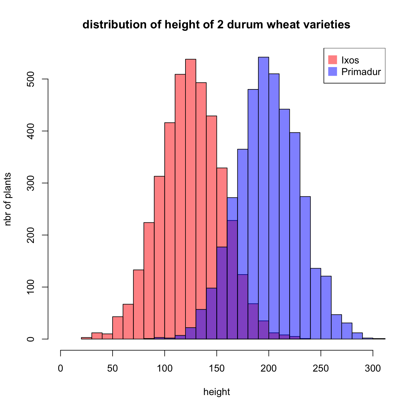
#Create data
set.seed(1)
Ixos=rnorm(4000 , 120 , 30)
Primadur=rnorm(4000 , 200 , 30)

# First distribution
hist(Ixos, breaks=30, xlim=c(0,300), col=rgb(1,0,0,0.5), xlab="height",
     ylab="nbr of plants", main="distribution of height of 2 durum wheat varieties" )

# Second with add=T to plot on top
hist(Primadur, breaks=30, xlim=c(0,300), col=rgb(0,0,1,0.5), add=T)

# Add legend
legend("topright", legend=c("Ixos","Primadur"), col=c(rgb(1,0,0,0.5),
     rgb(0,0,1,0.5)), pt.cex=2, pch=15 )
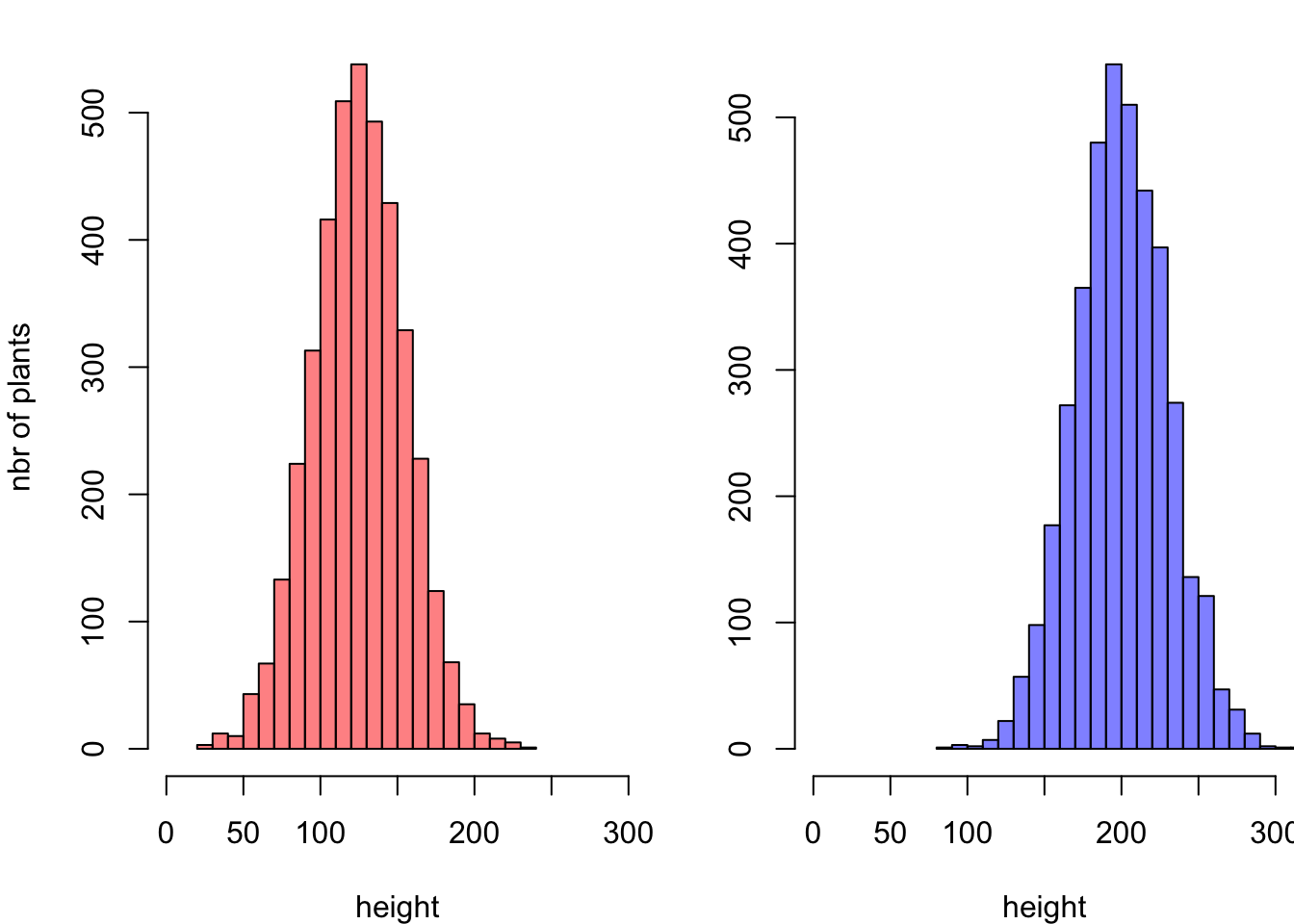
Note: this is how the figure looks like if groups are drawn one
beside each other:
par(
  mfrow=c(1,2),
  mar=c(4,4,1,0)
)

hist(Ixos, breaks=30 , xlim=c(0,300) , col=rgb(1,0,0,0.5) , xlab="height" , ylab="nbr of plants" , main="" )
hist(Primadur, breaks=30 , xlim=c(0,300) , col=rgb(0,0,1,0.5) , xlab="height" , ylab="" , main="")