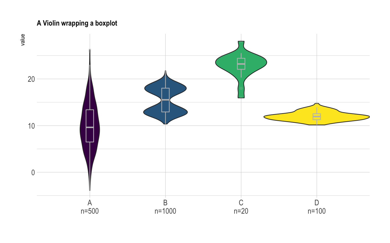
Building a violin plot with
ggplot2 is pretty straightforward thanks to the dedicated
geom_violin() function. It is possible to use
geom_boxplot() with a small width in addition
to display a boxplot that provides summary statistics.
Moreover, note a small trick that allows to provide sample size of each
group on the X axis: a new column called myaxis is created
and is then used for the X axis.
# Libraries
library(ggplot2)
library(dplyr)
library(hrbrthemes)
library(viridis)

# create a dataset
data <- data.frame(
  name=c( rep("A",500), rep("B",500), rep("B",500), rep("C",20), rep('D', 100)  ),
  value=c( rnorm(500, 10, 5), rnorm(500, 13, 1), rnorm(500, 18, 1), rnorm(20, 25, 4), rnorm(100, 12, 1) )
)

# sample size
sample_size = data %>% group_by(name) %>% summarize(num=n())

# Plot
data %>%
  left_join(sample_size) %>%
  mutate(myaxis = paste0(name, "\n", "n=", num)) %>%
  ggplot( aes(x=myaxis, y=value, fill=name)) +
    geom_violin(width=1.4) +
    geom_boxplot(width=0.1, color="grey", alpha=0.2) +
    scale_fill_viridis(discrete = TRUE) +
    theme_ipsum() +
    theme(
      legend.position="none",
      plot.title = element_text(size=11)
    ) +
    ggtitle("A Violin wrapping a boxplot") +
    xlab("")