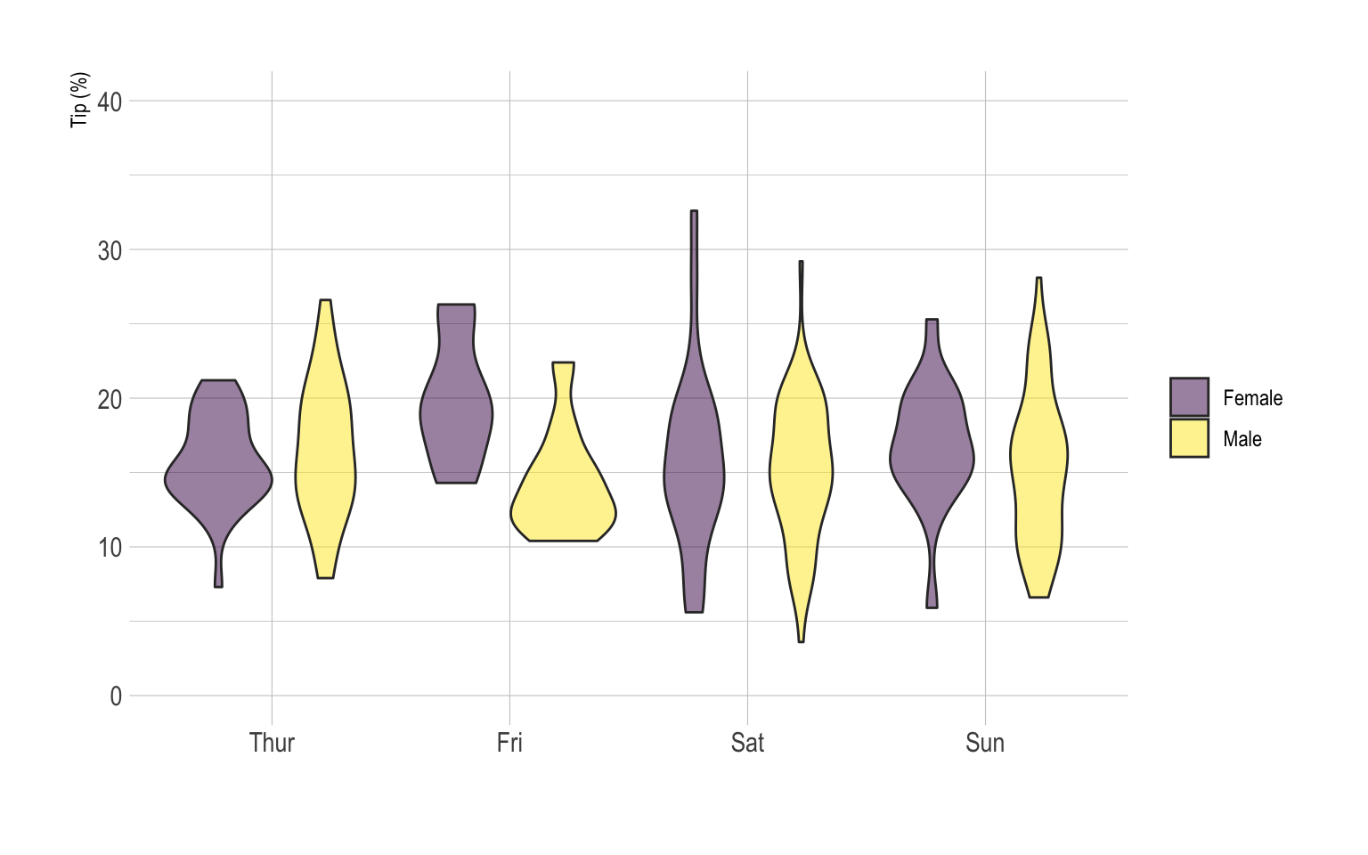
A grouped violin plot displays the
distribution of a numeric variable for groups and subgroups. Here,
groups are days of the week, and subgroups are Males and Females.
Ggplot2 allows this kind of representation thanks to the
position="dodge" option of the
geom_violin() function. Groups must be provided to
x, subgroups must be provided to fill.
# Libraries
library(ggplot2)
library(dplyr)
library(forcats)
library(hrbrthemes)
library(viridis)

# Load dataset from github
data <- read.table("https://raw.githubusercontent.com/holtzy/data_to_viz/master/Example_dataset/10_OneNumSevCatSubgroupsSevObs.csv", header=T, sep=",") %>%
  mutate(tip = round(tip/total_bill*100, 1))

# Grouped
data %>%
  mutate(day = fct_reorder(day, tip)) %>%
  mutate(day = factor(day, levels=c("Thur", "Fri", "Sat", "Sun"))) %>%
  ggplot(aes(fill=sex, y=tip, x=day)) +
    geom_violin(position="dodge", alpha=0.5, outlier.colour="transparent") +
    scale_fill_viridis(discrete=T, name="") +
    theme_ipsum()  +
    xlab("") +
    ylab("Tip (%)") +
    ylim(0,40)