About
This page showcases the work by the data visualization team at The Economist. You can find the original chart in this article.
Thanks to them for all the inspiring and insightful visualizations! Thanks also to Tomás Capretto who replicated the chart in R! 🙏🙏
As a teaser, here is the plot we’re gonna try building:

Load packages
It is possible to think it is not going to be too much work to reproduce today’s chart because, at first sight, there’s nothing that looks very fancy. However, it actually contains several subtle customizations that when added all together make the final result look original and beautiful.
This is article uses several plotting libraries apart from the nice
ggplot2 we always use. The first one is
shadowtext, a library that allows to draw text with shadows. Then, the popular
patchwork, which is going to make the task of combining
ggplot2 figures extremely easy. And finally, we’re also
going to use the grid library, the drawing library behind
ggplot2.
In addition, other utilities libraries are used:
ggtext to draw
text with multiple styles very easily, and
ggnewscale
to use multiple color scales in the same ggplot2 plot.
library(grid)
library(ggnewscale)
library(ggtext)
library(tidyverse)
library(shadowtext)
library(patchwork)
Create data
The chart we’re going to reproduce today is made of two separated plots, a line chart and a stacked area chart. These charts use different datasets that are created below:
# First, define colors.
BROWN <- "#AD8C97"
BROWN_DARKER <- "#7d3a46"
GREEN <- "#2FC1D3"
BLUE <- "#076FA1"
GREY <- "#C7C9CB"
GREY_DARKER <- "#5C5B5D"
RED <- "#E3120B"
The dataset for the line chart:
regions <- c(
  "Sub-Saharan Africa",
  "Asia and the Pacific",
  "Latin America and the Caribbean"
)

line_data <- data.frame(
  year = rep(c(2008, 2012, 2016, 2020), 3),
  percent = c(25.5, 21, 22.2, 24, 13.5, 9.5, 7.5, 5.5,10, 9, 7.5, 5.8),
  region = factor(rep(regions, each = 4), levels = regions)
)

line_labels<- data.frame(
  labels = c("Sub-Saharan Africa", "Asia and the Pacific", "Latin America and\nthe Caribbean"),
  x = c(2007.9, 2010, 2007.9),
  y = c(27, 13, 5.8),
  color = c(BLUE, GREEN, BROWN_DARKER)
)
And the dataset for the stacked area chart:
regions <- c(
  "Sub-Saharan Africa",
  "Asia and the Pacific",
  "Latin America and the Caribbean",
  "Rest of world"
)

stacked_data <- data.frame(
  year = rep(c(2008, 2012, 2016, 2020), 4),
  percent = c(65, 55, 67, 85, 130, 85, 65, 50, 10, 10, 10, 8, 60, 20, 10, 16),
  region = factor(rep(regions, each = 4), levels = rev(regions))
)

stacked_labels <- data.frame(
  labels = c(
    "Sub-Saharan Africa",
    "Asia and the Pacific",
    "Latin America and\nthe Caribbean",
    "Rest\nof world"
  ),
  x = c(2014, 2014, 2014, 2008.1),
  y = c(25, 100, 225, 225),
  color = c("white", "white", BROWN_DARKER, GREY_DARKER)
)
Note the values in the data frames are inferred from the original plot and not something computed from the original data source.
Basic linechart
Let’s get started by creating the line chart first. This is a line
chart that has dots drawn on top of it. In ggplot2 this
is as easy as adding a call to geom_point() after
geom_line() to ensure the dots are on top of the lines.
# Aesthetics defined in the `ggplot()` call are reused in the
# `geom_line()` and `geom_point()` calls.
plt1 <- ggplot(line_data, aes(year, percent)) +
  geom_line(aes(color = region), size = 2.4) +
  geom_point(
    aes(fill = region),
    size = 5,
    pch = 21, # Type of point that allows us to have both color (border) and fill.
    color = "white",
    stroke = 1 # The width of the border, i.e. stroke.
  ) +
  # Set values for the color and the fill
  scale_color_manual(values = c(BLUE, GREEN, BROWN)) +
  scale_fill_manual(values = c(BLUE, GREEN, BROWN)) +
  # Do not include any legend
  theme(legend.position = "none")

plt1
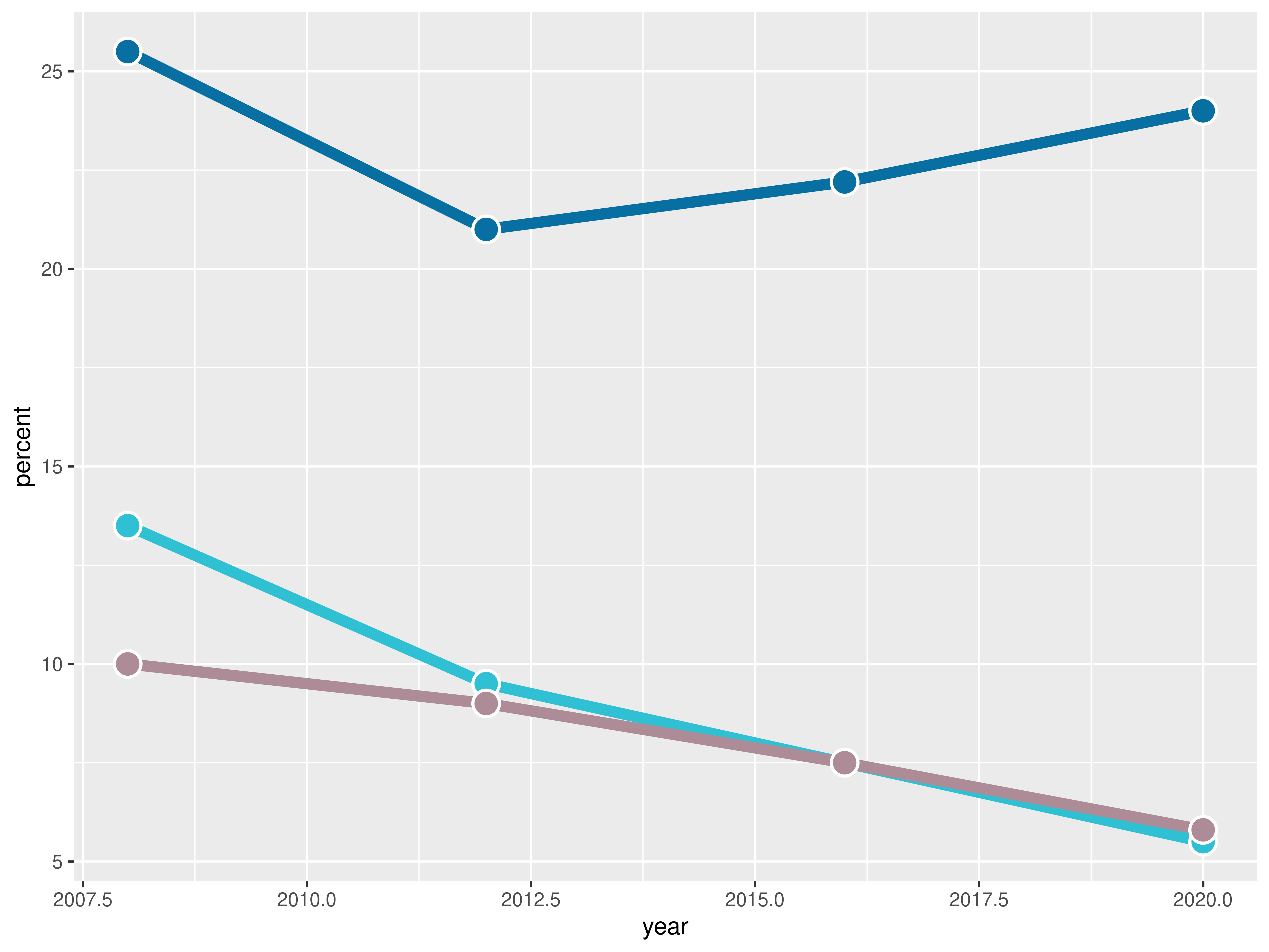
It’s been a fair start so far, but there’s still lot to do! Let’s continue with some layout customizations.
Customize layout
The next step is to customize the layout: change colors, modify axis labels, add grid lines, and many more exciting changes! Let’s do it!
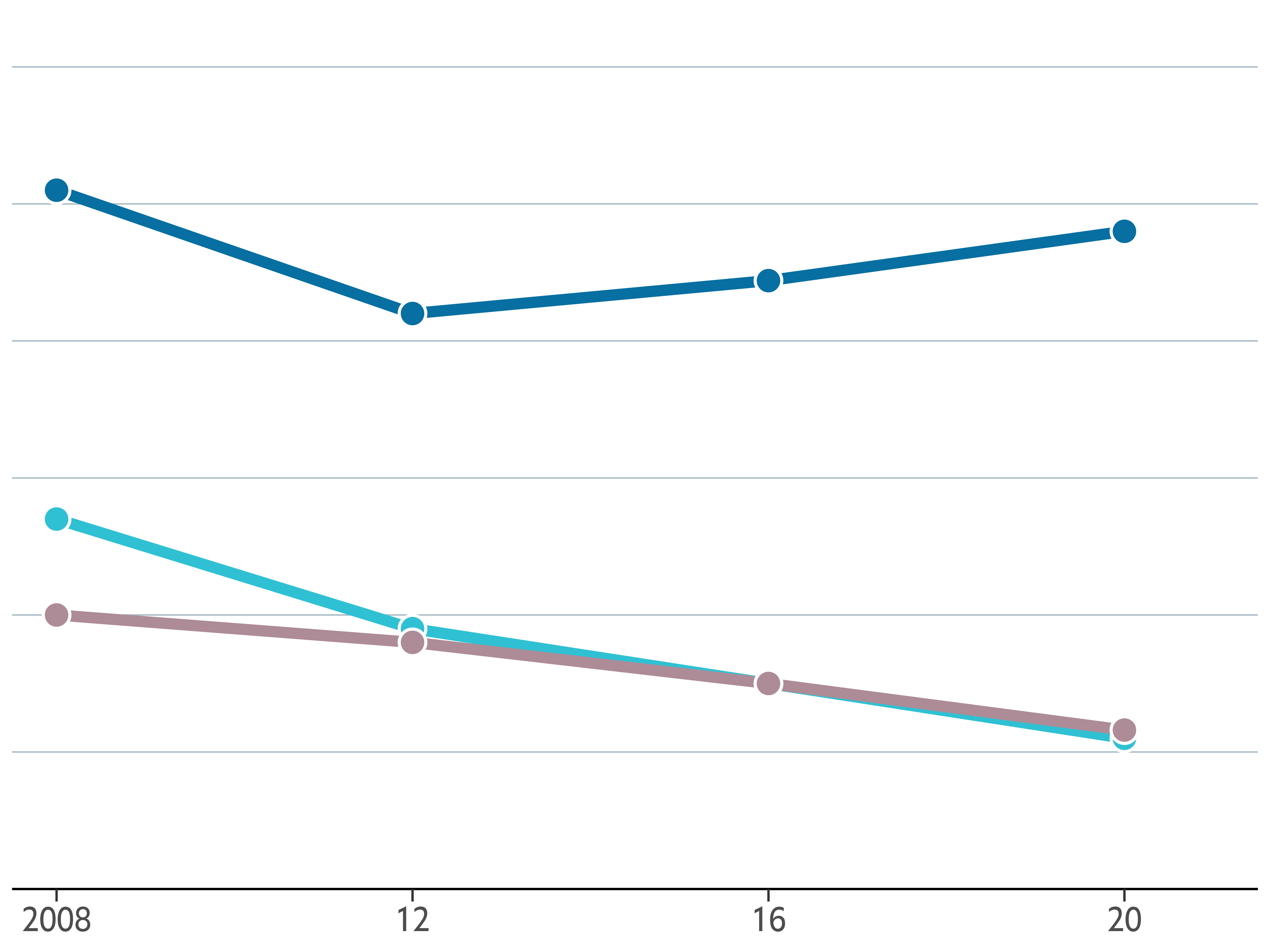
plt1 <- plt1 +
  scale_x_continuous(
    limits = c(2007.5, 2021.5),
    expand = c(0, 0), # The horizontal axis does not extend to either side
    breaks = c(2008, 2012, 2016, 2020),  # Set custom break locations
    labels = c("2008", "12", "16", "20") # And custom labels on those breaks!
  ) +
  scale_y_continuous(
    limits = c(0, 32),
    breaks = seq(0, 30, by = 5),
    expand = c(0, 0)
  ) +
  theme(
    # Set background color to white
    panel.background = element_rect(fill = "white"),
    # Remove all grid lines
    panel.grid = element_blank(),
    # But add grid lines for the vertical axis, customizing color and size
    panel.grid.major.y = element_line(color = "#A8BAC4", size = 0.3),
    # Remove tick marks on the vertical axis by setting their length to 0
    axis.ticks.length.y = unit(0, "mm"),
    # But keep tick marks on horizontal axis
    axis.ticks.length.x = unit(2, "mm"),
    # Remove the title for both axes
    axis.title = element_blank(),
    # Only the bottom line of the vertical axis is painted in black
    axis.line.x.bottom = element_line(color = "black"),
    # Remove labels from the vertical axis
    axis.text.y = element_blank(),
    # But customize labels for the horizontal axis
    axis.text.x = element_text(family = "Econ Sans Cnd", size = 16)
  )

plt1
It definitely starts to look very nice! 🤩
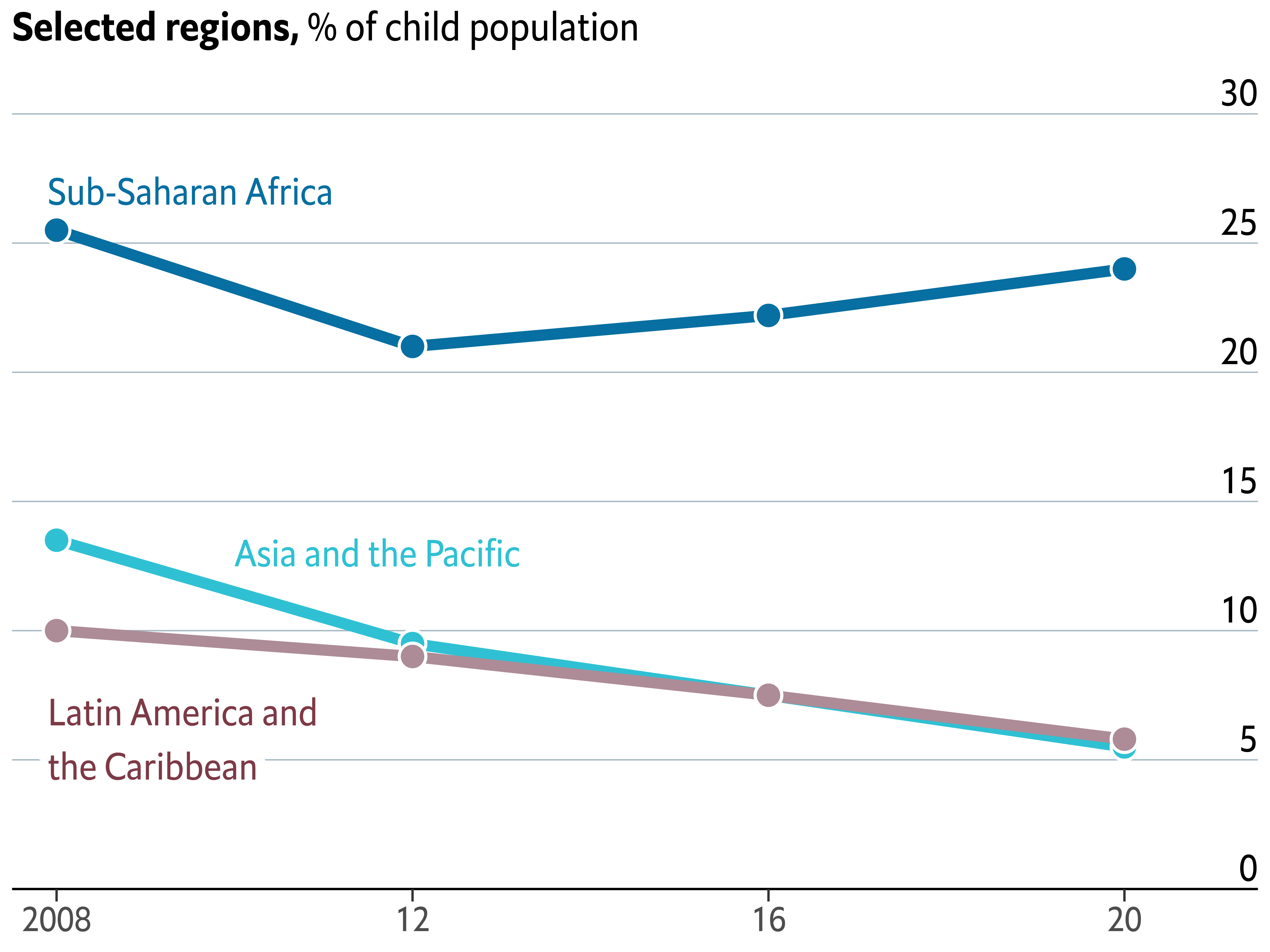
Add annotations and title
The chart doesn’t still indicate anything about the regions represented by each line, or the meaning of the vertical axis. It cannot be left like that. This is a good time to improve that!
The following chunk uses both geom_text() and
geom_shadowtext(). The first one is used to draw regular
text to indicate the values of the horizontal grid lines that serve as
a reference. On the other hand, geom_shadowtext() is used
to add the labels for the lines. The shadow added covers the
horizontal line behind the label for Latin America and the Caribbean
region.
In addition, new_scale_color() is used to add a new color
scale, the one used for the region labels. Although the colors are the
same than those added above, geom_shadowtext() uses a
different data set and thus is considered a new color scale.
Finally, the last step is to add a proper title. Note this title mixes
bold and regular text, which is very easy thanks to the
ggtext package.
# Add labels for the lines
plt1 <- plt1 +
  new_scale_color() +
  geom_shadowtext(
    aes(x, y, label = labels, color = color),
    data = line_labels,
    hjust = 0, # Align to the left
    bg.colour = "white", # Shadow color (or background color)
    bg.r = 0.4, # Radius of the background. The higher the value the bigger the shadow.
    family = "Econ Sans Cnd",
    size = 6
  ) +
  scale_color_identity() # Use the colors in the 'color' variable as they are.

# Add labels for the horizontal lines
plt1 <- plt1 +
  geom_text(
    data = data.frame(x = 2021.5, y = seq(0, 30, by = 5)),
    aes(x, y, label = y),
    hjust = 1, # Align to the right
    vjust = 0, # Align to the bottom
    nudge_y = 32 * 0.01, # The pad is equal to 1% of the vertical range (32 - 0)
    family = "Econ Sans Cnd",
    size = 6
  )

# Add title
plt1 <- plt1 +
  labs(
    title = "**Selected regions,** % of child population",
  ) +
  theme(
    # theme_markdown() is provided by ggtext and means the title contains
    # Markdown that should be parsed as such (the '**' symbols)
    plot.title = element_markdown(
      family = "Econ Sans Cnd",
      size = 18
    )
  )

plt1
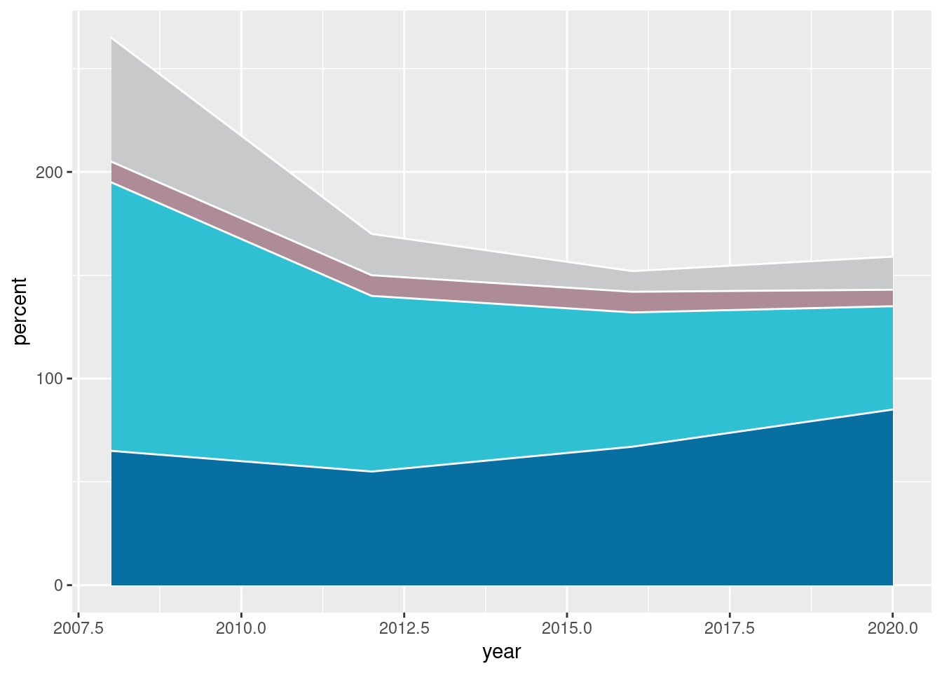
Stacked area chart
Thanks to the geom_area() function, it is quite
straightforward to create a
stacked area chart
in ggplot2.
plt2 <- ggplot(stacked_data) +
  # color = "white" indicates the color of the lines between the areas
  geom_area(aes(year, percent, fill = region), color = "white") +
  scale_fill_manual(values = c(GREY, BROWN, GREEN, BLUE)) +
  theme(legend.position = "None") # no legend

plt2
Customize layout
As with the previous chart, there’s also a lot to customize here!
plt2 <- plt2 +
  scale_x_continuous(
    # Note: Data goes from 2008 to 2020. Extra space is added on the right
    # so there's room for the grid line labels ;)
    limits = c(2007.5, 2021.5),
    expand = c(0, 0),
    breaks = c(2008, 2012, 2016, 2020),
    labels = c("2008", "12", "16", "20")
  ) +
  scale_y_continuous(
    limits = c(0, 320),
    breaks = seq(0, 300, by = 50),
    expand = c(0, 0)
  ) +
  theme(
    # Set background color to white
    panel.background = element_rect(fill = "white"),
    # Remove all grid lines
    panel.grid = element_blank(),
    # But add grid lines for the vertical axis, customizing color and size
    panel.grid.major.y = element_line(color = "#A8BAC4", size = 0.3),
    # Remove tick marks by setting their length to 0
    axis.ticks.length.y = unit(0, "mm"),
    axis.ticks.length.x = unit(2, "mm"),
    # Remove the title for both axes
    axis.title = element_blank(),
    # Only bottom line of the vertical axis is painted in black
    axis.line.x.bottom = element_line(color = "black"),
    # Remove labels from the vertical axis
    axis.text.y = element_blank(),
    # But customize labels for the horizontal axis
    axis.text.x = element_text(family = "Econ Sans Cnd", size = 16)
  )

plt2
Add labels and annotations
We’re about to finish this chart. This last step, which may be the
most convoluted step, consists of adding several labels and various
annotations. Firs of all, the labels for the areas. Then, the labels
for the horizontal gridlines. After that, we make use of the
geom_curve() function to add a curve that goes from the
“Latin America and the Caribbean” label to the area it represents. And
finally, it’s time for a title.
Sounds like lot of work? Come on, it’s not going to be that hard!
plt2 <- plt2 +
  geom_text(
    aes(x, y, label = labels, color = color),
    data = stacked_labels,
    hjust = 0,
    vjust = 0.5,
    family = "Econ Sans Cnd",
    size = 6,
    inherit.aes = FALSE
  ) +
  scale_color_identity()

plt2 <- plt2 +
  geom_text(
    data = data.frame(x = 2021.5, y = seq(0, 300, by = 50)),
    aes(x, y, label = y),
    hjust = 1,
    vjust = 0,
    nudge_y = 300 * 0.01, # Again, the pad is equal to 1% of the vertical range.
    family = "Econ Sans Cnd",
    size = 6,
    inherit.aes = FALSE
  )

plt2 <- plt2 +
  geom_curve(
    aes(x = x, y = y, xend = xend, yend = yend),
    data = data.frame(x = 2016.9, y = 210, xend = 2018.8, yend = 138),
    curvature = -0.5,
    angle = 90
  ) +
  geom_point(
    aes(x, y),
    data = data.frame(x = 2018.8, y = 138),
    color = "black"
  )

# Note again we use `element_markdown()` to render Markdown content
plt2 <- plt2 +
  labs(
    title = "**Number of children,** m",
  ) +
  theme(
    plot.title = element_markdown(
      family = "Econ Sans Cnd",
      size = 18
    )
  )

plt2
Combine charts
Now it comes one of the most exciting steps: combining the charts!
Thankfully, it exists patchwork which makes it extremely
easy to combine plots made with ggplot2.
The following chunk not only combines the charts, it also adjust their horizontal margins so the result has some space between the charts as in the original figure.
Next, we add a title to the plot obtained with patchwork using
plot_annotation() and a theme created for it.
plt1 <- plt1 + theme(plot.margin = margin(0, 0.05, 0, 0, "npc"))
plt2 <- plt2 + theme(plot.margin = margin(0, 0, 0.05, 0, "npc"))
plt <- plt1 | plt2


title_theme <- theme(
  plot.title = element_text(
    family = "Econ Sans Cnd",
    face = "bold",
    size = 22,
    margin = margin(0.8, 0, 0, 0, "npc")
  ),
  plot.subtitle = element_text(
    family = "Econ Sans Cnd",
    size = 20,
    margin = margin(0.4, 0, 0, 0, "npc")
  )
)

plt <- plt + plot_annotation(
    title = "All work, no play",
    subtitle = "Children in child labour*",
    theme = title_theme
  ) +
  theme(
    plot.margin = margin(0.075, 0, 0.1, 0, "npc"),
  )

plt

It’s so satisfying to see we’re so close! Let’s make one last effort and finish this chart!
Add final annotations with the grid library
The chart above is quite a good replicate of the original figure, but it is clearly missing some small, but very important, details. These are the distinctive red marks on top, and the captions with information about the source of the data and credit to the original author.
We’re going to use the grid library for this last task.
grid is a low-level plotting library that comes with any
R installation by default and provides many plotting
primitive functions. It is also the library that
ggplot2 uses to create the charts under the hood, and
that’s why we can combine them in the same chart.
Using grid will give us full control of what is added and
where it is added to the plot. The downside, is that it requires us to
write a considerable amount of extra code.
plt

# Add line on top of the chart
grid.lines(
  x = c(0, 1),
  y = 1,
  gp = gpar(col = "#e5001c", lwd = 4)
)

# Add rectangle on top-left
# lwd = 0 means the rectangle does not have an outer line
# 'just' gives the horizontal and vertical justification
grid.rect(
  x = 0,
  y = 1,
  width = 0.05,
  height = 0.025,
  just = c("left", "top"),
  gp = gpar(fill = "#e5001c", lwd = 0)
)
# Add first caption
grid.text(
  'Source: "Child Labour: Global estimates 2020, trends and the road forward", ILO and UNICEF',
  x = 0.005,
  y = 0.06,
  just = c("left", "bottom"),
  gp = gpar(
    col = "grey50",
    fontsize = 16,
    fontfamily = "Econ Sans Cnd"
  )
)

# Add second caption
grid.text(
  "The Economist",
  x = 0.005,
  y = 0.005,
  just = c("left", "bottom"),
  gp = gpar(
    col = "grey50",
    fontsize = 16,
    fontfamily = "Milo TE W01"
  )
)

# Add third caption
grid.text(
  "*5- to 17- year-olds",
  x = 0.995,
  y = 0.06,
  just = c("right", "bottom"),
  gp = gpar(
    col = "grey50",
    fontsize = 16,
    fontfamily = "Econ Sans Cnd"
  )
)
Voilà! We nailed it! 🎉
The extra mile
If you are attentive to the smallest of the details you may have noticed the titles in the chart above aren’t aligned to the leftmost side of the figure as in the original chart.
One alternative, the one we used
here, is to remove the titles made with ggplot2 and make all
the annotations from scratch using the grid library. Do
you like challenges? Then have a look at the article and go for it!