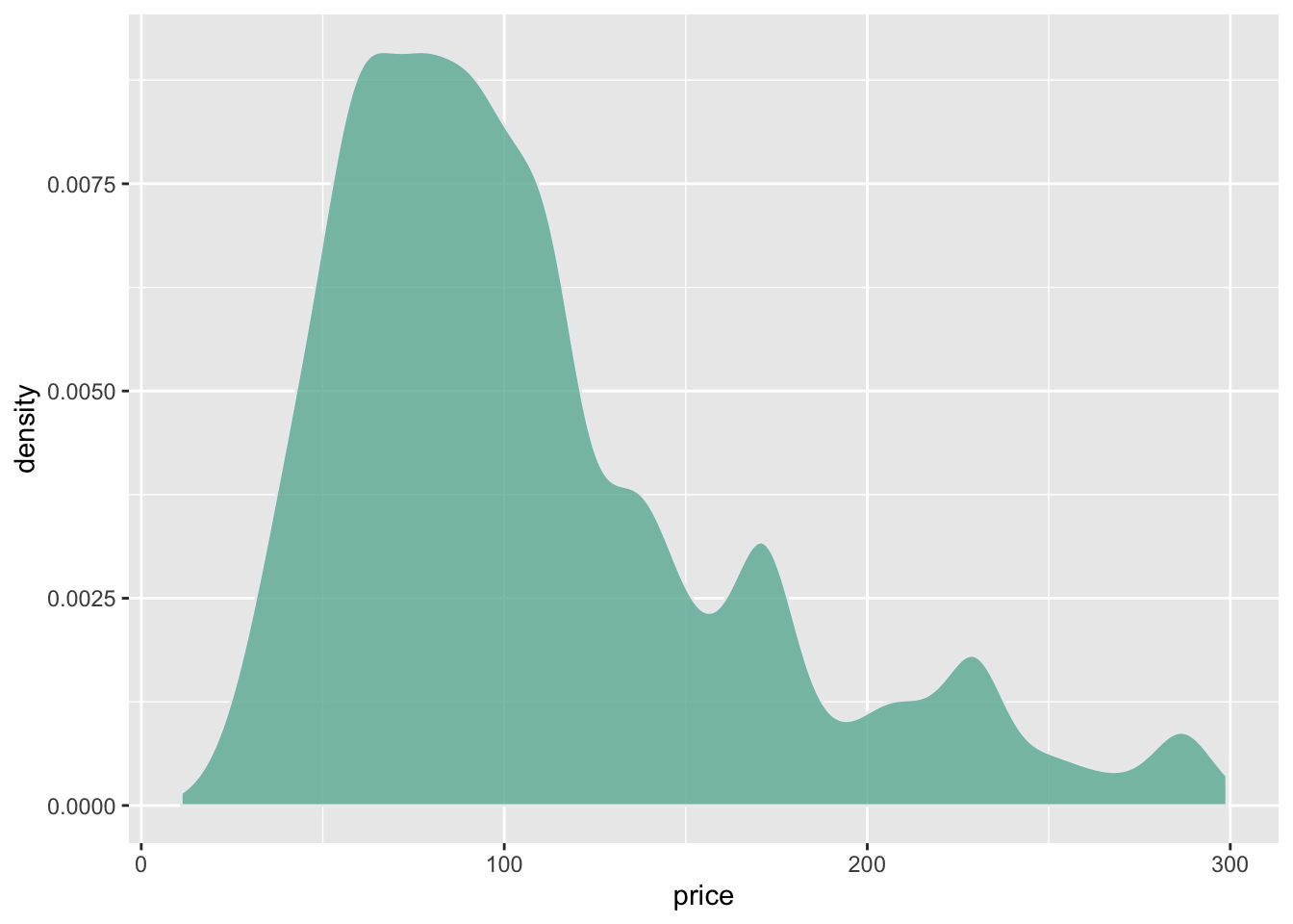
Density plots are built in ggplot2 thanks to the
geom_density geom. Only one numeric variable is need as
input.
# Libraries
library(ggplot2)
library(dplyr)

# Load dataset from github
data <- read.table("https://raw.githubusercontent.com/holtzy/data_to_viz/master/Example_dataset/1_OneNum.csv", header=TRUE)

# Make the histogram
data %>%
  filter( price<300 ) %>%
  ggplot( aes(x=price)) +
    geom_density(fill="#69b3a2", color="#e9ecef", alpha=0.8)
Custom with theme_ipsum
The hrbrthemes package offer a set of pre-built themes
for your charts. I am personnaly a big fan of the
theme_ipsum: easy to use and makes your chart look more
professional:
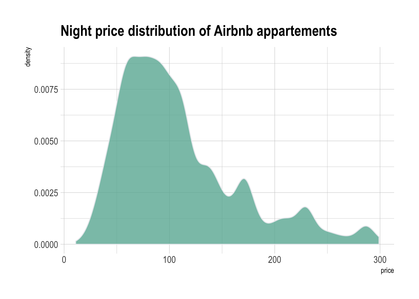
# Libraries
library(ggplot2)
library(dplyr)
library(hrbrthemes)

# Load dataset from github
data <- read.table("https://raw.githubusercontent.com/holtzy/data_to_viz/master/Example_dataset/1_OneNum.csv", header=TRUE)

# Make the histogram
data %>%
  filter( price<300 ) %>%
  ggplot( aes(x=price)) +
    geom_density(fill="#69b3a2", color="#e9ecef", alpha=0.8) +
    ggtitle("Night price distribution of Airbnb appartements") +
    theme_ipsum()