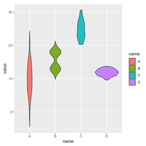
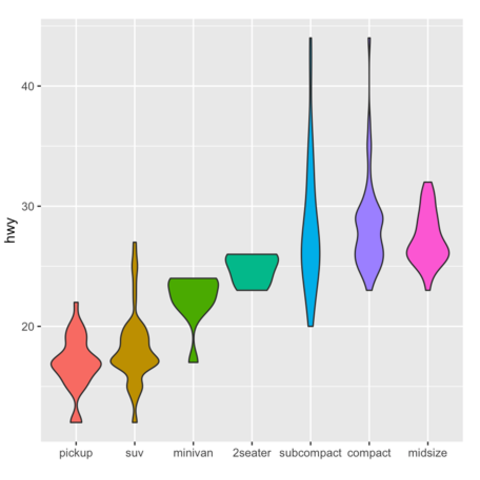
Violin Chart


Violin plots allow to visualize the distribution of a numeric variable for one or several groups. They are very well adapted for large dataset, as stated in data-to-viz.com. They're often used to replace boxplot.

Using ggplot2

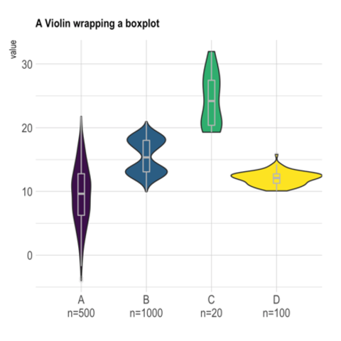
Violin charts can be produced with ggplot2 thanks to the geom_violin() function. The first chart of the series below describes its basic utilization and explain how to build violin chart from different input format.
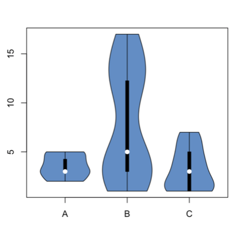


Using base R

It is doable to plot a violin chart using base R and the Vioplot library..

🌐 From the web

The web is full of astonishing R charts made by awesome bloggers. The R graph gallery tries to display some of the best creations and explain how their source code works. If you want to display your work here, please drop me a word or even better, submit a Pull Request!

Related chart types


Violin
Density
Histogram
Boxplot
Ridgeline