A boxplot summarizes the distribution of a numeric variable for one or several groups.
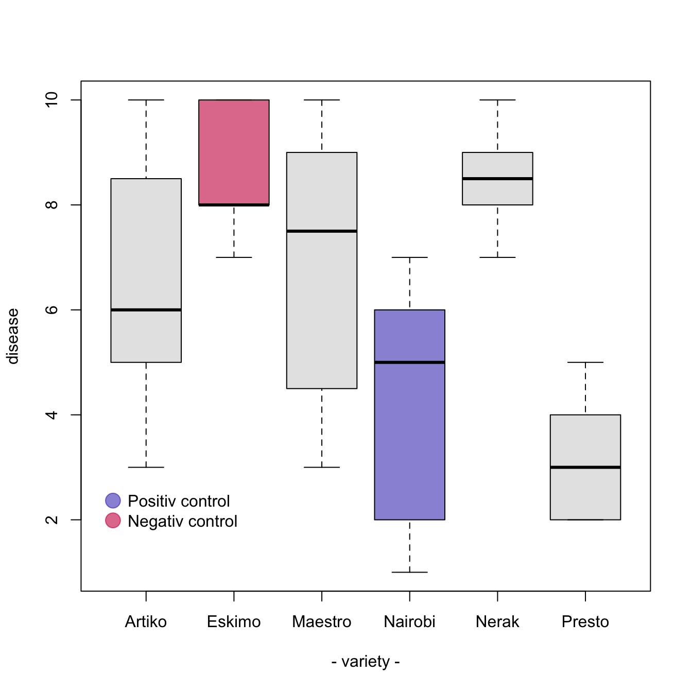
It can be usefull to add colors to specific groups to highlight them. For exemple, positive and negative controls are likely to be in different colors.
The easiest way is to give a vector (myColor here) of
colors when you call the boxplot() function. Use
ifelse statements to add the color you want to a
specific name.
#Create data
names <- c(rep("Maestro", 20) , rep("Presto", 20) ,
      rep("Nerak", 20), rep("Eskimo", 20), rep("Nairobi", 20), rep("Artiko", 20))
value <- c(  sample(3:10, 20 , replace=T) , sample(2:5, 20 , replace=T) ,
      sample(6:10, 20 , replace=T), sample(6:10, 20 , replace=T) ,
      sample(1:7, 20 , replace=T), sample(3:10, 20 , replace=T) )
data <- data.frame(names,value)

# Prepare a vector of colors with specific color for Nairobi and Eskimo
myColors <- ifelse(levels(data$names)=="Nairobi" , rgb(0.1,0.1,0.7,0.5) ,
              ifelse(levels(data$names)=="Eskimo", rgb(0.8,0.1,0.3,0.6),
              "grey90" ) )

# Build the plot
boxplot(data$value ~ data$names ,
    col=myColors ,
    ylab="disease" , xlab="- variety -")

# Add a legend
legend("bottomleft", legend = c("Positiv control","Negativ control") ,
    col = c(rgb(0.1,0.1,0.7,0.5) , rgb(0.8,0.1,0.3,0.6)) , bty = "n", pch=20 , pt.cex = 3, cex = 1, horiz = FALSE, inset = c(0.03, 0.1))