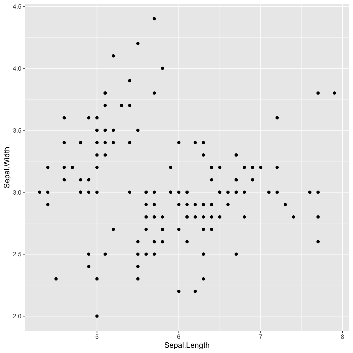
Default scatter plot in ggplot2
Here’s what the default scatter plot output looks like with
ggplot2:
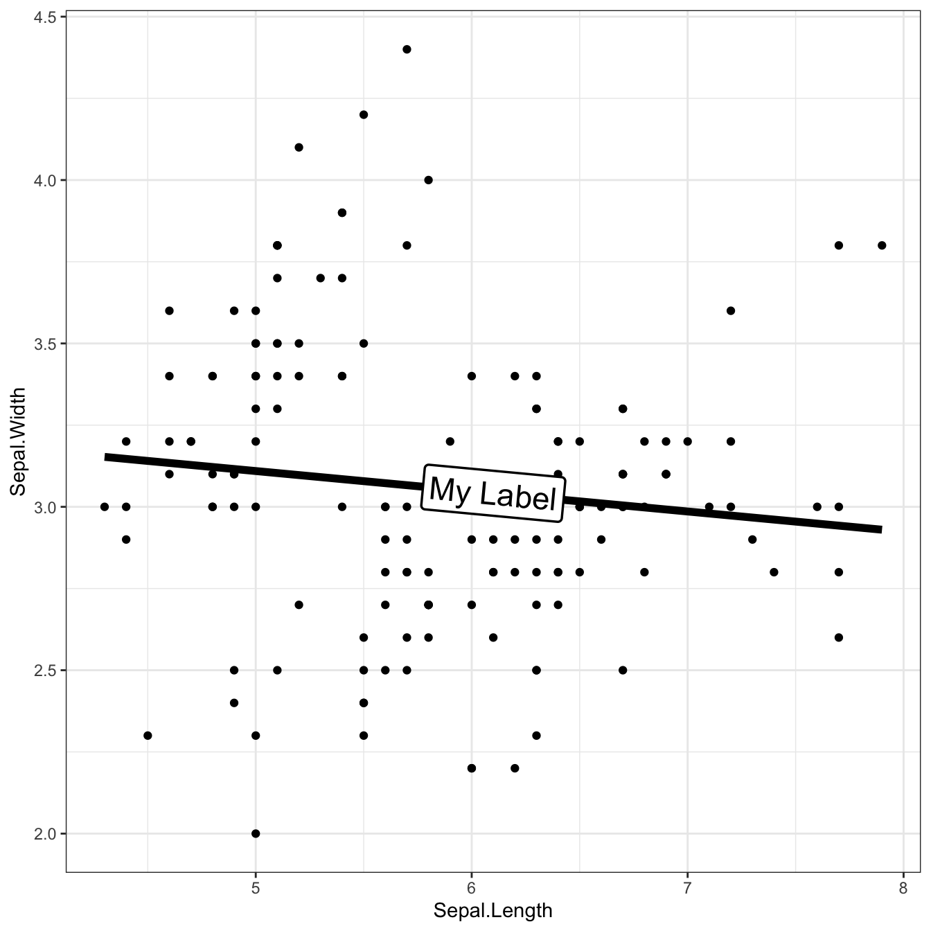
Add trend line with label on top
With the geom_labelsmooth() function, we add a trend
line with a label on it!
It has the following arguments:
-
fill: the background color of the label -
method: type of trend wanted. In our case,lmmeans the ordinary least squared estimator (linear regression). Check the function documentation for available possibilities -
size,linewidthandboxlinewidth: define the properties of the text and its box
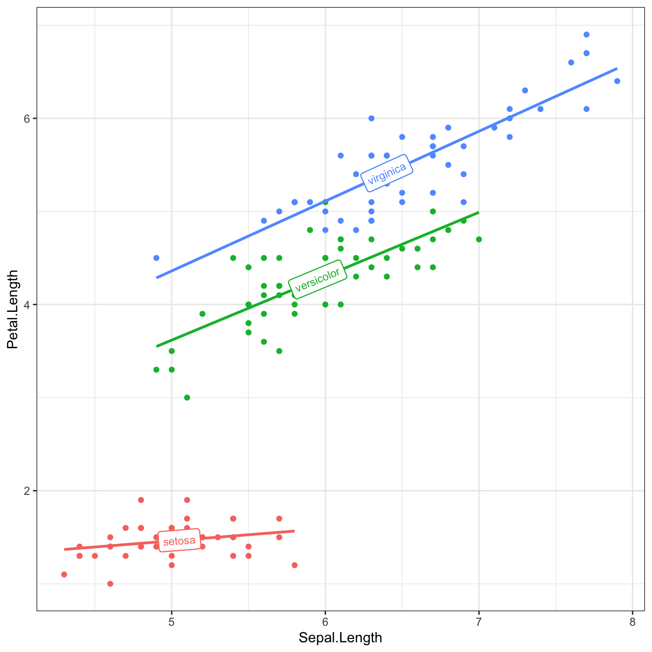
Multiple groups trend lines with labels
In the case of a multi-group scatter plot, the
geom_labelsmooth() function works just as simply:
-
we add
color=Species -
we change
label = 'My Label'tolabel = Species
And that’s it!
library(hrbrthemes)
data(iris)

ggplot(iris, aes(x = Sepal.Length, y = Petal.Length, color = Species)) +
  geom_point() +
  geom_labelsmooth(aes(label = Species), fill = "white",
                method = "lm", formula = y ~ x,
                size = 3, linewidth = 1, boxlinewidth = 0.4) +
  theme_bw() + guides(color = 'none') # remove legend
Conclusion
In this post, we look at how to use the geomtexpath package to create scatter plots with trend lines and labels. To find out more about how to customize a scatter plot, see the dedicated section.