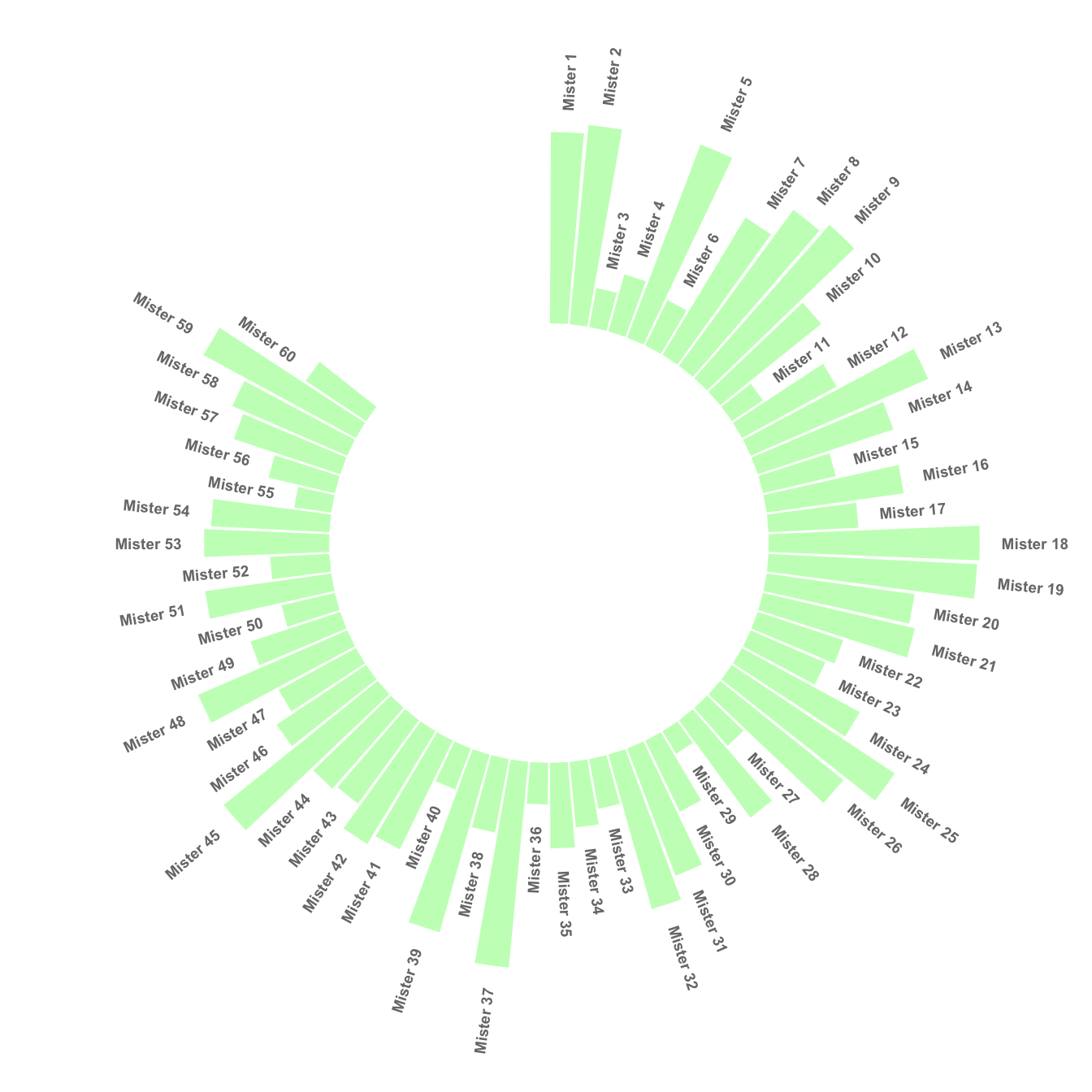
Add a gap in the circle
A circular barplot is a barplot where bars are displayed along a circle instead of a line. This page aims to teach you how to make a circular barplot with groups.
Since this kind of chart is a bit tricky, I strongly advise to understand graph #295 and #296 that will teach you the basics.
The first step is to build a circular barplot with a break in the circle. Actually, I just added a few empty lines at the end of the initial data frame:
# library
library(tidyverse)
# Create dataset
data <- data.frame(
individual=paste( "Mister ", seq(1,60), sep=""),
value=sample( seq(10,100), 60, replace=T)
)
# Set a number of 'empty bar'
empty_bar <- 10
# Add lines to the initial dataset
to_add <- matrix(NA, empty_bar, ncol(data))
colnames(to_add) <- colnames(data)
data <- rbind(data, to_add)
data$id <- seq(1, nrow(data))
# Get the name and the y position of each label
label_data <- data
number_of_bar <- nrow(label_data)
angle <- 90 - 360 * (label_data$id-0.5) /number_of_bar # I substract 0.5 because the letter must have the angle of the center of the bars. Not extreme right(1) or extreme left (0)
label_data$hjust <- ifelse( angle < -90, 1, 0)
label_data$angle <- ifelse(angle < -90, angle+180, angle)
# Make the plot
p <- ggplot(data, aes(x=as.factor(id), y=value)) + # Note that id is a factor. If x is numeric, there is some space between the first bar
geom_bar(stat="identity", fill=alpha("green", 0.3)) +
ylim(-100,120) +
theme_minimal() +
theme(
axis.text = element_blank(),
axis.title = element_blank(),
panel.grid = element_blank(),
plot.margin = unit(rep(-1,4), "cm")
) +
coord_polar(start = 0) +
geom_text(data=label_data, aes(x=id, y=value+10, label=individual, hjust=hjust), color="black", fontface="bold",alpha=0.6, size=2.5, angle= label_data$angle, inherit.aes = FALSE )
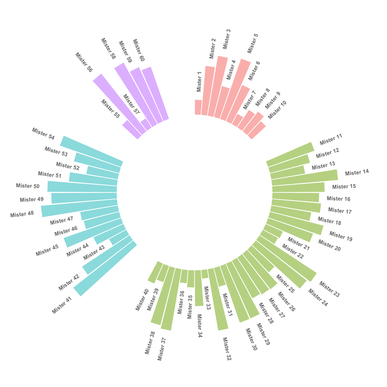
pSpace between groups
This concept can now be used to add space between each group of the
dataset. I add n lines with only NA at the
bottom of each group.
This chart is far more insightful since it allows one to quickly compare the different groups, and to compare the value of items within each group.
# library
library(tidyverse)

# Create dataset
data <- data.frame(
  individual=paste( "Mister ", seq(1,60), sep=""),
  group=c( rep('A', 10), rep('B', 30), rep('C', 14), rep('D', 6)) ,
  value=sample( seq(10,100), 60, replace=T)
)

# Set a number of 'empty bar' to add at the end of each group
empty_bar <- 4
to_add <- data.frame( matrix(NA, empty_bar*nlevels(data$group), ncol(data)) )
colnames(to_add) <- colnames(data)
to_add$group <- rep(levels(data$group), each=empty_bar)
data <- rbind(data, to_add)
data <- data %>% arrange(group)
data$id <- seq(1, nrow(data))

# Get the name and the y position of each label
label_data <- data
number_of_bar <- nrow(label_data)
angle <- 90 - 360 * (label_data$id-0.5) /number_of_bar     # I substract 0.5 because the letter must have the angle of the center of the bars. Not extreme right(1) or extreme left (0)
label_data$hjust <- ifelse( angle < -90, 1, 0)
label_data$angle <- ifelse(angle < -90, angle+180, angle)

# Make the plot
p <- ggplot(data, aes(x=as.factor(id), y=value, fill=group)) +       # Note that id is a factor. If x is numeric, there is some space between the first bar
  geom_bar(stat="identity", alpha=0.5) +
  ylim(-100,120) +
  theme_minimal() +
  theme(
    legend.position = "none",
    axis.text = element_blank(),
    axis.title = element_blank(),
    panel.grid = element_blank(),
    plot.margin = unit(rep(-1,4), "cm")
  ) +
  coord_polar() +
  geom_text(data=label_data, aes(x=id, y=value+10, label=individual, hjust=hjust), color="black", fontface="bold",alpha=0.6, size=2.5, angle= label_data$angle, inherit.aes = FALSE )

p
Order bars
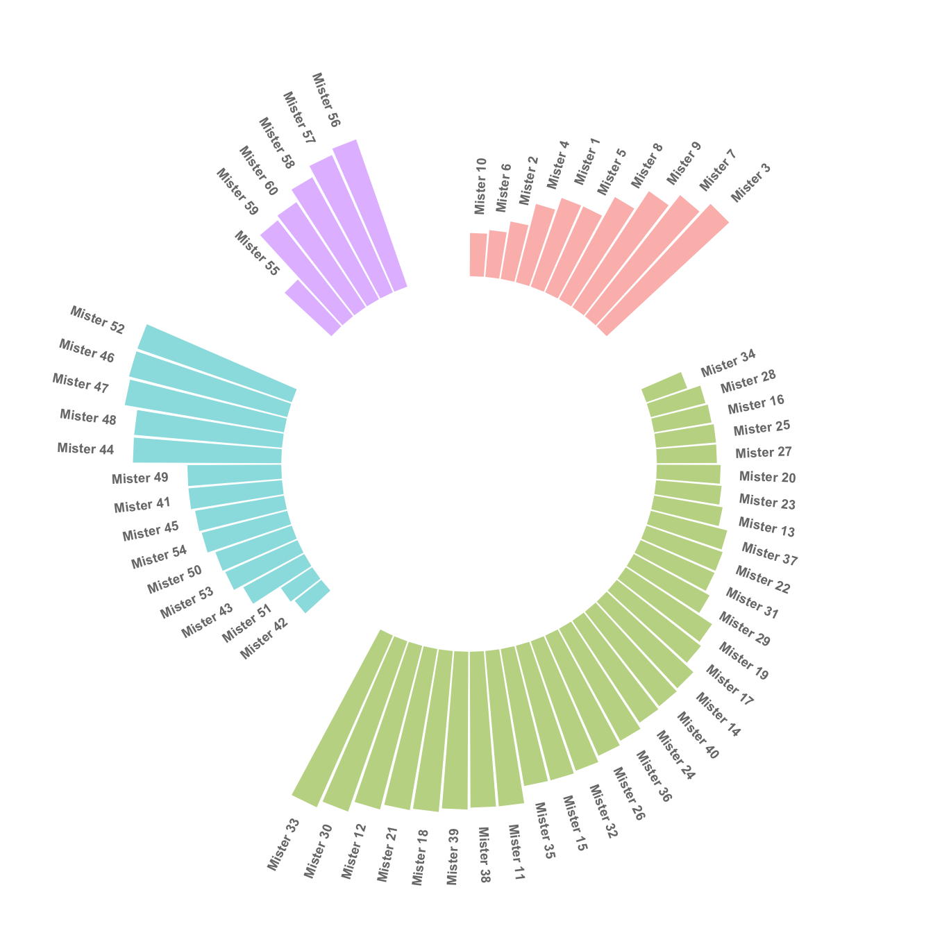
Here observations are sorted by bar height within each group. It can be useful if your goal is to understand what are the highest / lowest observations within and across groups.
The method used to order groups in ggplot2 is extensively described in this dedicated page. Basically, you just have to add the following piece of code right after the data frame creation:
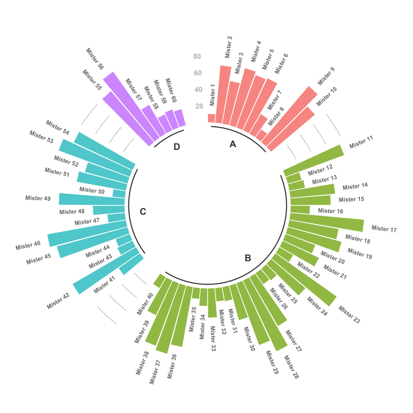
Circular barchart customization
Last but not least, it is highly advisable to add some customisation to your chart. Here we add group names (A, B, C and D), and we add a scale to help compare the sizes of the bars. Voila! The code is a bit long, but the result is quite worth it in my opinion!
# library
library(tidyverse)

# Create dataset
data <- data.frame(
  individual=paste( "Mister ", seq(1,60), sep=""),
  group=c( rep('A', 10), rep('B', 30), rep('C', 14), rep('D', 6)) ,
  value=sample( seq(10,100), 60, replace=T)
)

# Set a number of 'empty bar' to add at the end of each group
empty_bar <- 3
to_add <- data.frame( matrix(NA, empty_bar*nlevels(data$group), ncol(data)) )
colnames(to_add) <- colnames(data)
to_add$group <- rep(levels(data$group), each=empty_bar)
data <- rbind(data, to_add)
data <- data %>% arrange(group)
data$id <- seq(1, nrow(data))

# Get the name and the y position of each label
label_data <- data
number_of_bar <- nrow(label_data)
angle <- 90 - 360 * (label_data$id-0.5) /number_of_bar     # I substract 0.5 because the letter must have the angle of the center of the bars. Not extreme right(1) or extreme left (0)
label_data$hjust <- ifelse( angle < -90, 1, 0)
label_data$angle <- ifelse(angle < -90, angle+180, angle)

# prepare a data frame for base lines
base_data <- data %>%
  group_by(group) %>%
  summarize(start=min(id), end=max(id) - empty_bar) %>%
  rowwise() %>%
  mutate(title=mean(c(start, end)))

# prepare a data frame for grid (scales)
grid_data <- base_data
grid_data$end <- grid_data$end[ c( nrow(grid_data), 1:nrow(grid_data)-1)] + 1
grid_data$start <- grid_data$start - 1
grid_data <- grid_data[-1,]

# Make the plot
p <- ggplot(data, aes(x=as.factor(id), y=value, fill=group)) +       # Note that id is a factor. If x is numeric, there is some space between the first bar

  geom_bar(aes(x=as.factor(id), y=value, fill=group), stat="identity", alpha=0.5) +

  # Add a val=100/75/50/25 lines. I do it at the beginning to make sur barplots are OVER it.
  geom_segment(data=grid_data, aes(x = end, y = 80, xend = start, yend = 80), colour = "grey", alpha=1, size=0.3 , inherit.aes = FALSE ) +
  geom_segment(data=grid_data, aes(x = end, y = 60, xend = start, yend = 60), colour = "grey", alpha=1, size=0.3 , inherit.aes = FALSE ) +
  geom_segment(data=grid_data, aes(x = end, y = 40, xend = start, yend = 40), colour = "grey", alpha=1, size=0.3 , inherit.aes = FALSE ) +
  geom_segment(data=grid_data, aes(x = end, y = 20, xend = start, yend = 20), colour = "grey", alpha=1, size=0.3 , inherit.aes = FALSE ) +

  # Add text showing the value of each 100/75/50/25 lines
  annotate("text", x = rep(max(data$id),4), y = c(20, 40, 60, 80), label = c("20", "40", "60", "80") , color="grey", size=3 , angle=0, fontface="bold", hjust=1) +

  geom_bar(aes(x=as.factor(id), y=value, fill=group), stat="identity", alpha=0.5) +
  ylim(-100,120) +
  theme_minimal() +
  theme(
    legend.position = "none",
    axis.text = element_blank(),
    axis.title = element_blank(),
    panel.grid = element_blank(),
    plot.margin = unit(rep(-1,4), "cm")
  ) +
  coord_polar() +
  geom_text(data=label_data, aes(x=id, y=value+10, label=individual, hjust=hjust), color="black", fontface="bold",alpha=0.6, size=2.5, angle= label_data$angle, inherit.aes = FALSE ) +

  # Add base line information
  geom_segment(data=base_data, aes(x = start, y = -5, xend = end, yend = -5), colour = "black", alpha=0.8, size=0.6 , inherit.aes = FALSE )  +
  geom_text(data=base_data, aes(x = title, y = -18, label=group), hjust=c(1,1,0,0), colour = "black", alpha=0.8, size=4, fontface="bold", inherit.aes = FALSE)

p
What’s next?
Last step: a circular stacked grouped barplot described in graph #299. Or check the circular barplot section for more examples.