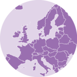
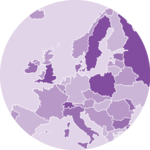
About choropleth map
Two inputs are needed to build a choropleth map:
- A geospatial object providing region boundaries (city districts of the south of France in this example). Data are available at the geoJSON format here, and this post explains in detail how to read and represent geoJSON format with R.
- A numeric variable that we use to color each geographical unit. Here we will use the number of restaurant per city. The data has been found here.
Find and download a .geoJSON file
This step has been extensively describe in
chart #325. The sf library allows to read this type of format in
R. For plotting it with ggplot2,
the geom_sf() function allows to
represent this type of object.
# Geospatial data available at the geojson format
tmp_geojson <- tempfile(fileext = ".geojson")
download.file(
"https://raw.githubusercontent.com/gregoiredavid/france-geojson/master/communes.geojson",
tmp_geojson
)
library(sf)
my_sf <- read_sf(tmp_geojson)
# Since it is a bit too much data, I select only a subset of it:
my_sf <- my_sf[substr(my_sf$code, 1, 2) %in% c(
"06", "83",
"13", "30", "34", "11", "66"
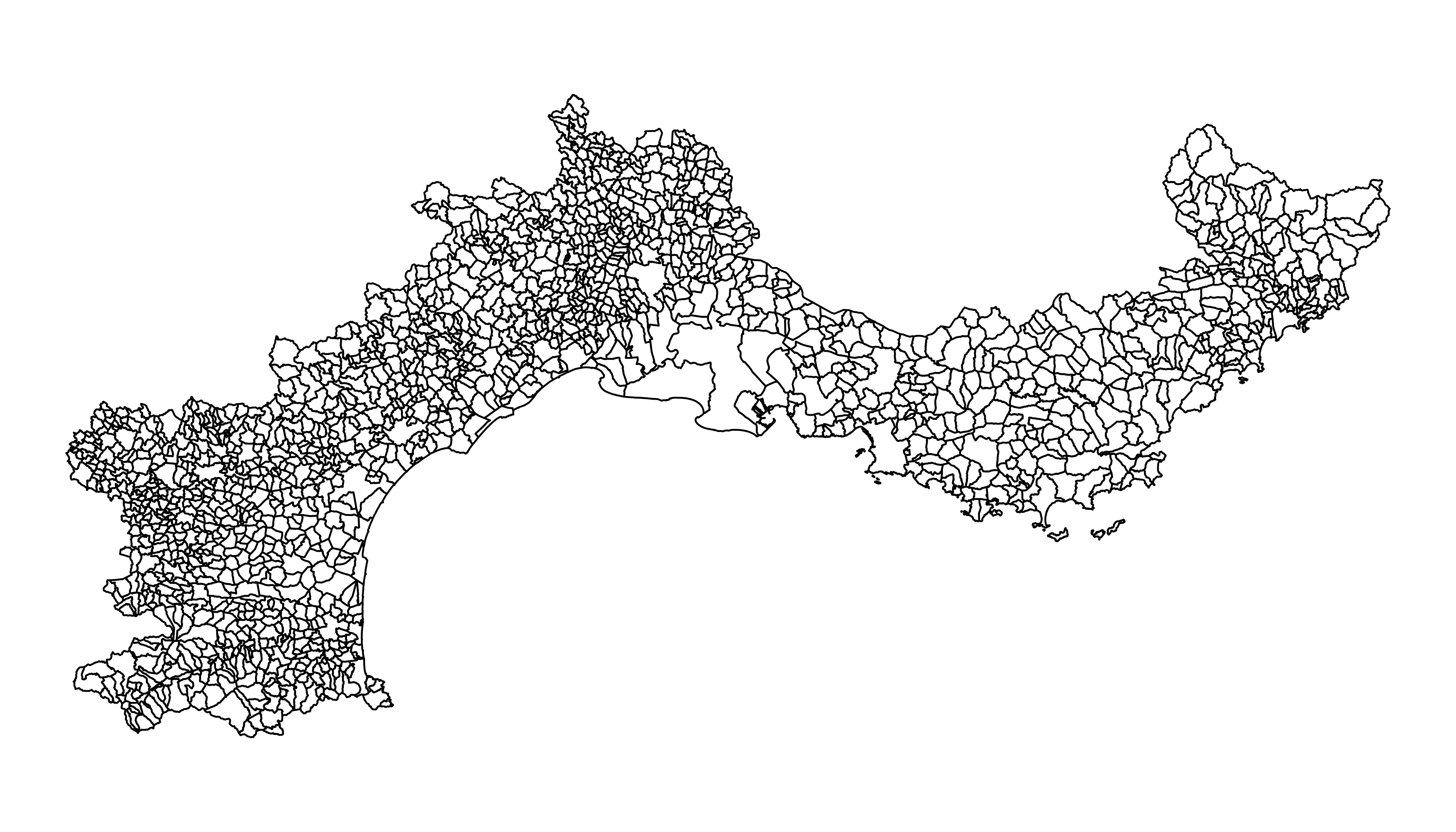
), ]Basic background map
We now have a geospatial object called my_sf. This object
could be plotted as is using the plot() function as
explained here.
On ggplot2 we can use
geom_sf() to plot the shape.
library(ggplot2)
ggplot(my_sf) +
  geom_sf(fill = "white", color = "black", linewidth = 0.3) +
  theme_void()
Read the numeric variable
The number of restaurant per city district has been found on the
internet and a clean version is stored on the gallery website. It is
thus easy to read it with read.table(). Before doing a
choropleth map, it is a good
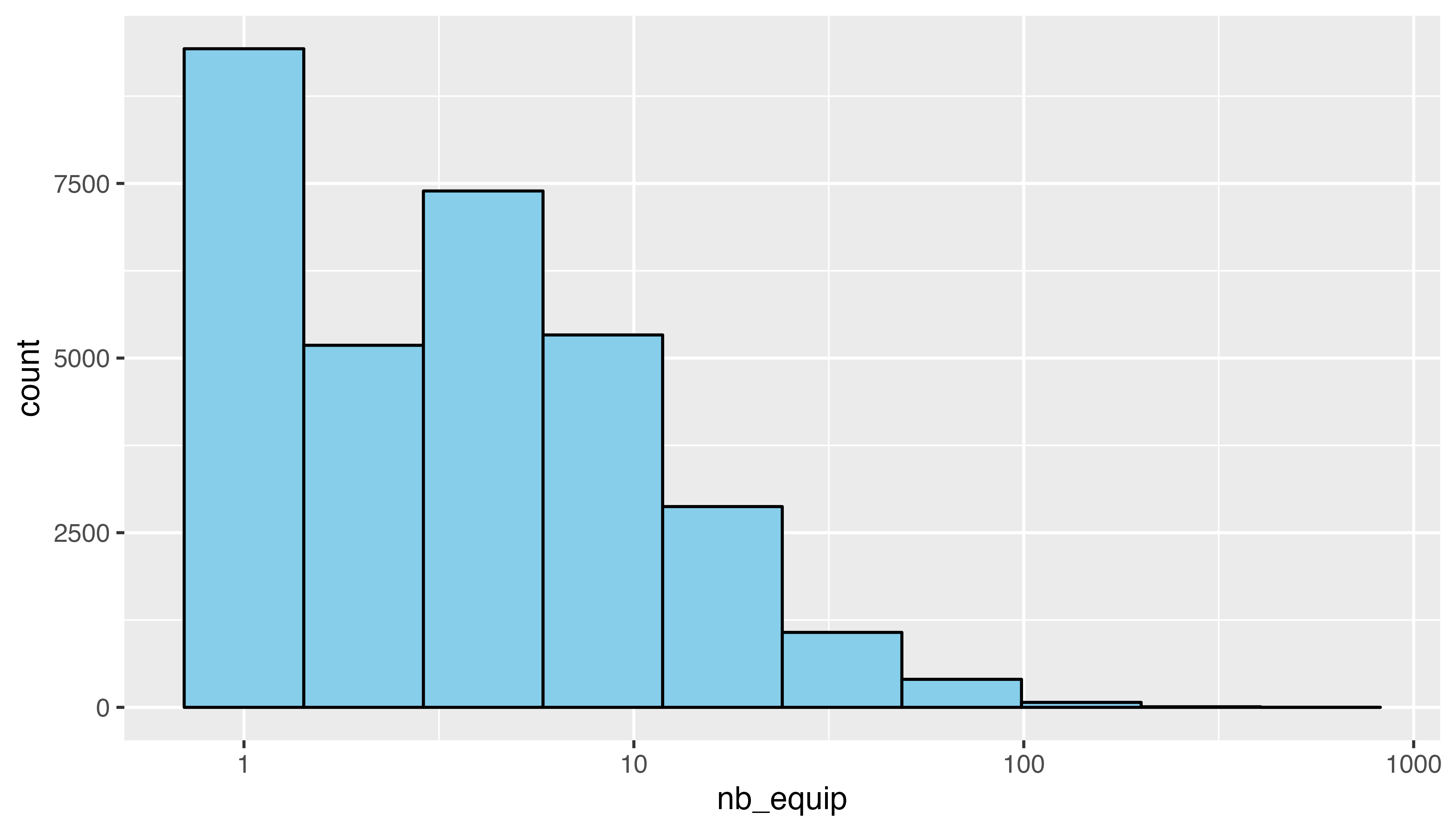
practice to check the distribution of your variable.
Here, we have a long tail distribution: a few cities have a lot of restaurant. Thus we will probably need to apply a log scale to our color palette. It will avoid that all the variation is absorbed by these high values.
# read data
data <- read.table(
  "https://raw.githubusercontent.com/holtzy/R-graph-gallery/master/DATA/data_on_french_states.csv",
  header = T, sep = ";"
)

head(data)
# Distribution of the number of restaurant?
library(dplyr)
data %>%
ggplot(aes(x = nb_equip)) +
geom_histogram(bins = 10, fill = "skyblue", color = "black") +
scale_x_log10()
Merge geospatial and numeric data
This is a key step in choropleth map: your 2 inputs must have a id in common to make the link between them!
Read the numeric variable
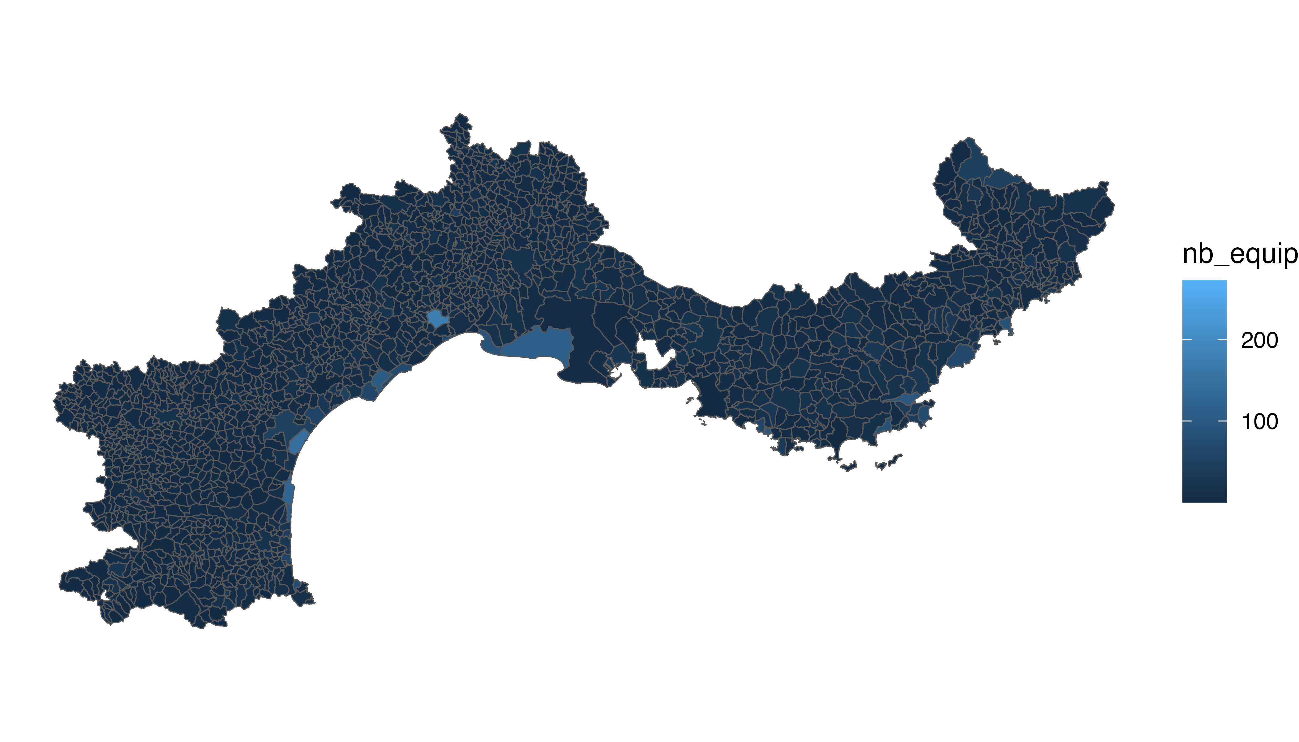
We can make a first basic choropleth map. We just need to add
fill = our_value in the aesthetic of our polygons.
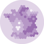
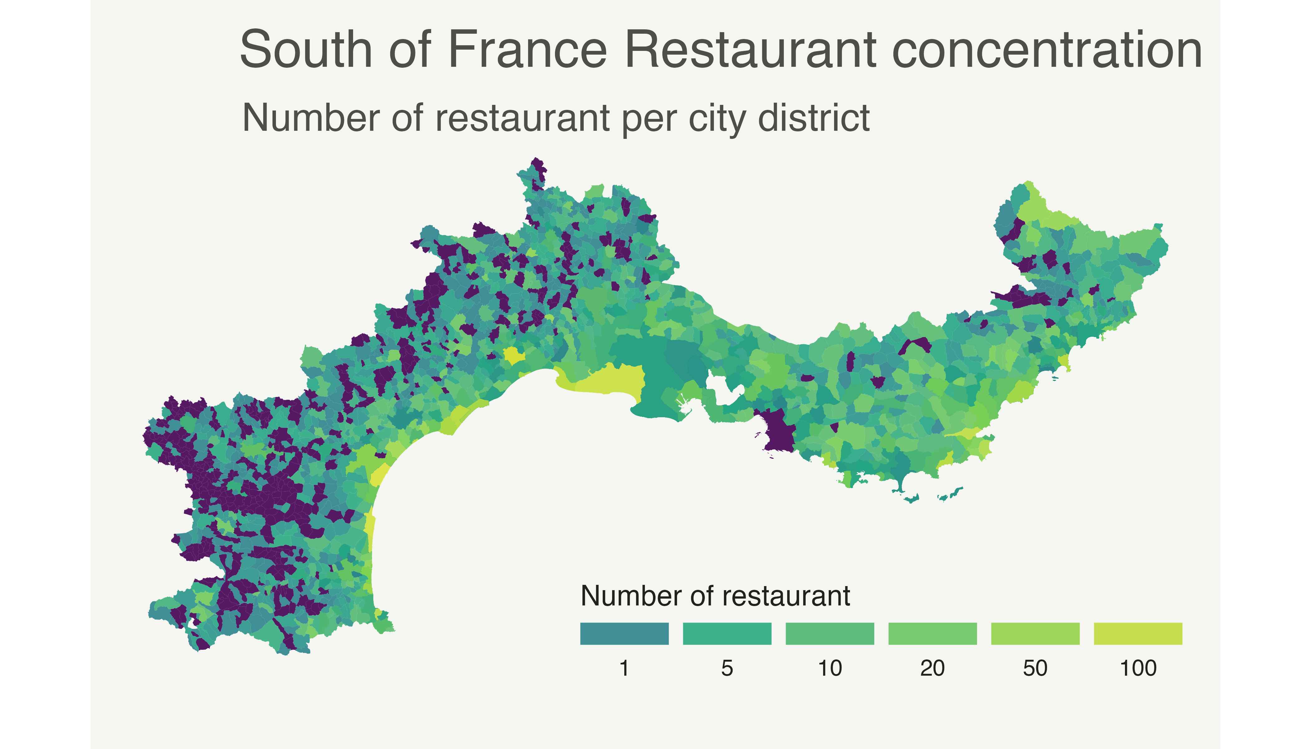
Customized choropleth map with R and ggplot2
We need to change the color palette, improve the legend, use a log scale transformation for the colorscale, change background and add titles and explanation.
Here is the code to do that, and the final result!
p <- ggplot(my_sf_merged) +
  geom_sf(aes(fill = nb_equip), linewidth = 0, alpha = 0.9) +
  theme_void() +
  scale_fill_viridis_c(
    trans = "log", breaks = c(1, 5, 10, 20, 50, 100),
    name = "Number of restaurant",
    guide = guide_legend(
      keyheight = unit(3, units = "mm"),
      keywidth = unit(12, units = "mm"),
      label.position = "bottom",
      title.position = "top",
      nrow = 1
    )
  ) +
  labs(
    title = "South of France Restaurant concentration",
    subtitle = "Number of restaurant per city district",
    caption = "Data: INSEE | Creation: Yan Holtz | r-graph-gallery.com"
  ) +
  theme(
    text = element_text(color = "#22211d"),
    plot.background = element_rect(fill = "#f5f5f2", color = NA),
    panel.background = element_rect(fill = "#f5f5f2", color = NA),
    legend.background = element_rect(fill = "#f5f5f2", color = NA),
    plot.title = element_text(
      size = 20, hjust = 0.01, color = "#4e4d47",
      margin = margin(
        b = -0.1, t = 0.4, l = 2,
        unit = "cm"
      )
    ),
    plot.subtitle = element_text(
      size = 15, hjust = 0.01,
      color = "#4e4d47",
      margin = margin(
        b = -0.1, t = 0.43, l = 2,
        unit = "cm"
      )
    ),
    plot.caption = element_text(
      size = 10,
      color = "#4e4d47",
      margin = margin(
        b = 0.3, r = -99, t = 0.3,
        unit = "cm"
      )
    ),
    legend.position = c(0.7, 0.09)
  )

p
Going further
This post explains how to build a choropleth map with R and ggplot2.
You might be interested in how to create an interactive choropleth map, and more generally in the choropleth section of the gallery.