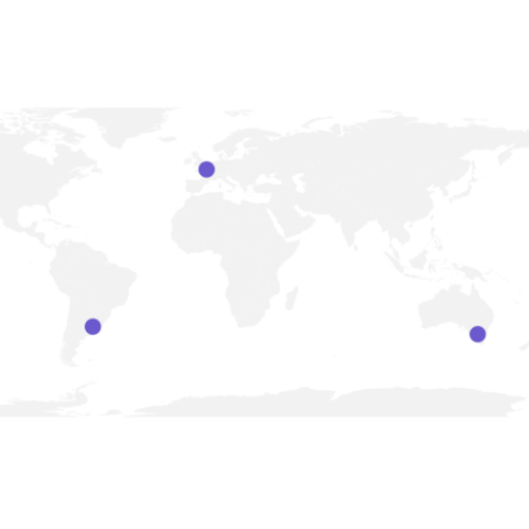
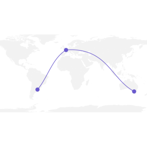
Step by step
The following example is a step by step approach to great circles in R. It will guides you through the use of the gcintermediate() function of the geosphere package. It notably tackles the issue that arises when 2 cities have their shortest distance passing behind the globe. Explore it here.
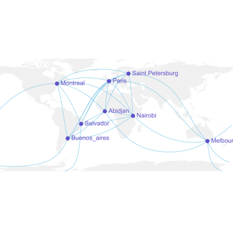
Application to real data
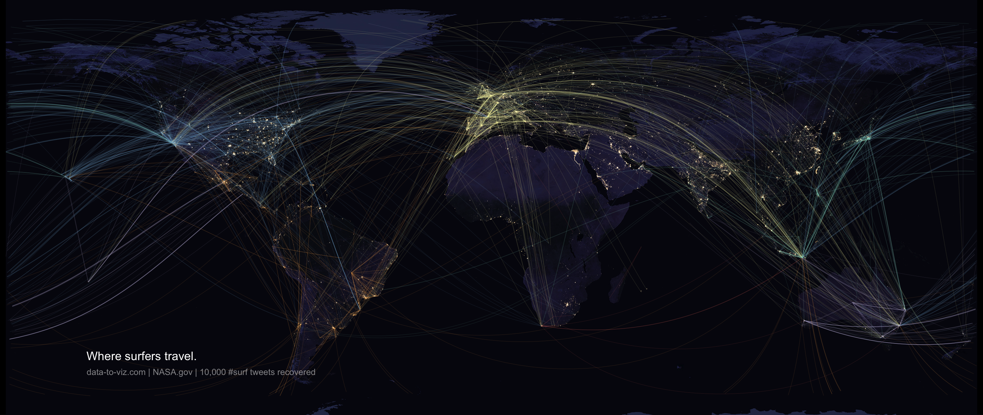
The following map shows where surfers travel based on their twitter activity. Thousands of tweets containing #surf have been recovered and geocoded. Home and current locations are represented using great circles following the method described above.
Note: This project is extensively described in data-to-viz.com
About the project Code