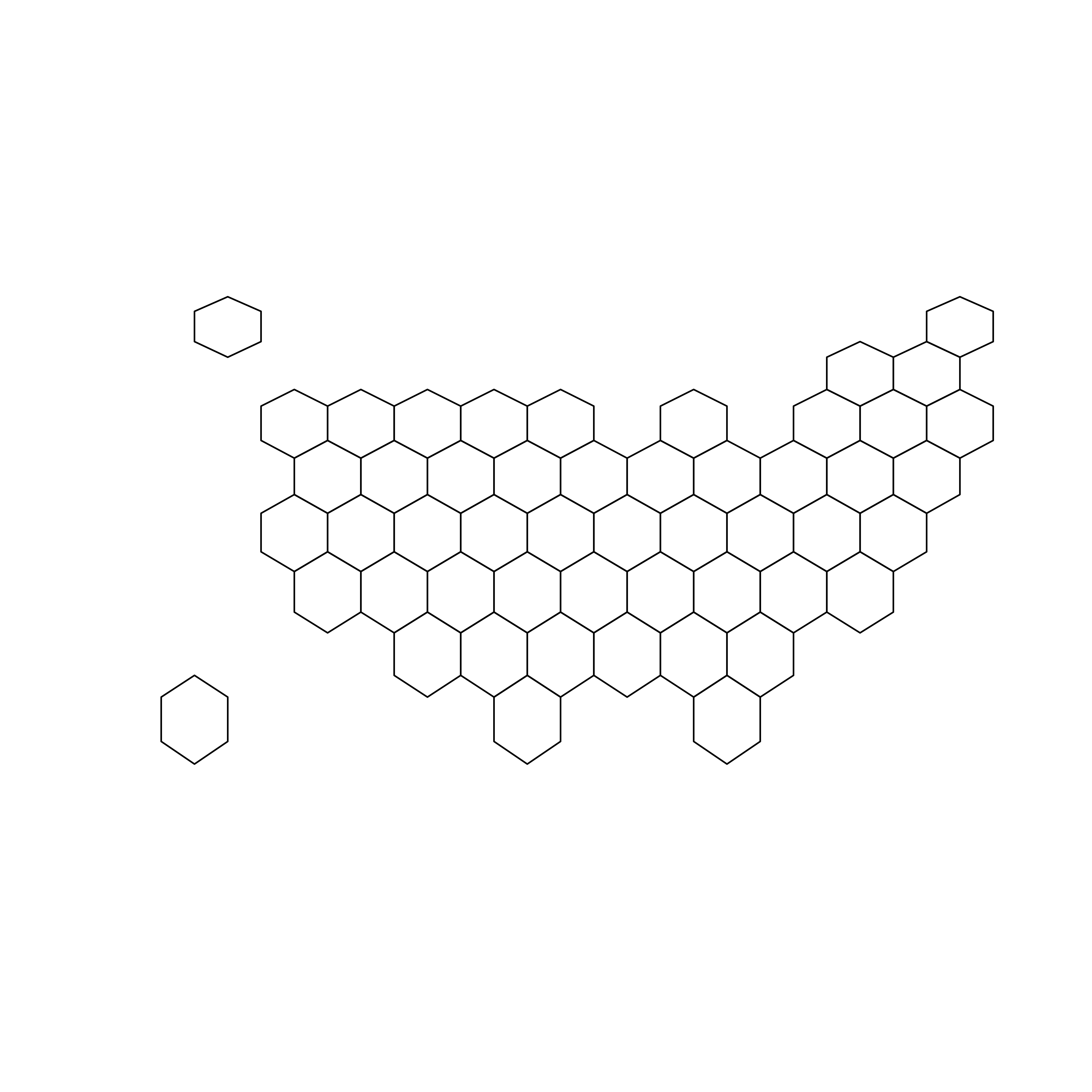
Basic hexbin map
The first step is to build a basic hexbin map of the US. Note that the gallery dedicates a whole section to this kind of map.
Hexagons boundaries are provided
here. You have to download it at the geojson format and
load it in R thanks to the
st_read() / read_sf() functions.
Then you get a geospatial object that you can plot using the
plot() function. This is widely explained in the
background map section of the gallery.
# library
library(tidyverse)
library(sf)
library(RColorBrewer)
# Hexagons boundaries at geojson format were found here, and stored on my github https://team.carto.com/u/andrew/tables/andrew.us_states_hexgrid/public/map.
# Load this file. (Note: I stored in a folder called DATA)
my_sf <- read_sf("DATA/us_states_hexgrid.geojson.json")
# Bit of reformatting
my_sf <- my_sf %>%
mutate(google_name = gsub(" \\(United States\\)", "", google_name))
# Show it
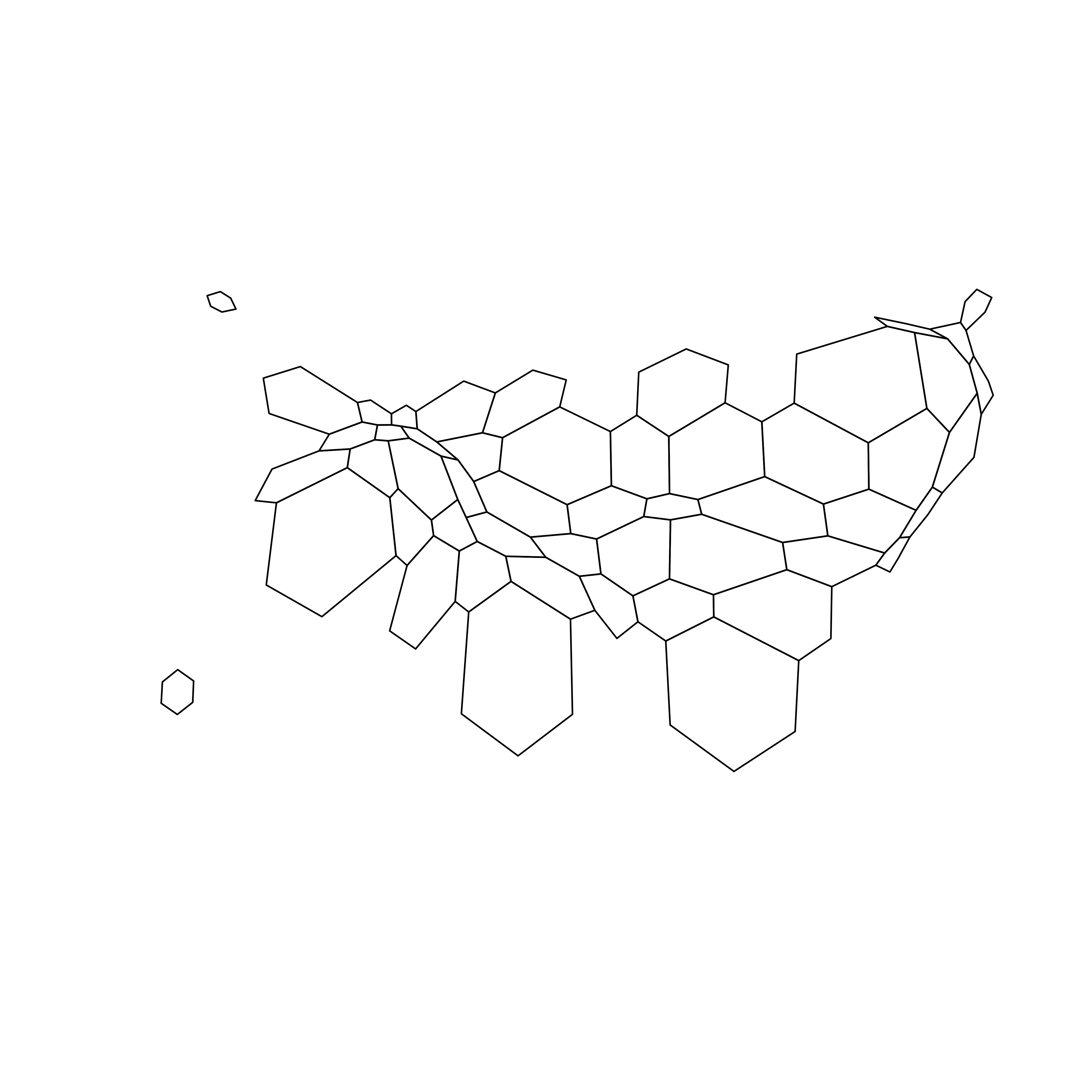
plot(st_geometry(my_sf))Distort hexagone size with cartogram
The geospatial object has an attached data frame that provides several information for each region.
We need to add a new column to this data frame. This column will
provide the population per state, available at
.csv format
here.
We can thus use the cartogram library to
distort the size of each state (=hexagon),
proportionally to this column. The new geospatial object we get
can be drawn with the same plot function.
# Library
library(cartogram)

# Load the population per states (source: https://www.census.gov/data/tables/2017/demo/popest/nation-total.html)
pop <- read.table("https://raw.githubusercontent.com/holtzy/R-graph-gallery/master/DATA/pop_US.csv", sep = ",", header = T)
pop$pop <- pop$pop / 1000000

# merge both
my_sf <- my_sf %>% left_join(., pop, by = c("google_name" = "state"))

# Compute the cartogram, using this population information
# First we need to change the projection, we use Mercator (AKA Google Maps, EPSG 3857)
my_sf_merc <- st_transform(my_sf, 3857)
cartogram <- cartogram_cont(my_sf_merc, "pop")

# Back to original projection
cartogram <- st_transform(cartogram, st_crs(my_sf))

# First look!
plot(st_geometry(cartogram))
Cartogram and choropleth
To get a satisfying result, let’s:
- color hexagons according to their population
- add legend
- add background color
- add title
-
add state name. Label position is computed thanks to the
gCentroid()function. The centroid can be understand as the center of a polygon, and by so a good proxy to place the label.
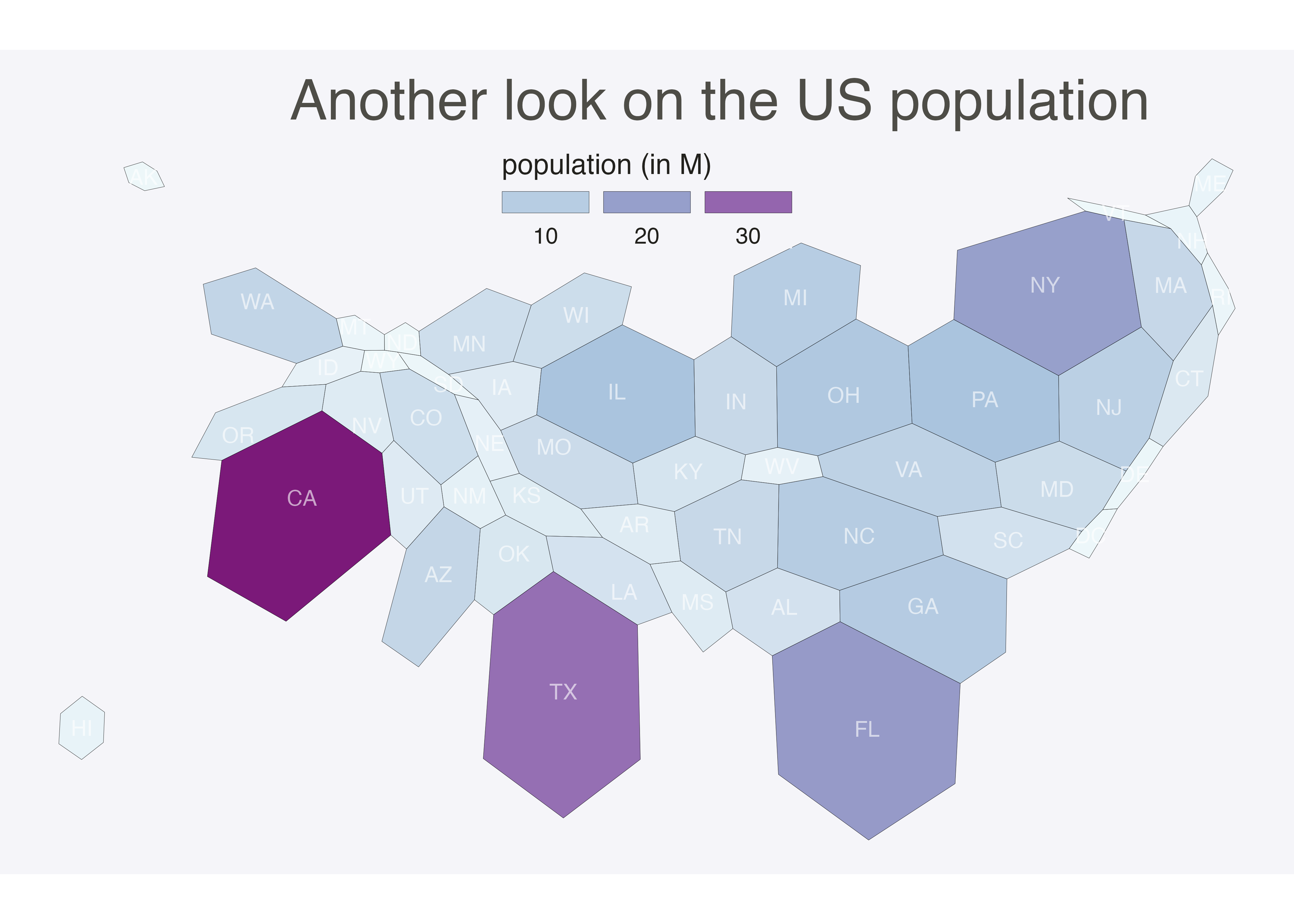
# Library
# plot
ggplot(cartogram) +
  geom_sf(aes(fill = pop), linewidth = 0.05, alpha = 0.9, color = "black") +
  scale_fill_gradientn(
    colours = brewer.pal(7, "BuPu"), name = "population (in M)",
    labels = scales::label_comma(),
    guide = guide_legend(
      keyheight = unit(3, units = "mm"),
      keywidth = unit(12, units = "mm"),
      title.position = "top",
      label.position = "bottom"
    )
  ) +
  geom_sf_text(aes(label = iso3166_2), color = "white", size = 3, alpha = 0.6) +
  theme_void() +
  ggtitle("Another look on the US population") +
  theme(
    legend.position = c(0.5, 0.9),
    legend.direction = "horizontal",
    text = element_text(color = "#22211d"),
    plot.background = element_rect(fill = "#f5f5f9", color = NA),
    panel.background = element_rect(fill = "#f5f5f9", color = NA),
    legend.background = element_rect(fill = "#f5f5f9", color = NA),
    plot.title = element_text(size = 22, hjust = 0.5, color = "#4e4d47", margin = margin(b = -0.1, t = 0.4, l = 2, unit = "cm")),
  )
Going further
This post explains how to use the cartogram method on a
hexbin map.
You might be interested in interested in 2d density hexbin map, and more generally in the hexbin map section of the gallery.