Using the
ggplot2 library
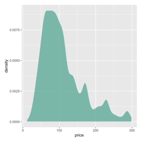
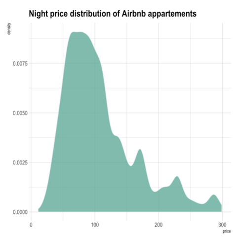
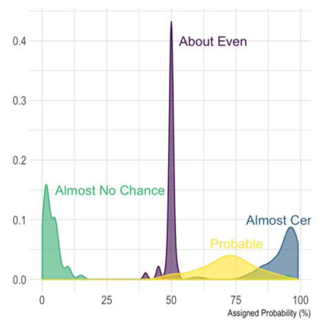
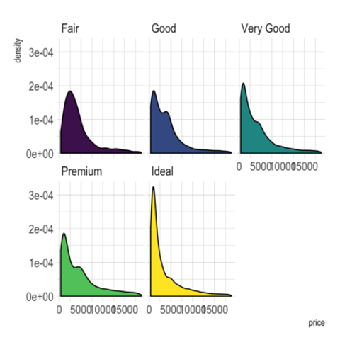
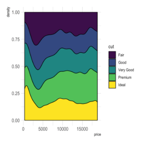
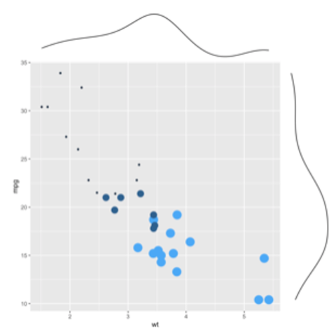
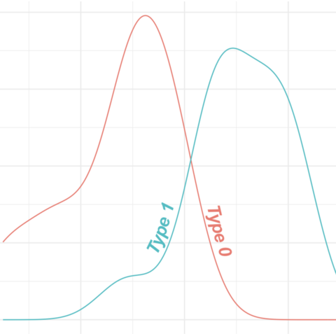
A
density plot
shows the distribution of a numeric variable. In
ggplot2, the geom_density() function takes
care of the kernel density estimation and plot the results. A
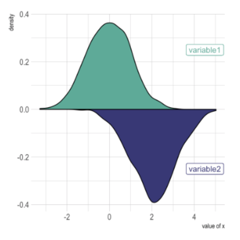
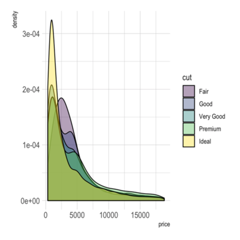
common task in dataviz is to compare the distribution of several
groups. The
graph #135 provides a few
guidelines on how to do so.