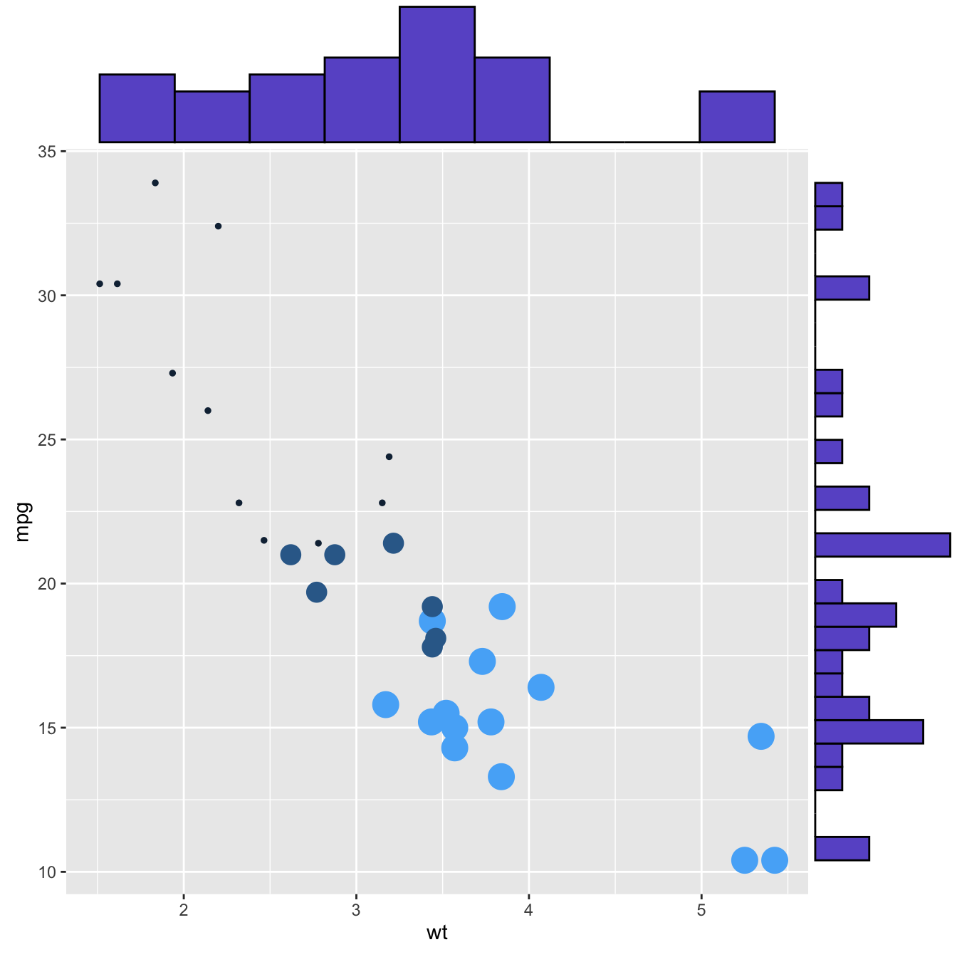
Basic use of ggMarginal()
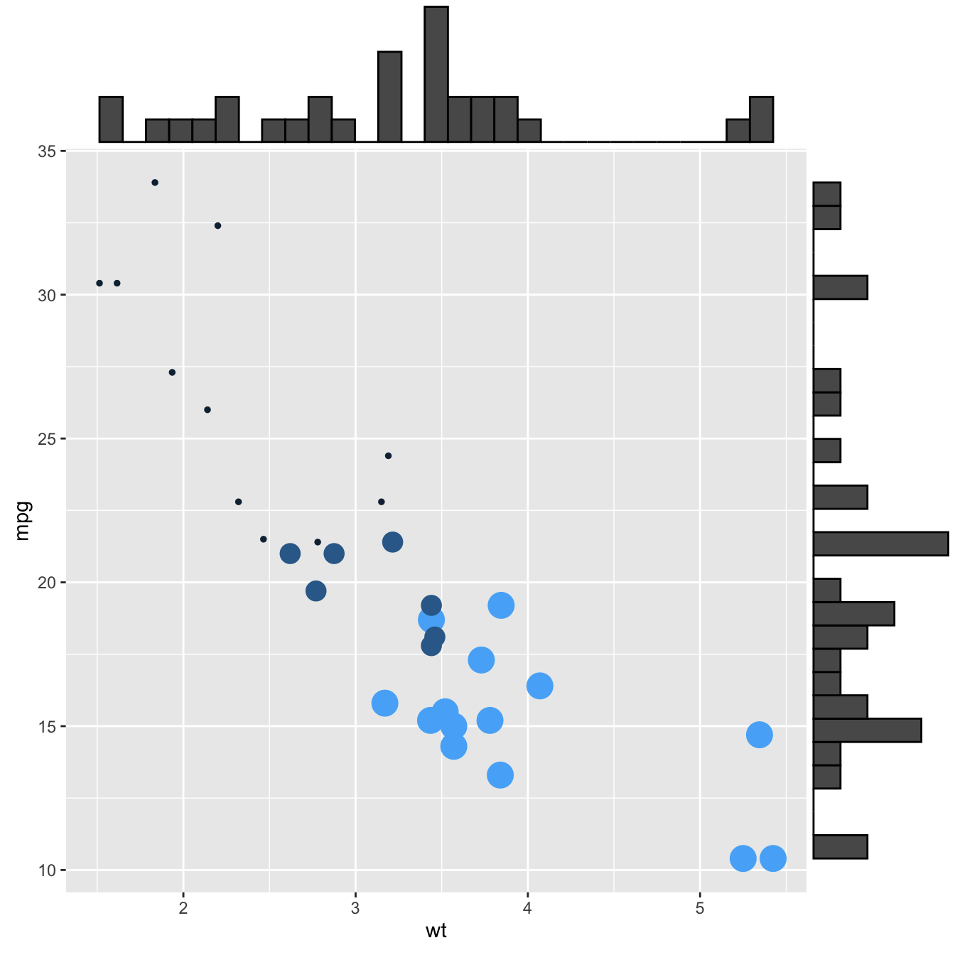
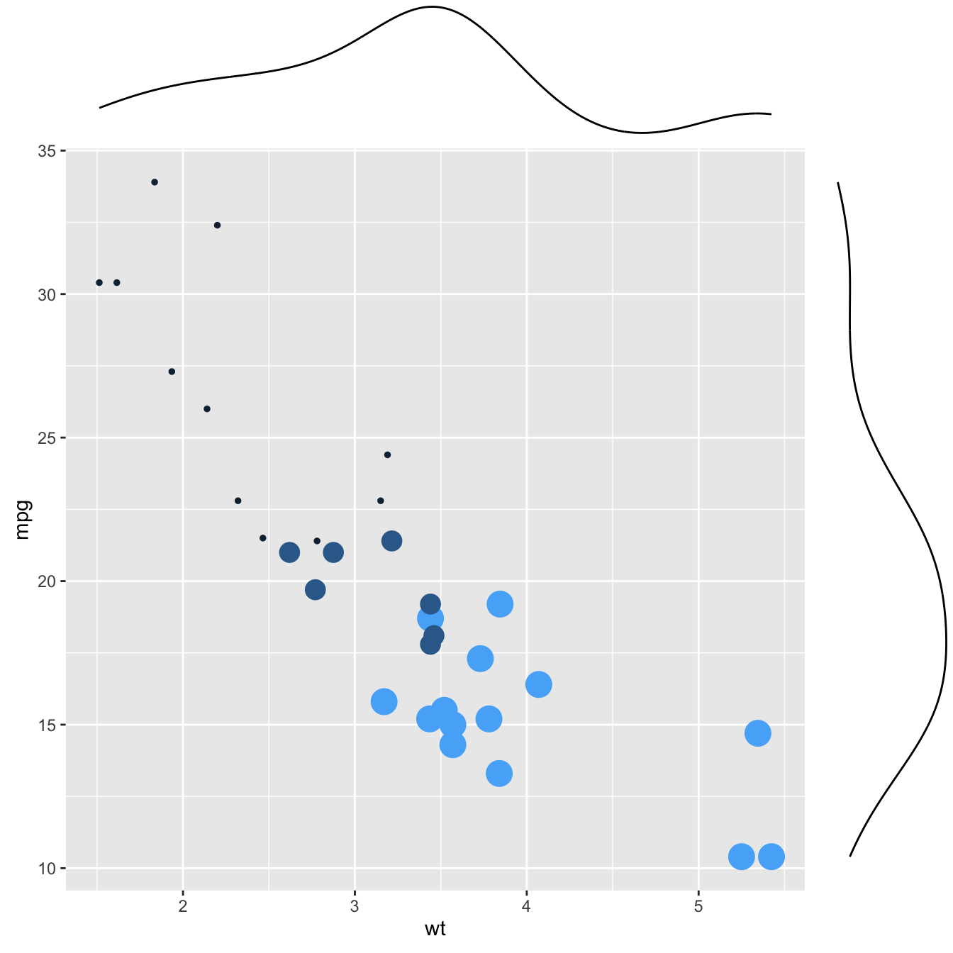
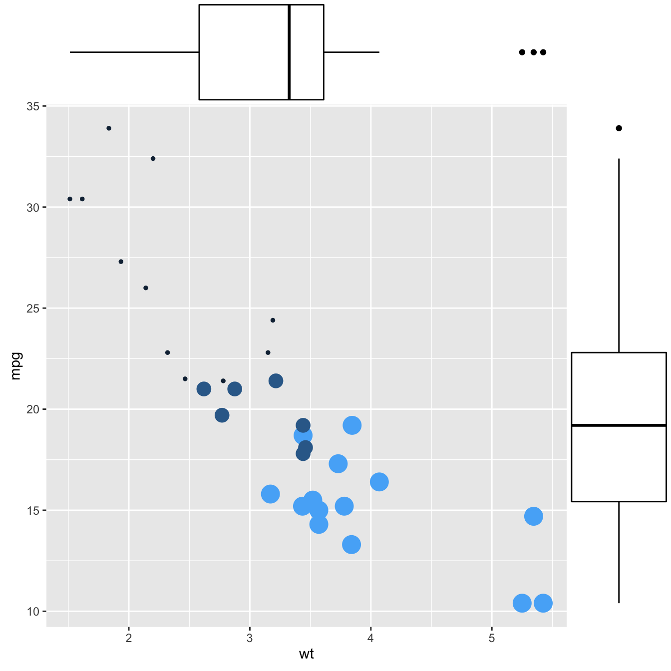
Here are 3 examples of marginal distribution added on X and Y axis of a
scatterplot. The ggExtra library makes it a breeze thanks
to the ggMarginal() function. Three main types of
distribution are available: histogram,
density and
boxplot.
# library
library(ggplot2)
library(ggExtra)

# The mtcars dataset is proposed in R
head(mtcars)

# classic plot :
p <- ggplot(mtcars, aes(x=wt, y=mpg, color=cyl, size=cyl)) +
      geom_point() +
      theme(legend.position="none")

# with marginal histogram
p1 <- ggMarginal(p, type="histogram")

# marginal density
p2 <- ggMarginal(p, type="density")

# marginal boxplot
p3 <- ggMarginal(p, type="boxplot")
More customization
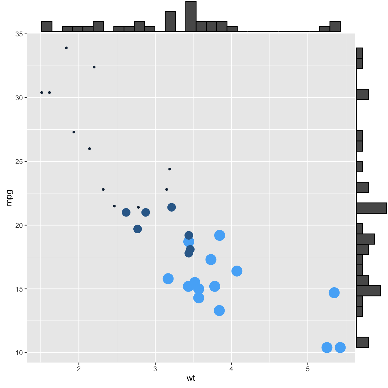
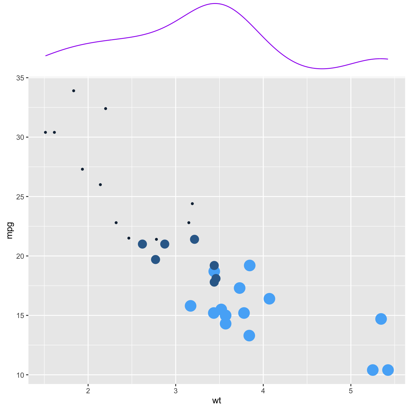
Three additional examples to show possible customization:
- change marginal plot size with
size - custom marginal plot appearance with all usual parameters
-
show only one marginal plot with
margins = 'x'ormargins = 'y'
# library
library(ggplot2)
library(ggExtra)

# The mtcars dataset is proposed in R
head(mtcars)

# classic plot :
p <- ggplot(mtcars, aes(x=wt, y=mpg, color=cyl, size=cyl)) +
      geom_point() +
      theme(legend.position="none")

# Set relative size of marginal plots (main plot 10x bigger than marginals)
p1 <- ggMarginal(p, type="histogram", size=10)

# Custom marginal plots:
p2 <- ggMarginal(p, type="histogram", fill = "slateblue", xparams = list(  bins=10))

# Show only marginal plot for x axis
p3 <- ggMarginal(p, margins = 'x', color="purple", size=4)