plotly


The plotly package in R is an advanced tool for creating interactive and high-quality visualizations. It enhances the visual appeal and user interaction of your graphics, making the data exploration process more insightful.

The plotly package supports a wide range of charts and plots and works seamlessly with ggplot2 graphics through the ggplotly() function, converting static ggplot2 plots into interactive Plotly graphics.
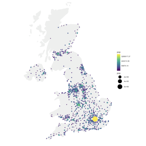
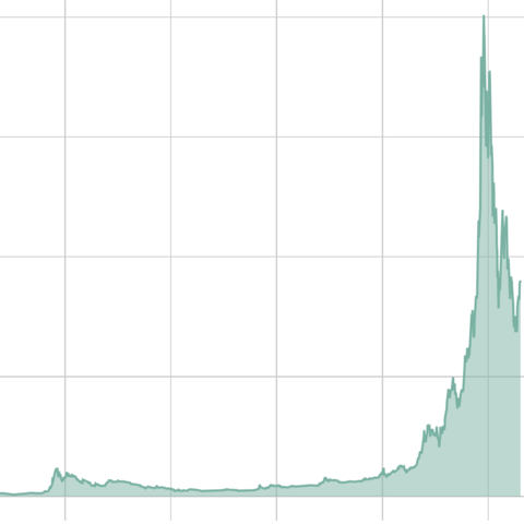
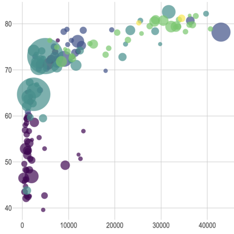
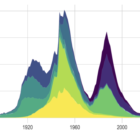
The R Graphics Gallery showcases many examples where plotly and ggplotly() are used to enhance ggplot2 charts.

This page offers tips on how to maximize the effectiveness of Plotly in R, including how to customize interactive elements and leverage the dynamic capabilities of ggplotly() to bring your data visualizations to life.
ggplotly() is all you need

The ggplotly() function takes a ggplot2 graphic as argument and returns an interactive version of it. This means you can make your graphics interactive with a single line of code!

Bear in mind, however, that the plotly package has other functionalities. Plotly has its own native syntax for creating interactive graphics from scratch that relies on the plot_ly() function. In practice, this is useful when you want access to a very precise level of customization and/or to create graphics not supported by ggplot2 (which is uncommon but not impossible).


Quick start

The most awesome feature of plotly is its ggplotly() function. If you know how to make a ggplot2 chart, you are 10 seconds away to rendering an interactive version. Just call the ggplotly() function, and you’re done. Visit the interactive graphic section of the gallery for more.

library(ggplot2)
    library(plotly)
    library(gapminder)

    p <- gapminder %>%
    filter(year==1977) %>%
    ggplot( aes(gdpPercap, lifeExp, size = pop, color=continent)) +
    geom_point() +
    theme_bw()

    ggplotly(p)

this chart is interactive: hover, drag, zoom, export and more.


Examples

Interactivity has a major role in data visualization. It allows to focus on specific parts of the chart, to zoom in and out and to explore your data.

In the gallery, you can find many examples illustrating the ggplotly() function of the plotly library. Here they are:


Tooltip

You can customize the tooltip of your ggplotly() chart. This is done by using the tooltip argument of the ggplotly() function. Here is an example using the gapminder dataset:

See Code


Native plotly


Plotly has its own native syntax for creating interactive graphics from scratch that relies on the plot_ly() function. It creates really nice charts too in just a few lines!

This chart on the right was built with litteraly a single line of code with plot_ly().

Read post


Related chart types


Ggplot2
Animation
Interactivity
3D
Caveats
Data art