Packages
For this post, we need to install and load the ggbeeswarm package.
We can install it from CRAN using
install.packages("ggbeeswarm"). Then, we can load it:
Dataset
Since beeswarm plots are made to
visualize individual data points, we need a dataset
that contains numerical values. Here, we’ll use the iris
dataset, which is a built-in dataset in R.
We can easily load it:
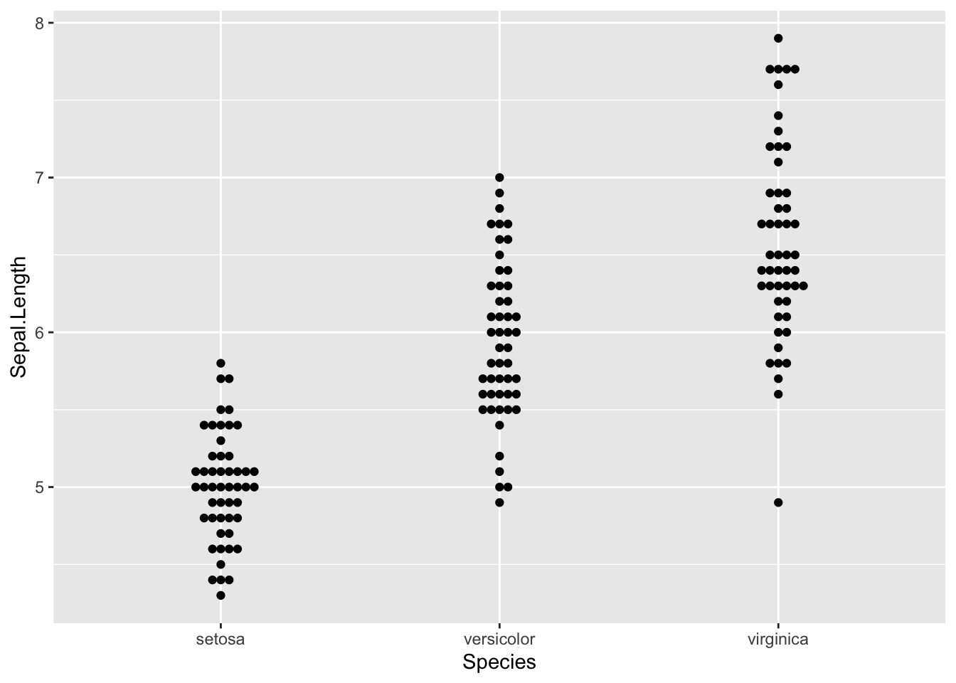
Grouped beeswarm
We can easily create a grouped beeswarm plot by
specifying a categorical variable in the aes()
function.
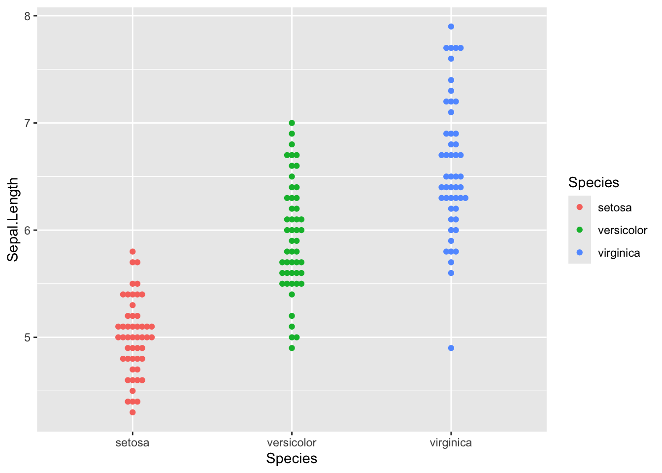
Color by group
And in order to make the plot more readable, we can
add some color to the points using the
colour argument.
Customize colors
We can also customize the colors using the
scale_color_manual() function. And thanks to the
theme_minimal() function, we can make the plot a bit
more elegant.
ggplot(iris,aes(x=Species, y=Sepal.Length, colour=Species)) +
geom_beeswarm() +
scale_color_manual(values=c("#999999", "#E69F00", "#56B4E9")) +
theme_minimal()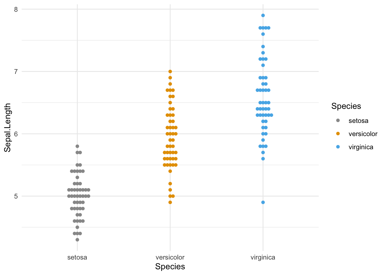
Going further
This post explains how to create a grouped beeswarm plot with R and the ggbeeswarm package.
You might also be interested in how to customize a beeswarm plot.
Related chart types