If I had to pick only 6 packages to create my next graph, it would probably be those (but life would be a nightmare 🙃)
Ggplot2 is more than famous now. Using the gramar of graphics is a paradigm change that will make your life 100 times easier.
I always analyse my data in a clean report thanks to Rmarkdown, which allows to include interactive charts with plotly. I almost always use hrbrthemes to improve the chart appearance in 1 line of code, and display charts together with patchwork.
This section is currently work in progress. Please signup to know when some more content is published!
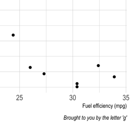
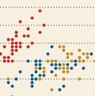
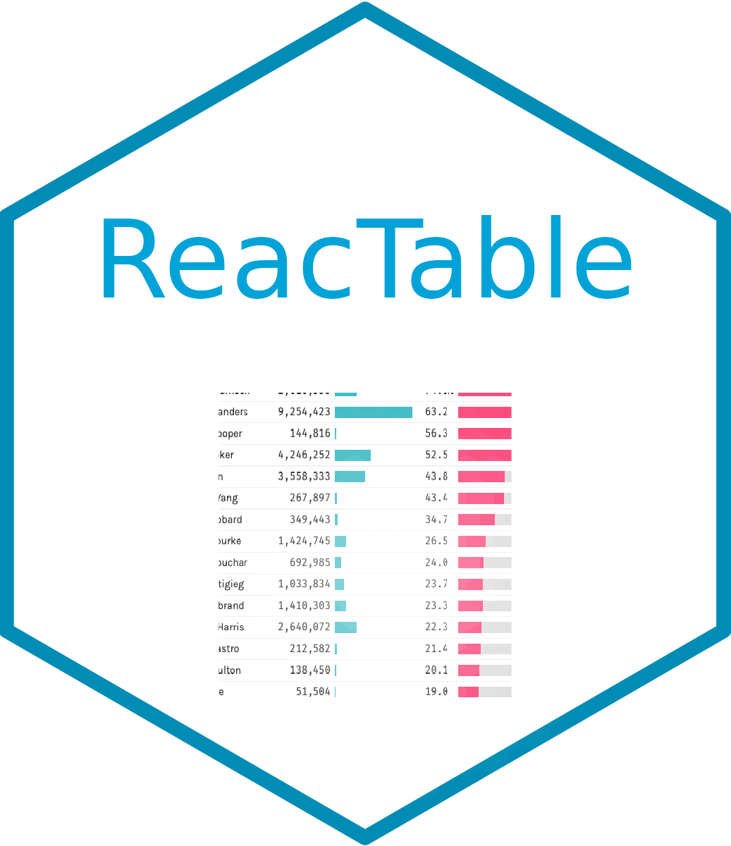
ggplot2 is very powerful on its own. But it gets even better thanks to its extensions
Here is a curated a collection of the best ggplot2 extensions that
enhance and elevate the core capabilities of ggplot2.
These extensions, seamlessly integrated with the foundational ggplot2 framework, unlock new visualization techniques, streamline intricate plotting tasks, and offer innovative ways to represent complex data.
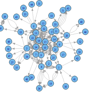
Network diagram? Chord diagram? Hierarchical edge bundling? All those chart types are based on the same kind of data structure.
Fortunately, some packages are specialized for this kind of situation, making it a breeze to build those kind of charts:
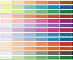
Who never spent hours tweaking colors on a chart, without achieving perfection? 🙃
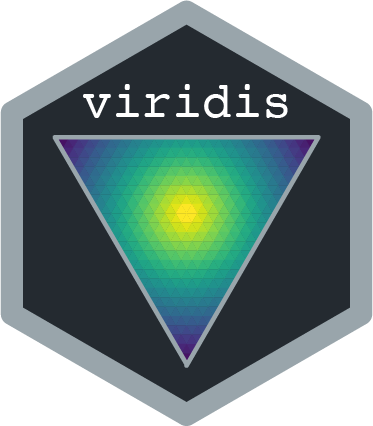
Picking up colors randomly has a very low probability to bring you anywhere. The following packages are listing thousands of predefined continuous and categorical palettes, ready for your next projects.
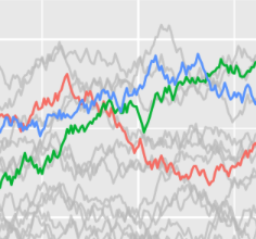
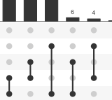
R is natively powerful when it comes to data visualization. ggplot2 allows to build even more chart types.
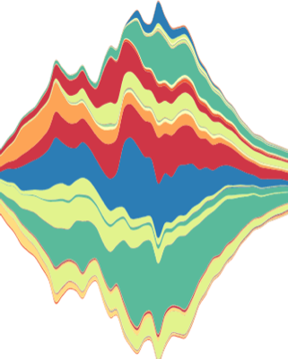
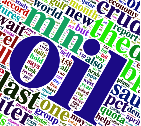
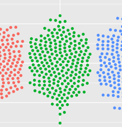
But some lesser-known chart types remain on the list. Fortunately, R also benefits a very large ecosystem of packages allowing to build litteraly any kind of graphic: