Adding text with geom_text() or geom_label()
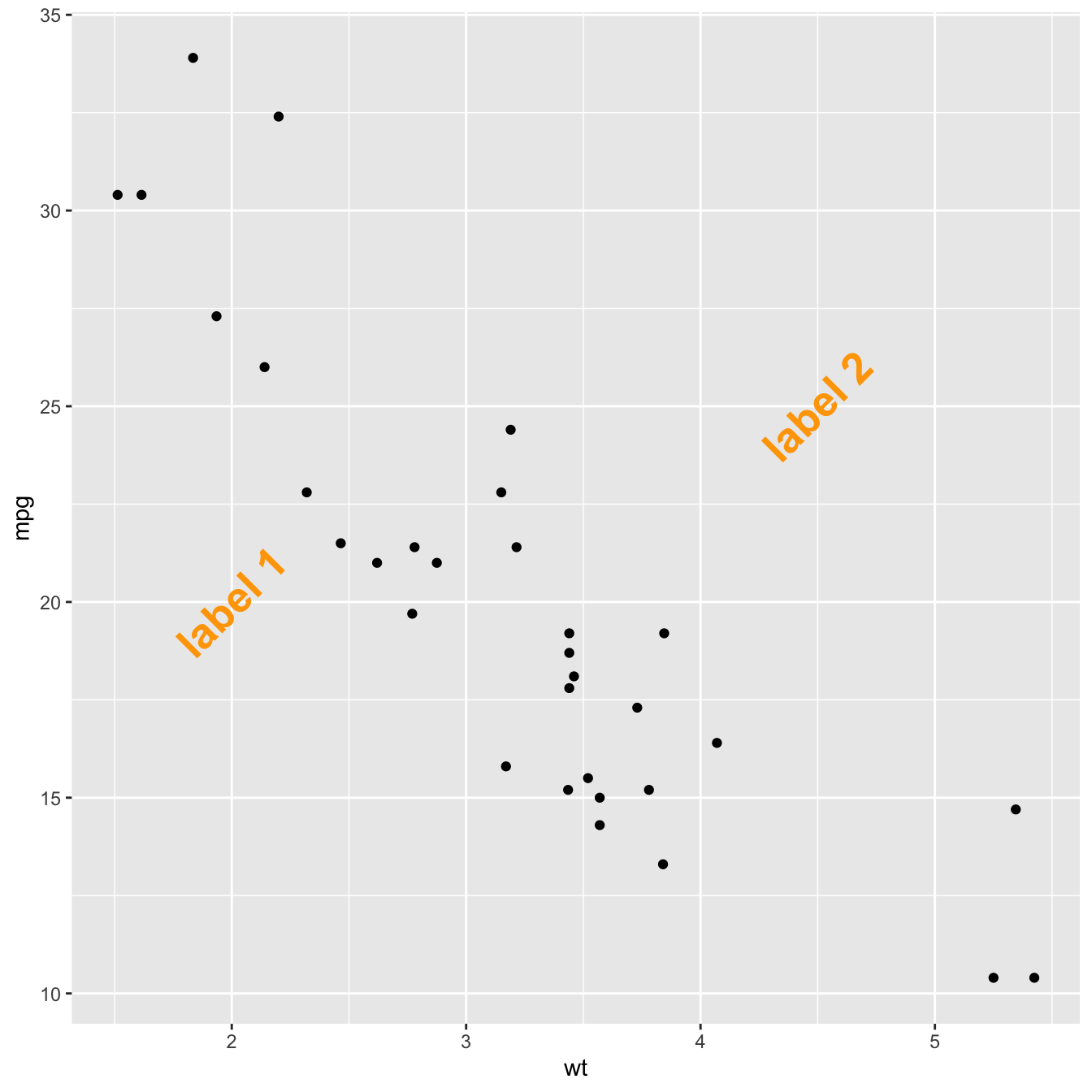
Text is the most common kind of annotation. It allows to give more information on the most important part of the chart.
Using ggplot2, 2 main functions are available for that kind
of annotation:
geom_textto add a simple piece of textgeom_labelto add a label: framed text
Note that the annotate() function is a good alternative
that can reduces the code length for simple cases.
# library
library(ggplot2)
# basic graph
p <- ggplot(mtcars, aes(x = wt, y = mpg)) +
geom_point()
# a data frame with all the annotation info
annotation <- data.frame(
x = c(2,4.5),
y = c(20,25),
label = c("label 1", "label 2")
)
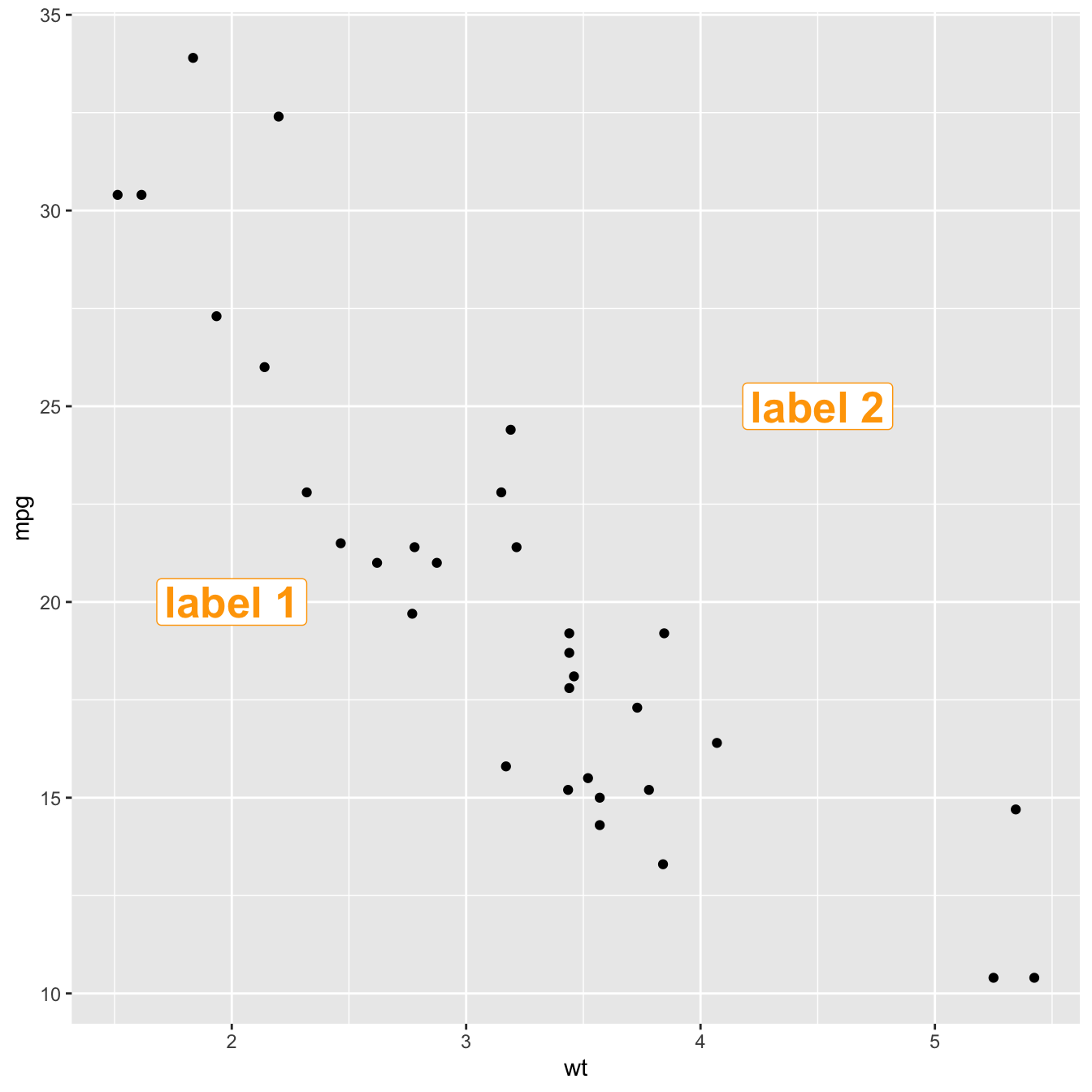
# Add text
p + geom_text(data=annotation, aes( x=x, y=y, label=label), ,
color="orange",
size=7 , angle=45, fontface="bold" )
# Note: possible to shorten with annotate:
# p +
# annotate("text", x = c(2,4.5), y = c(20,25),
# label = c("label 1", "label 2") , color="orange",
# size=7 , angle=45, fontface="bold")# Right chart: using labels
p + geom_label(data=annotation, aes( x=x, y=y, label=label), ,
color="orange",
size=7 , angle=45, fontface="bold" )
Add shapes with annotate()
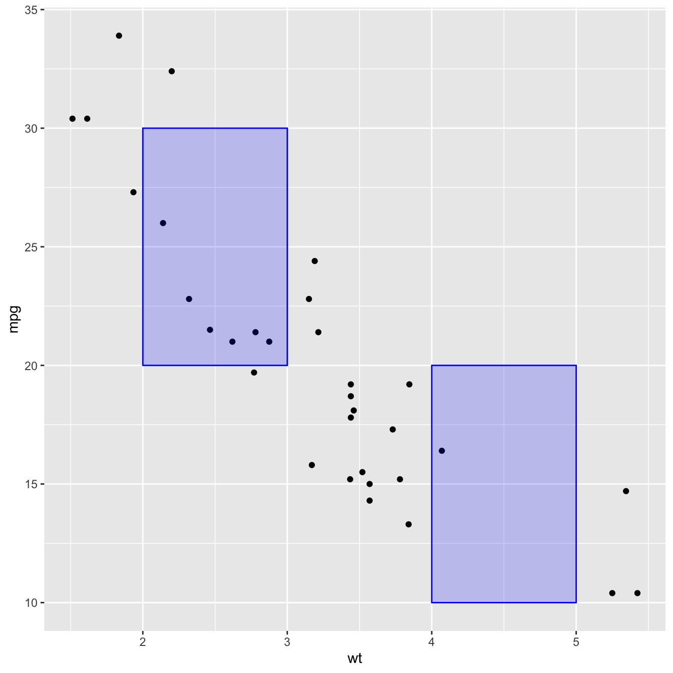
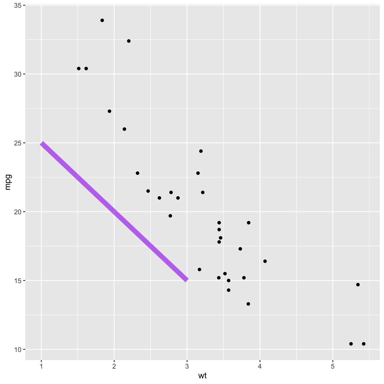
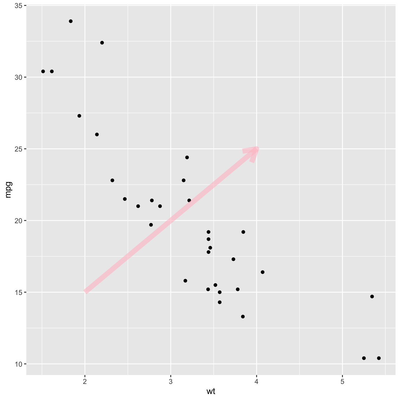
The annotate() function allows to add all kind of shape on
a ggplot2 chart. The first argument will control what kind
is used: rect or segment for rectangle,
segment or arrow.
# Add rectangles
p + annotate("rect", xmin=c(2,4), xmax=c(3,5), ymin=c(20,10) , ymax=c(30,20), alpha=0.2, color="blue", fill="blue")
# Add segments
p + annotate("segment", x = 1, xend = 3, y = 25, yend = 15, colour = "purple", size=3, alpha=0.6)# Add arrow
p + annotate("segment", x = 2, xend = 4, y = 15, yend = 25, colour = "pink", size=3, alpha=0.6, arrow=arrow())
Add ablines with geom_hline() and geom_vline()
An abline is a segment that goes from one chart extremity to the
other. ggplot2 offers the geom_hline() and
geom_vline() functions that are dedicated to it.
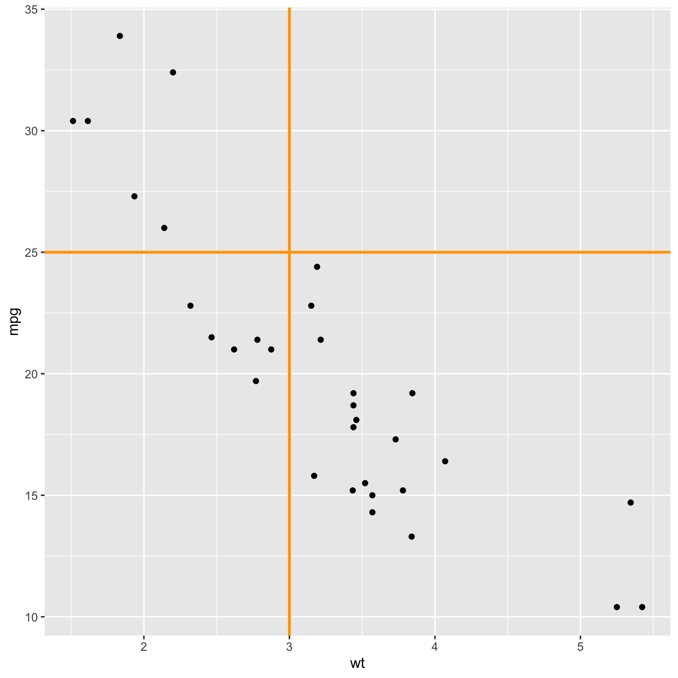
p +
  # horizontal
  geom_hline(yintercept=25, color="orange", size=1) +
  # vertical
  geom_vline(xintercept=3, color="orange", size=1)
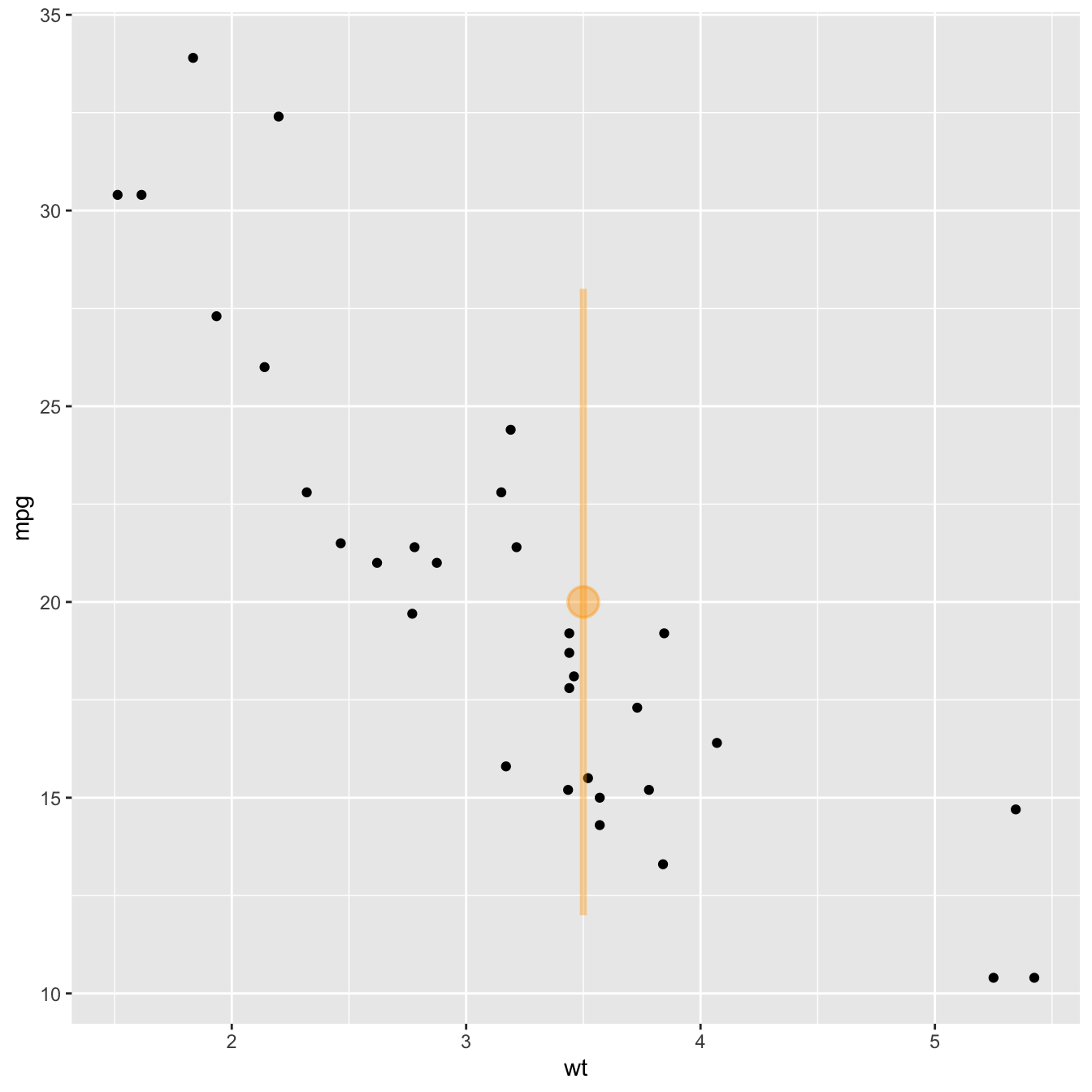
Add a point and a range with.. pointrange()
Last kind of annotation, add a dot and a segment directly with
pointrange().