Donut chart and pie chart are built using similar process in R. Thus, you probably want to visit the pie section for more examples.
Pie chart sectionggplot2 package
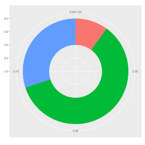
There is no specific geom to build donut charts with
ggplot2. The trick is to build a
stacked barplot and use coord_polar() to make it
circular. The following examples will guide you through this process.
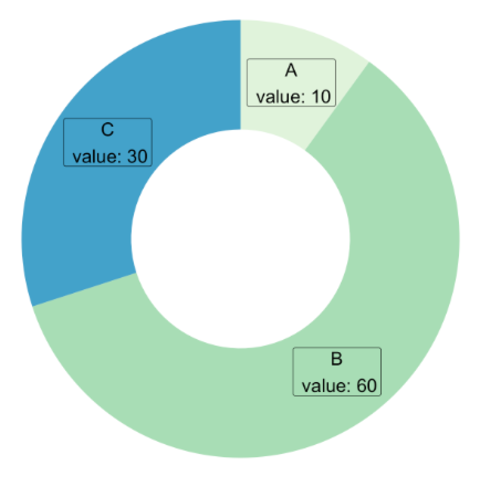
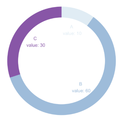
It is also possible to build your donut chart without using any library. The example shows how, providing a reusable function that you can quickly apply to your input dataset.
Piecharts are highly criticized in dataviz. Use it with care, or even better, use alternatives like barcharts, lollipop plots, treemap and others.
What's wrong with it? Barchart Lollipop