Basic dendrogram
First of all, let’s remind how to build a basic
dendrogram with R:
- input dataset is a dataframe with individuals in row, and features in column
-
dist()is used to compute distance between sample hclust()performs the hierarchical clustering-
the
plot()function can plot the output directly as a tree
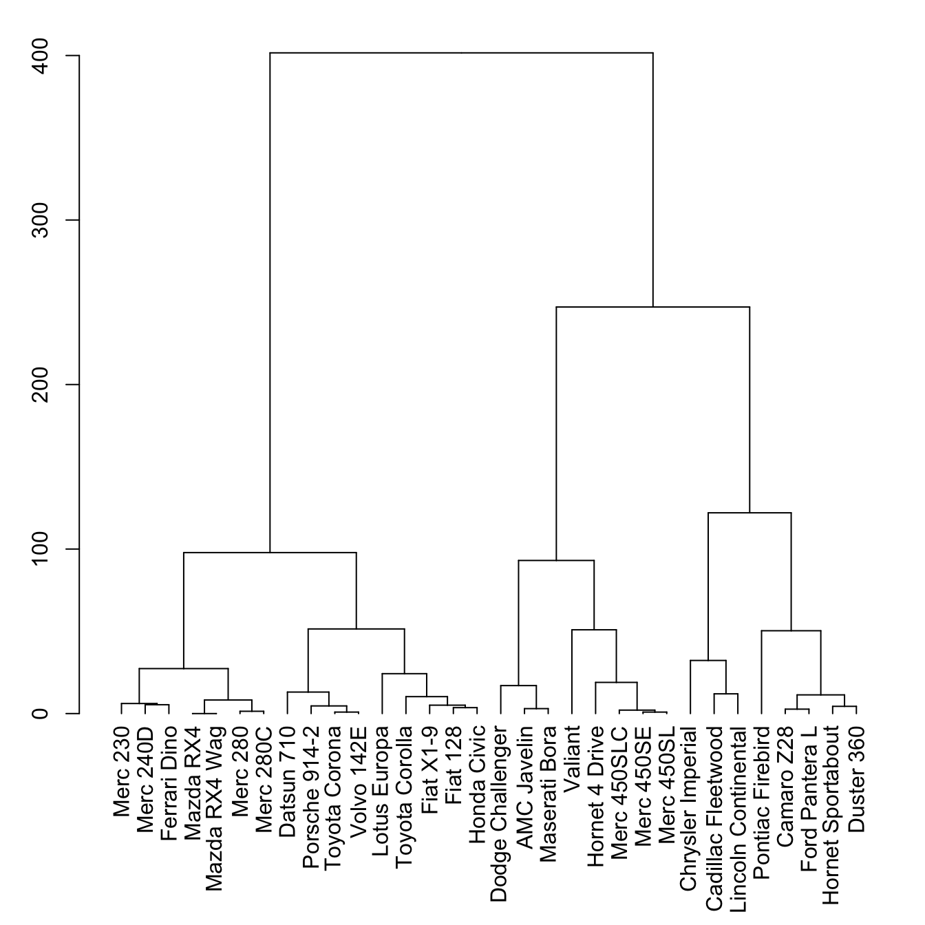
# Library
library(tidyverse)

# Data
head(mtcars)

# Clusterisation using 3 variables
mtcars %>%
  select(mpg, cyl, disp) %>%
  dist() %>%
  hclust() %>%
  as.dendrogram() -> dend

# Plot
par(mar=c(7,3,1,1))  # Increase bottom margin to have the complete label
plot(dend)
The set() function
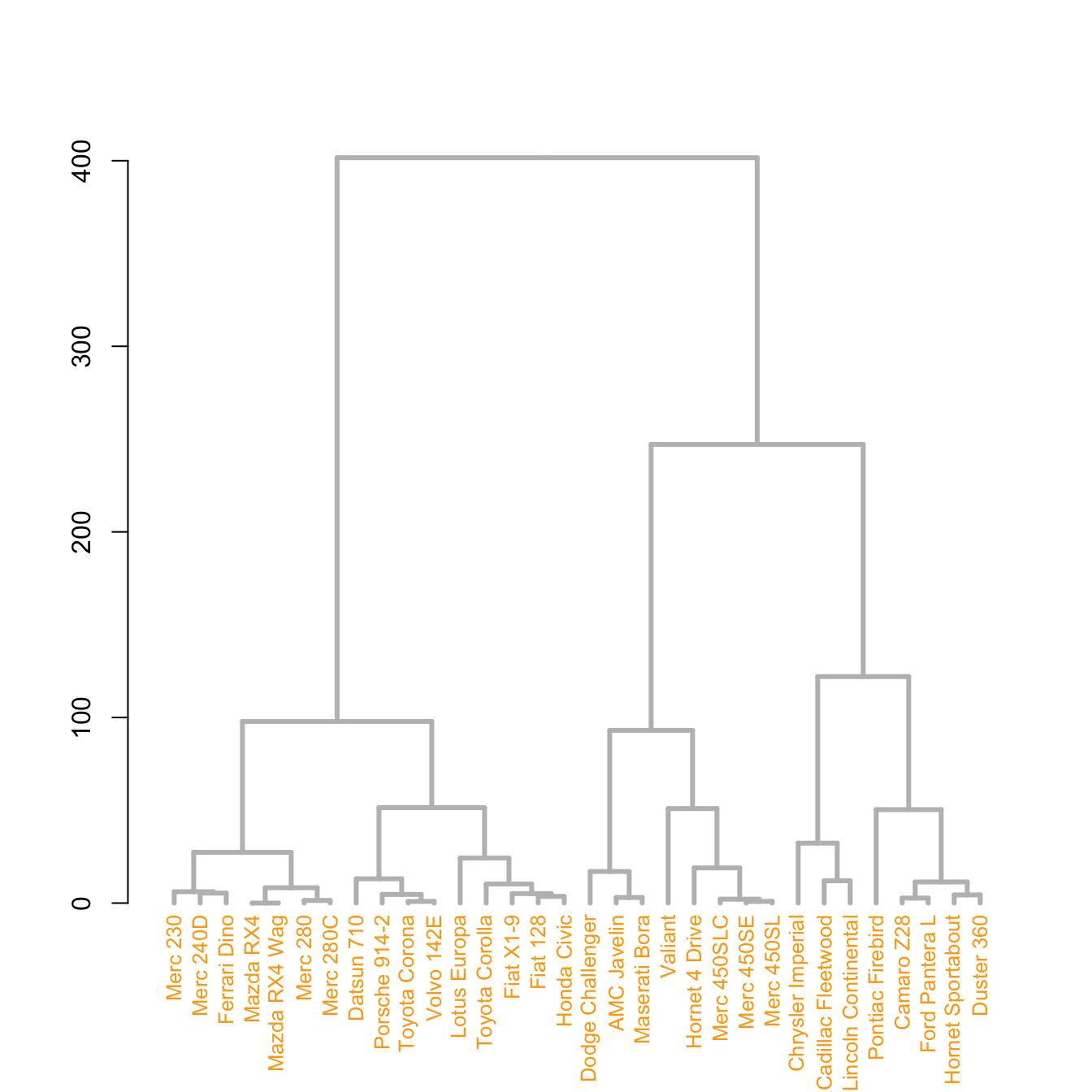
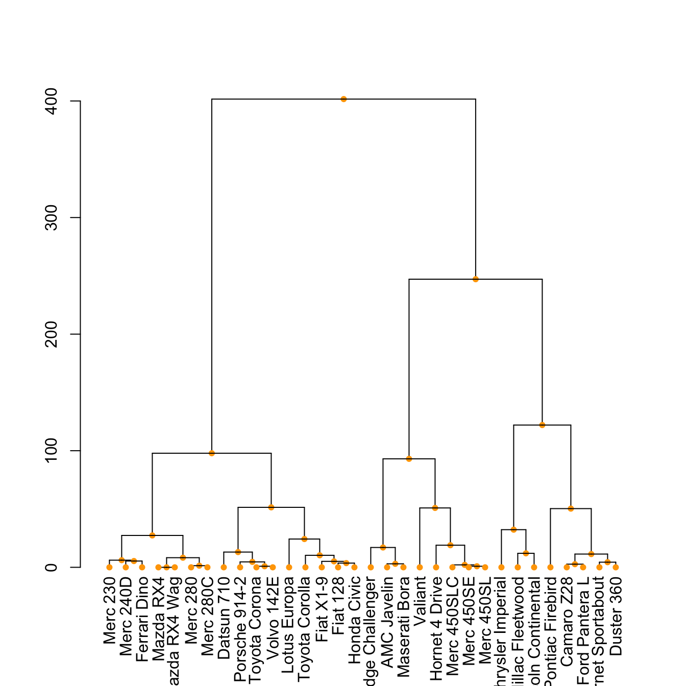
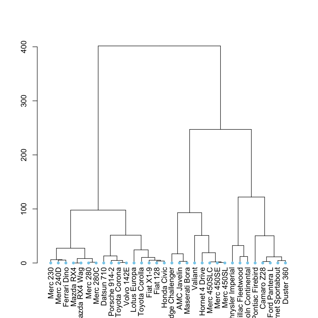
The set() function of dendextend allows to
modify the attribute of a specific part of the tree.
You can customize the cex, lwd,
col, lty for branches and
labels for example. You can also custom the nodes or the
leaf. The code below illustrates this concept:
# library
library(dendextend)

# Chart (left)
dend %>%
  # Custom branches
  set("branches_col", "grey") %>% set("branches_lwd", 3) %>%
  # Custom labels
  set("labels_col", "orange") %>% set("labels_cex", 0.8) %>%
  plot()
# Middle
dend %>%
set("nodes_pch", 19) %>%
set("nodes_cex", 0.7) %>%
set("nodes_col", "orange") %>%
plot()# right
dend %>%
set("leaves_pch", 19) %>%
set("leaves_cex", 0.7) %>%
set("leaves_col", "skyblue") %>%
plot()Highlight clusters

The dendextend library has some good functionalities to
highlight the tree clusters.
You can color branches and label following their cluster attribution,
specifying the number of cluster you want. The
rect.dendrogram() function even allows to highlight one or
several specific clusters with a rectangle.
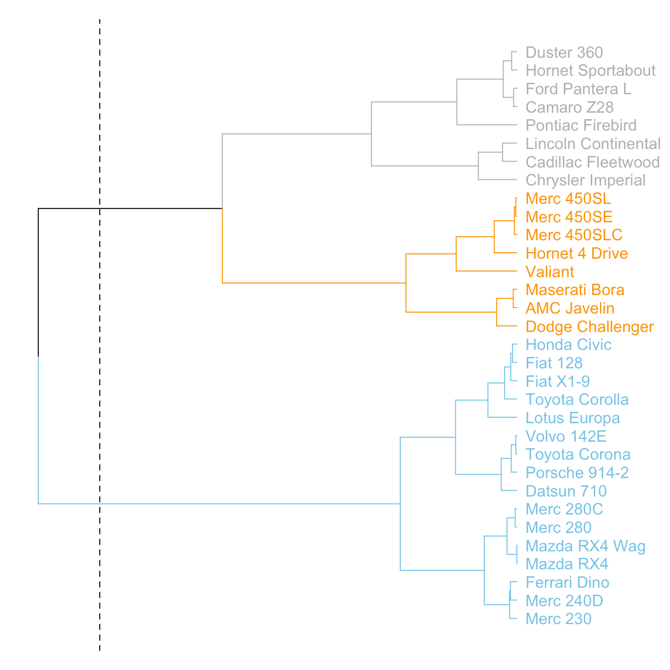
# Color in function of the cluster
par(mar=c(1,1,1,7))
dend %>%
  set("labels_col", value = c("skyblue", "orange", "grey"), k=3) %>%
  set("branches_k_color", value = c("skyblue", "orange", "grey"), k = 3) %>%
  plot(horiz=TRUE, axes=FALSE)
abline(v = 350, lty = 2)
# Highlight a cluster with rectangle
par(mar=c(9,1,1,1))
dend %>%
set("labels_col", value = c("skyblue", "orange", "grey"), k=3) %>%
set("branches_k_color", value = c("skyblue", "orange", "grey"), k = 3) %>%
plot(axes=FALSE)
rect.dendrogram( dend, k=3, lty = 5, lwd = 0, x=1, col=rgb(0.1, 0.2, 0.4, 0.1) ) Comparing with an expected clustering
It is a common task to compare the cluster you get with an expected distribution.
In the mtcars dataset we used to build our dendrogram,
there is an am column that is a binary variable. We can
check if this variable is consistent with the cluster we got using
the colored_bars() function.
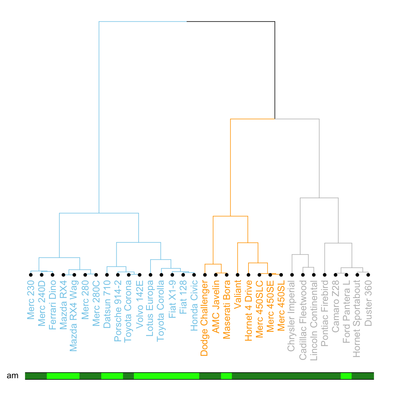
# Create a vector of colors, darkgreen if am is 0, green if 1.
my_colors <- ifelse(mtcars$am==0, "forestgreen", "green")

# Make the dendrogram
par(mar=c(10,1,1,1))
dend %>%
  set("labels_col", value = c("skyblue", "orange", "grey"), k=3) %>%
  set("branches_k_color", value = c("skyblue", "orange", "grey"), k = 3) %>%
  set("leaves_pch", 19)  %>%
  set("nodes_cex", 0.7) %>%
  plot(axes=FALSE)

# Add the colored bar
colored_bars(colors = my_colors, dend = dend, rowLabels = "am")
Comparing 2 dendrograms with tanglegram()
It is possible to compare 2 dendrograms using the
tanglegram() function.
Here it illustrates a very important concept: when you calculate your distance matrix and when you run your hierarchical clustering algorithm, you cannot simply use the default options without thinking about what you’re doing. Have a look to the differences between 2 different methods of clusterisation.
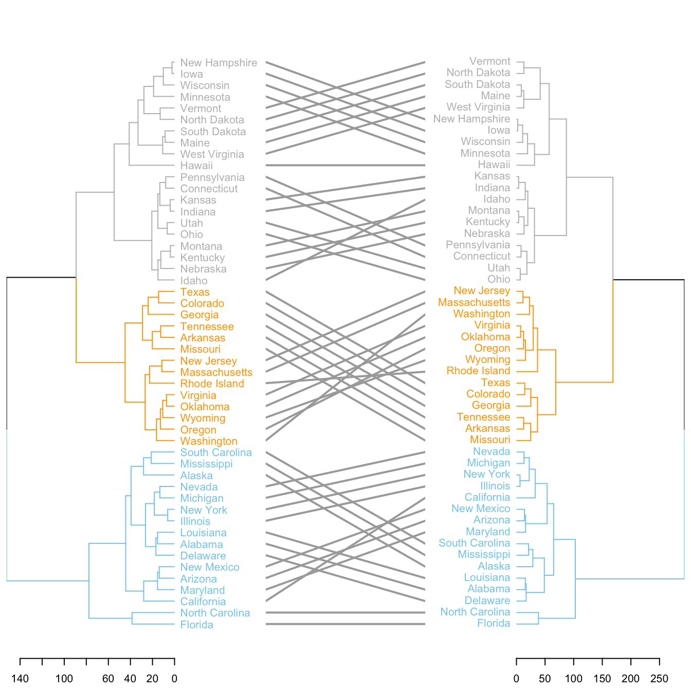
# Make 2 dendrograms, using 2 different clustering methods
d1 <- USArrests %>% dist() %>% hclust( method="average" ) %>% as.dendrogram()
d2 <- USArrests %>% dist() %>% hclust( method="complete" ) %>% as.dendrogram()

# Custom these kendo, and place them in a list
dl <- dendlist(
  d1 %>%
    set("labels_col", value = c("skyblue", "orange", "grey"), k=3) %>%
    set("branches_lty", 1) %>%
    set("branches_k_color", value = c("skyblue", "orange", "grey"), k = 3),
  d2 %>%
    set("labels_col", value = c("skyblue", "orange", "grey"), k=3) %>%
    set("branches_lty", 1) %>%
    set("branches_k_color", value = c("skyblue", "orange", "grey"), k = 3)
)

# Plot them together
tanglegram(dl,
           common_subtrees_color_lines = FALSE, highlight_distinct_edges  = TRUE, highlight_branches_lwd=FALSE,
           margin_inner=7,
           lwd=2
)