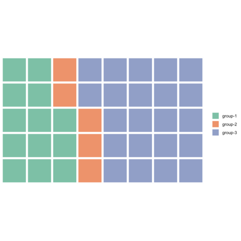
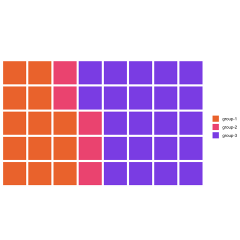
Waffle Chart


A Waffle Chart visually represents categorical data through a grid of small squares, resembling a waffle. Each category is assigned a unique color, and the number of squares allocated to each category corresponds to its proportional share of the total data count.
In this section, numerous examples utilizing R and the waffle package are presented, showcasing the two distinct syntaxes provided by the library.

Introduction

There are several packages available for creating waffle charts in R, with one of the most popular being the waffle package developed by hrbrmstr.

This package offers two distinct APIs (application programming interfaces). The first resembles base R syntax, utilizing the waffle() function. The second aligns with the tidyverse philosophy and can be seamlessly integrated into a ggplot2 call.

This page offers examples utilizing both APIs, starting from basic implementations and progressively exploring more advanced customization options.

Step by step - the waffle package

The waffle package and its waffle() function is probably the easiest way to build waffle charts in R. The examples below will teach you how to build a simple waffle chart in just a few lines of code.
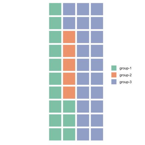
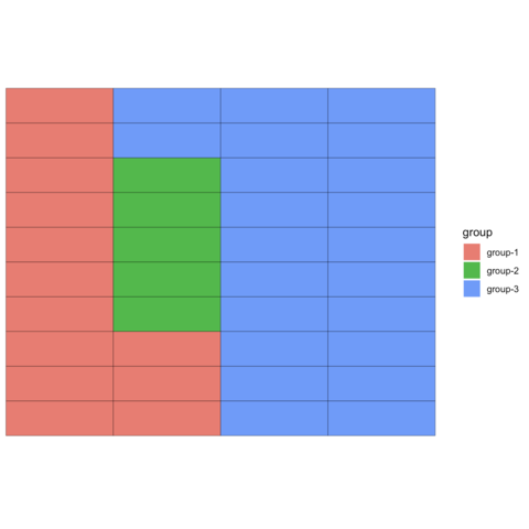


Waffle and ggplot2

Still with the waffle package, we can this time use ggplot2 to build waffle charts. This allows to benefit from the ggplot2 customization capabilities.


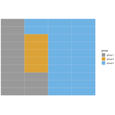
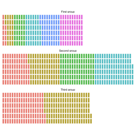
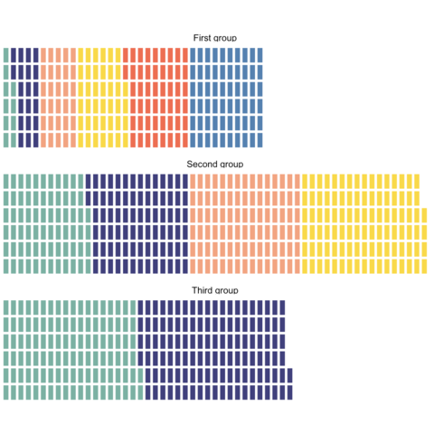
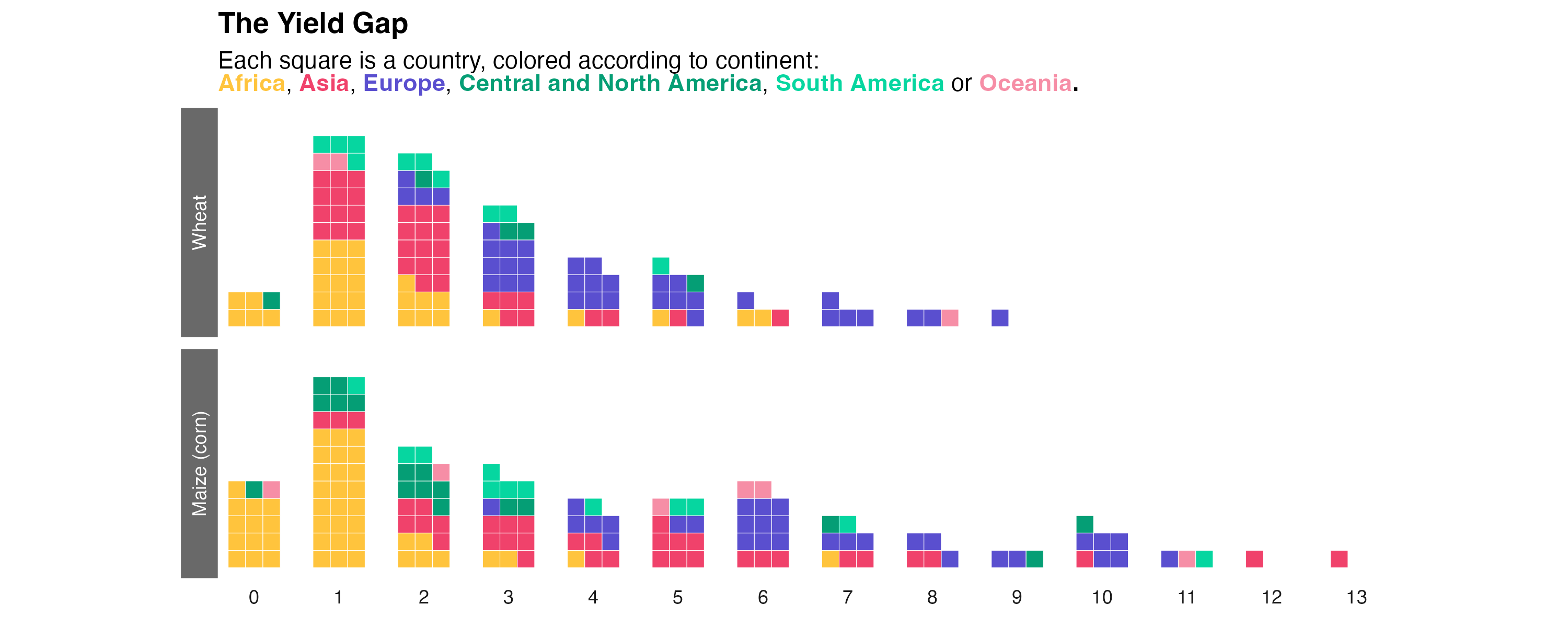
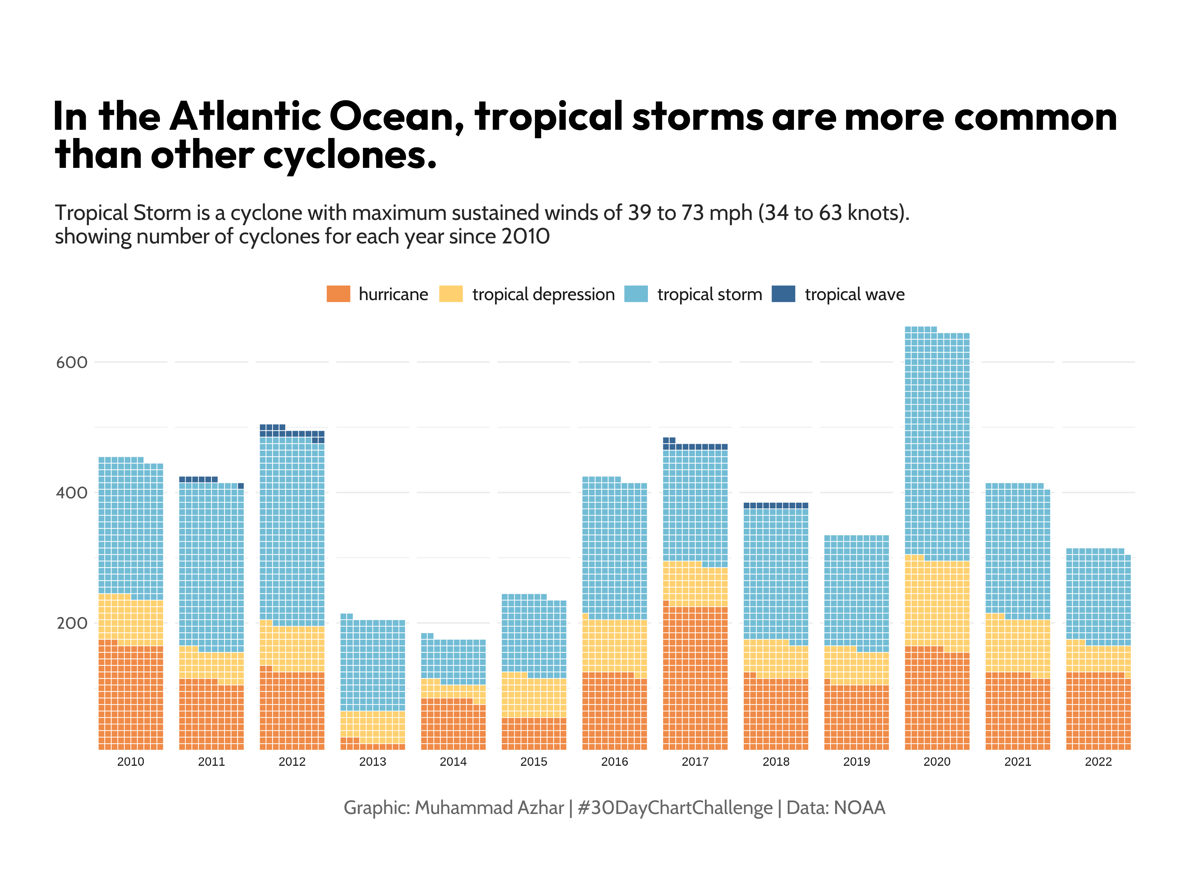
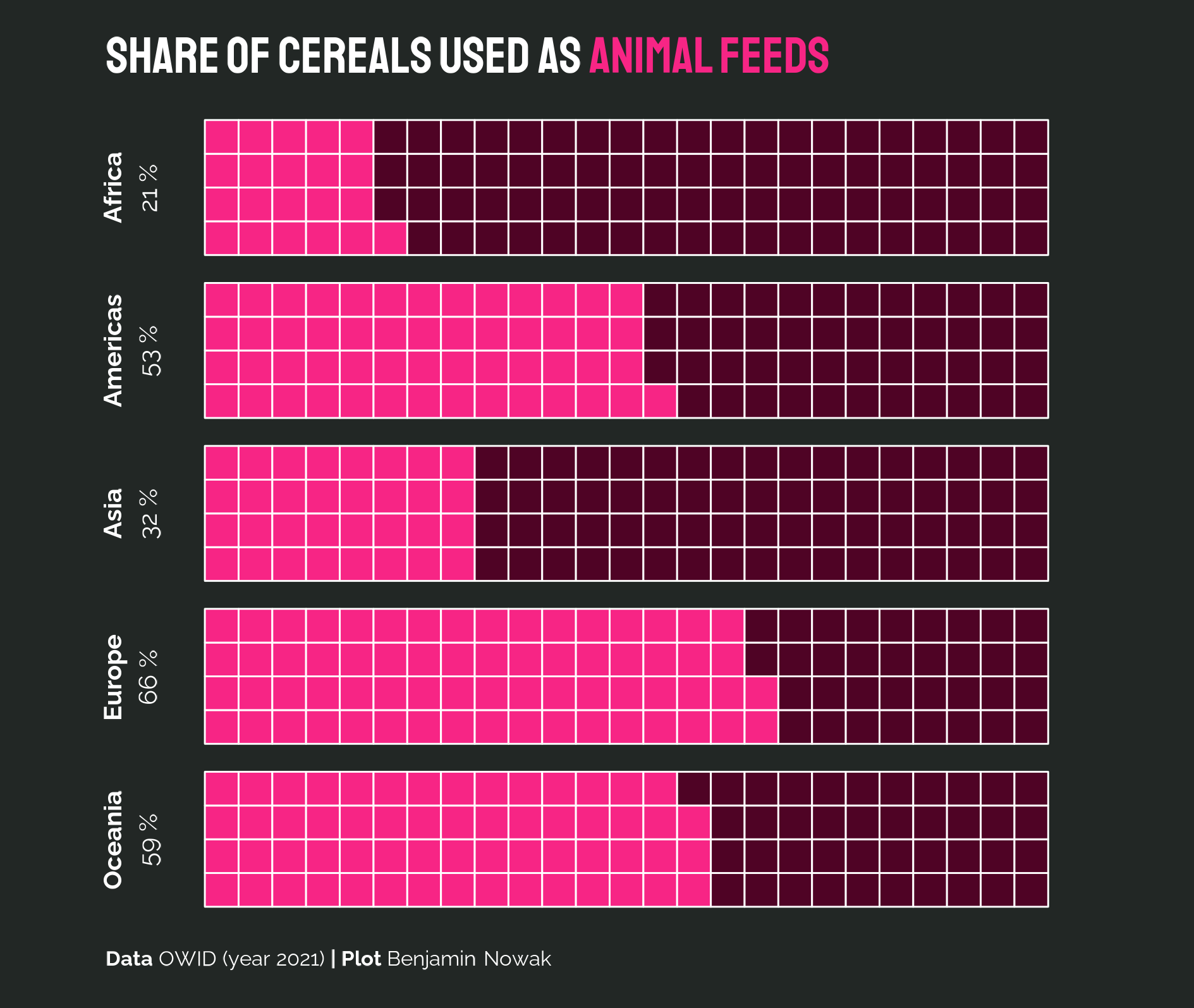
Best waffle chart examples

The examples below are the most popular waffle charts of the R graph gallery. They are a good starting point to learn how to create real life waffle charts.

Related chart types


Grouped and Stacked barplot
Treemap
Doughnut
Pie chart
Dendrogram
Circular packing