About this chart
This post explains how to build a treemap with custom annotations and labels.
It was produced by Yobanny Sámano on the occasion of a Tidy Tuesday in 2021! We’ll see how to reproduce it using his code.
Since there are 2 distinct versions of this chart, we’ll see how to reproduce both of them.
Let’s see what the final output looks like:
Load data
To create our Treemap, we will need the following packages. Install them if needed, then you can load them:
#install.packages(c("tidyverse", "treemap", "ggfittext", "scales", "ggtext"))
library(tidyverse)
library(treemap)
library(ggfittext)
library(scales)
library(ggtext)
We will also need to load 2 datasets which may be downloaded at the Gallery repo or loaded directy in R as shown below:
artwork <- readr::read_csv(
  'https://raw.githubusercontent.com/holtzy/R-graph-gallery/master/DATA/artwork.csv',
  show_col_types = FALSE
)
artists <- readr::read_csv(
  'https://raw.githubusercontent.com/holtzy/R-graph-gallery/master/DATA/artist_data.csv',
  show_col_types = FALSE
)
Then, let’s merge the datasets and clean the data a little bit:
artwork_artist <- artwork %>%
  left_join(artists,by = c("artistId" = "id")
            ) %>%
  mutate(gender = case_when(str_detect(artist, "British") ~ "Other",
                            str_detect(artist, "Art & Language") ~ "Male",
                            TRUE ~ gender),
         artist = case_when(str_detect(artist, "British") ~ "British School",
                            TRUE ~ artist)
         ) %>%
  filter(!is.na(gender)) %>%
  group_by(artist, gender) %>%
  summarise(total = n()) %>%
  #filter(name != "Turner, Joseph Mallord William") %>%
  ungroup() %>%
  mutate(id_tree = row_number())
Make the first treemap
We start by creating a simple treemap:
data_tree <- treemap(artwork_artist,
                     index=c("artist"),
                     vSize="total",
                     type="categorical",
                     vColor = "gender",
                     algorithm = "pivotSize",
                     sortID = "id_tree",
                     mirror.y = TRUE,
                     mirror.x = TRUE,
                     border.lwds = 0.7,
                     aspRatio = 5/3)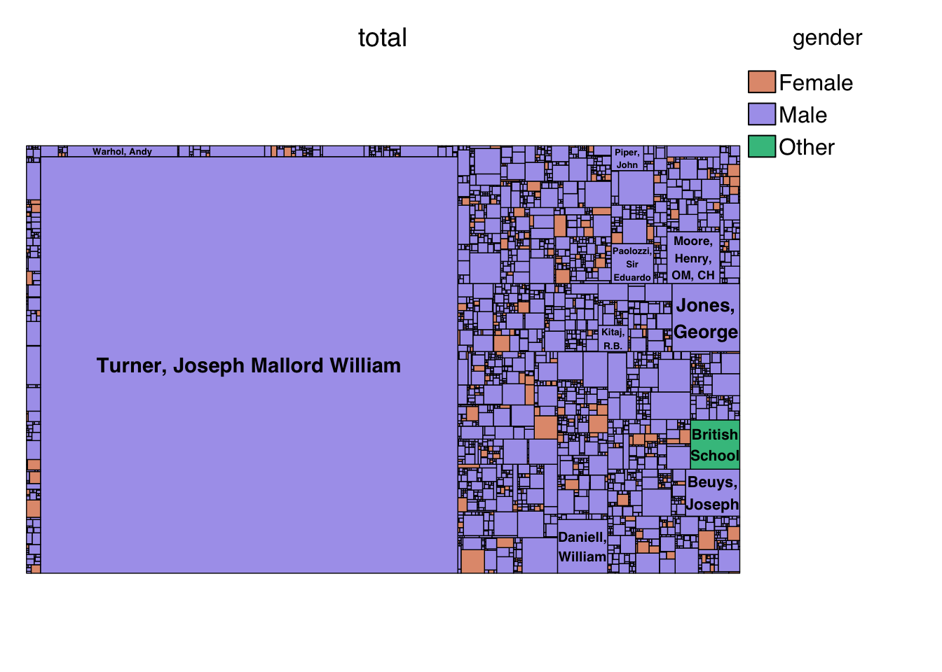
And now we customize it:
data_ggplot <- data_tree[["tm"]] %>%
as_tibble() %>%
arrange(desc(vSize)) %>%
mutate(rank = row_number(),
xmax = x0 + w,
ymax = y0 + h,
label_artist = str_glue("{artist}\n({comma(vSize, accuracy = 1)})")
)
how_to_read <- tibble(label = c("**How to read:**",
"Each rectangle represents an artist",
"The size represents the number of artworks",
"The color represents the gender of the artist,
<span style='color:#C95C35'>**female**</span> or
<span style='color:#0A7575'>**male**</span>"),
x = c(0.5, 0.5, 0.5, 0.5),
y = c(-0.07, -0.11, -0.15, -0.19))
p1 <- ggplot(data_ggplot) +
geom_rect(aes(xmin = x0,
ymin = y0,
xmax = xmax,
ymax= ymax,
fill = vColor),
size = 0.1,
colour = "#1E1D23",
alpha = 0.9) +
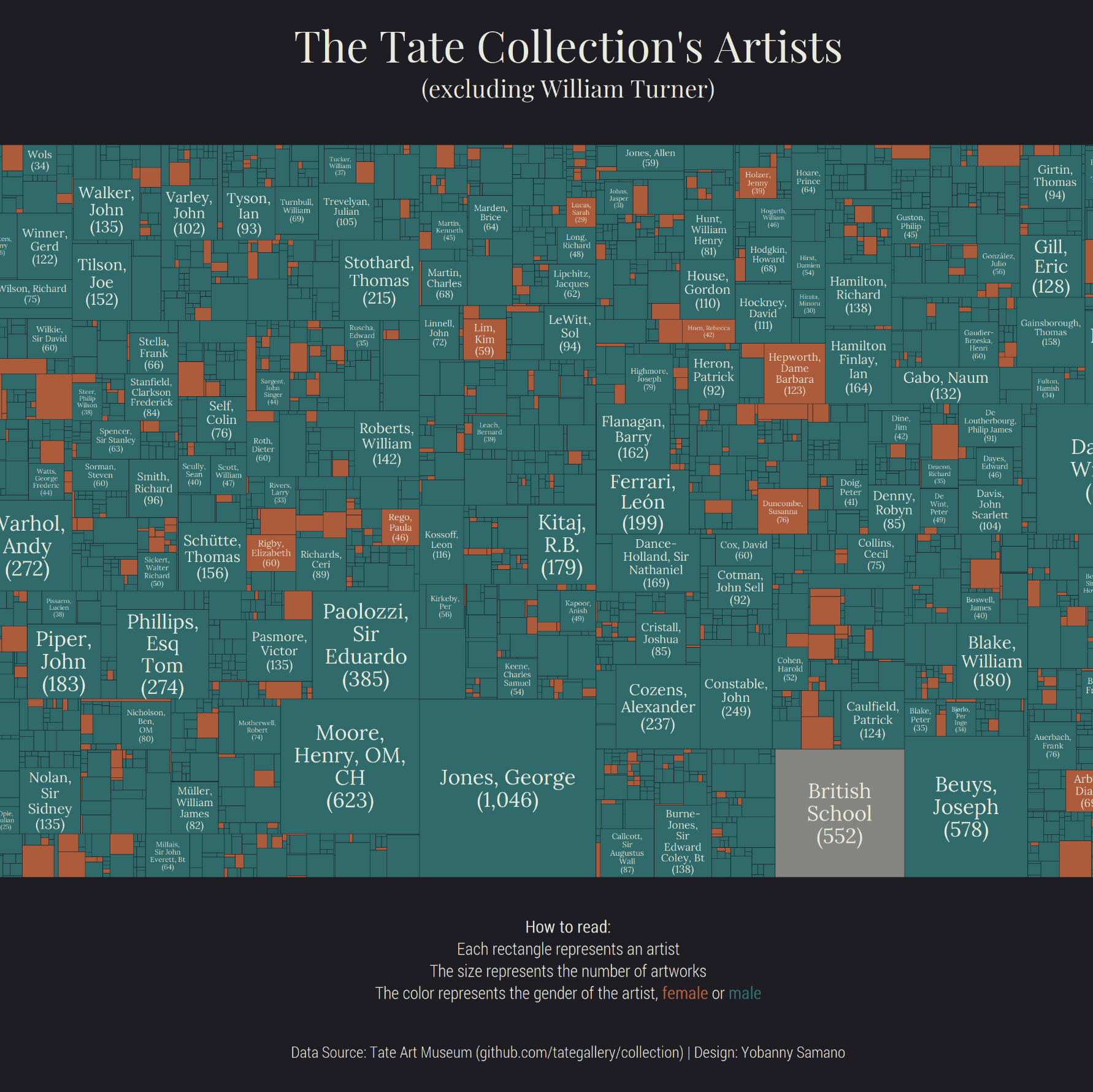
#geom_fit_text(data = data_ggplot %>% filter(rank <= 200),
# aes(xmin = x0,
# xmax = xmax,
# ymin = y0,
# ymax = ymax,
# label = label_artist),
# colour = "#E8EADC",
# family = "Lora",
# min.size = 4,
# reflow = TRUE) +
geom_richtext(data = how_to_read,
aes(x, y, label = label),
size = 3.5,
color = "#E8EADC",
fill = NA,
label.color = NA,
hjust = 0.5,
family = "serif") +
labs(title = "The Tate Collection's Artists",
caption = "Data Source: Tate Art Museum (github.com/tategallery/collection) | Design: Yobanny Samano") +
scale_fill_manual(values = c("#C95C35", "#0A7575", "#8f9089")) +
theme_void() +
theme(text = element_text(colour ="#E8EADC"),
legend.position = "none",
plot.background = element_rect(fill = "#1E1D23",
colour = "#1E1D23"),
plot.margin = margin(30, 10, 20, 10),
plot.title = element_text(family = "serif",
size = 25,
hjust = 0.5),
plot.caption = element_text(family = "serif",
size = 9,
hjust = 0.5)
)
p1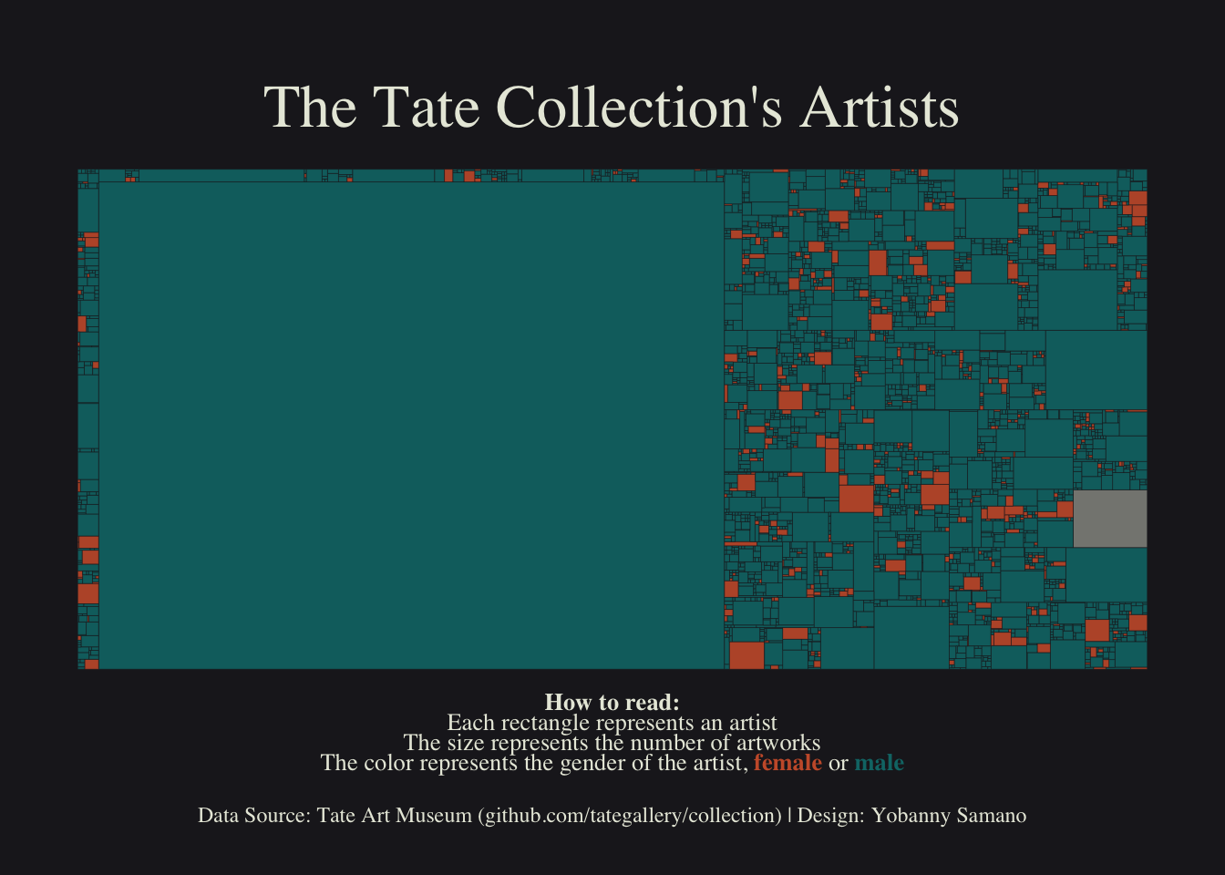
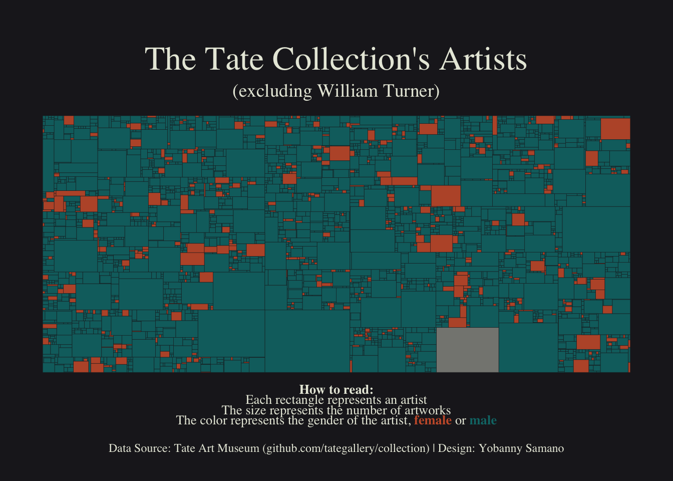
Make the second treemap
Once again, we start by creating a simple treemap:
data_tree <- treemap(artwork_artist %>% filter(total != 39389),
                      index=c("artist"),
                      vSize="total",
                      type="categorical",
                      vColor = "gender",
                      algorithm = "pivotSize",
                      sortID = "id_tree",
                      mirror.y = TRUE,
                      mirror.x = TRUE,
                      border.lwds = 0.7,
                      aspRatio = 5/3)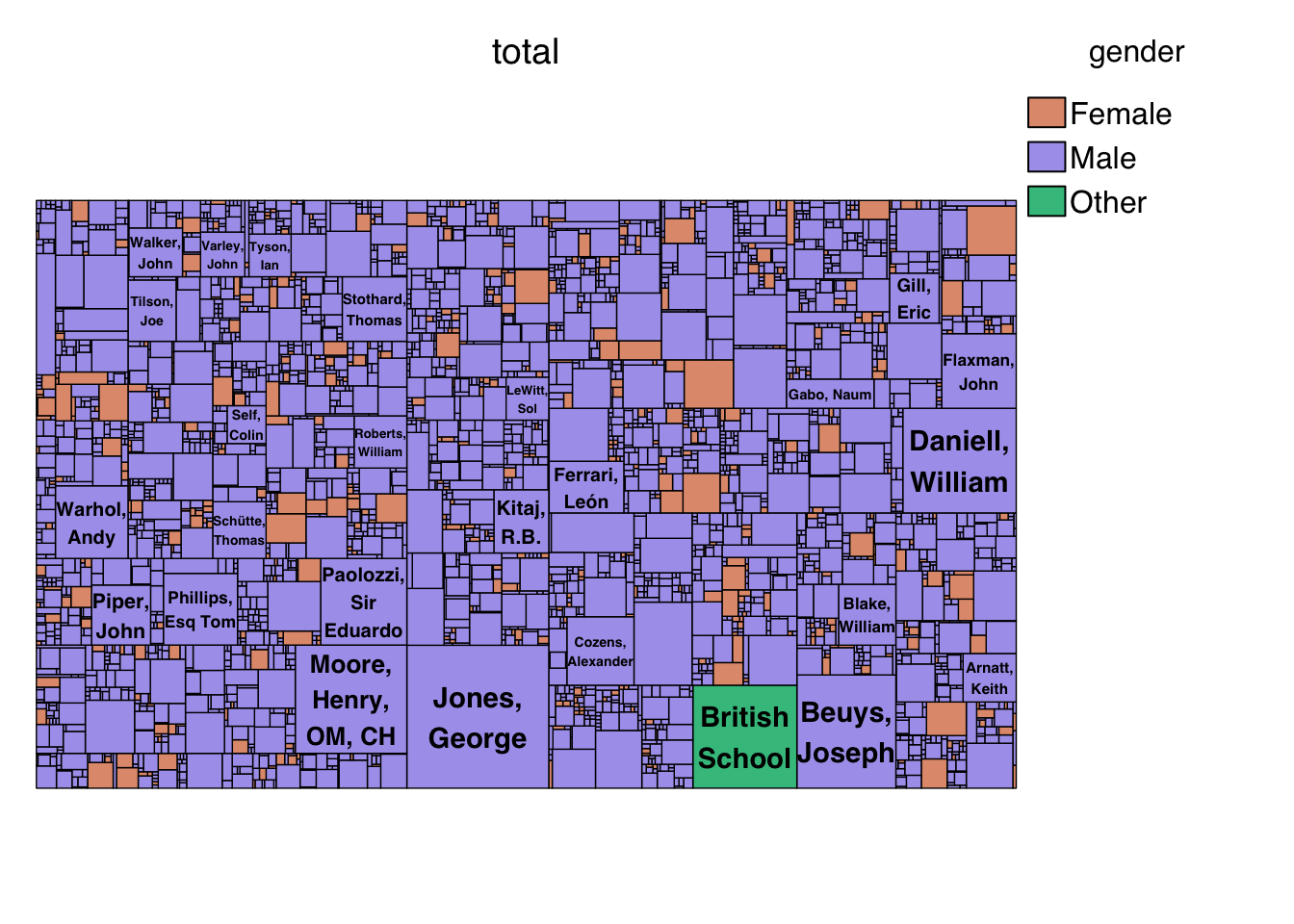
Now let’s customize it:
data_ggplot <- data_tree[["tm"]] %>%
  as_tibble() %>%
  arrange(desc(vSize)) %>%
  mutate(rank = row_number(),
         xmax = x0 + w,
         ymax = y0 + h,
         label_artist = str_glue("{artist}\n({comma(vSize, accuracy = 1)})")
         )

p2 <- ggplot(data_ggplot) +
  geom_rect(aes(xmin = x0,
                ymin = y0,
                xmax = xmax,
                ymax= ymax,
                fill = vColor),
            size = 0.1,
            colour = "#1E1D23",
            alpha = 0.9) +
  #geom_fit_text(data = data_ggplot %>% filter(rank <= 300),
  #              aes(xmin = x0,
  #                  xmax = xmax,
  #                  ymin = y0,
  #                  ymax = ymax,
  #                  label = label_artist),
  #              colour = "#E8EADC",
  #              family = "Lora",
  #              min.size = 3.5,
  #              reflow = TRUE) +
  geom_richtext(data = how_to_read,
                aes(x, y, label = label),
                size = 3.5,
                color = "#E8EADC",
                fill = NA,
                label.color = NA,
                hjust = 0.5,
                family = "serif") +
  labs(title = "The Tate Collection's Artists",
       subtitle = "(excluding William Turner)",
       caption = "Data Source: Tate Art Museum (github.com/tategallery/collection) | Design: Yobanny Samano") +
  scale_fill_manual(values = c("#C95C35", "#0A7575", "#8f9089")) +
  theme_void() +
  theme(text = element_text(colour ="#E8EADC"),
        legend.position = "none",
        plot.background = element_rect(fill = "#1E1D23",
                                       colour = "#1E1D23"),
        plot.margin = margin(30, 10, 20, 10),
        plot.title = element_text(family = "serif",
                                  size = 25,
                                  hjust = 0.5),
        plot.subtitle = element_text(family = "serif",
                                     size = 14,
                                     hjust = 0.5),
        plot.caption = element_text(family = "serif",
                                    size = 9,
                                    hjust = 0.5)
        )
p2