It is of importance to understand that a connected scatterplot is basically an hybrid between a scatterplot and a lineplot. Thus, please visit the related section here and here to get more examples, since the techniques used are very similar.
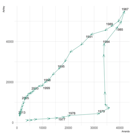
Please note also that 2 types of connected scatterplot exist. The first is simply a lineplot with dots added on top of it. It takes as input 2 numeric variables only. The second shows the relationship between 2 numerical variables across time. It requires 3 numerical variables as input. Confusing? Visit data-to-viz to clarify.
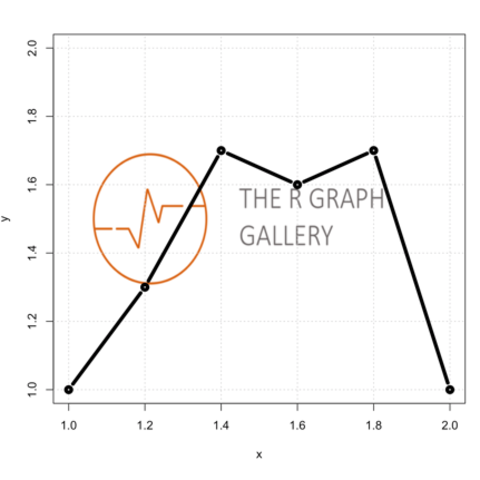
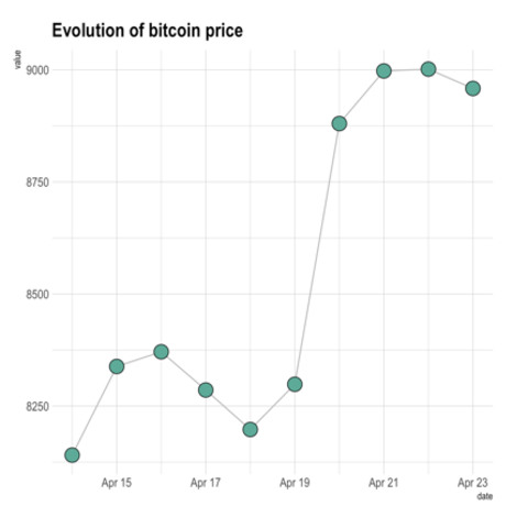
ggplot2Pretty straightforward once you understood how to build a scatterplot and a lineplot. See the focus on annotation that is handy for the second type of connected scatter (see above).
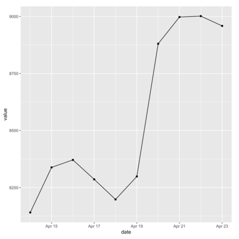
Connected scatterplots are often used for time series. Remember the R graph gallery offers a dedicated section, with heaps of examples. For instance, here is an interactive chart made with the dygraphs library.
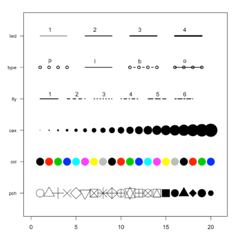
Basic R also allows to build connected scatterplot thanks to the `line()` function. You just need to use the `b` option of the `type` argument. See examples below.