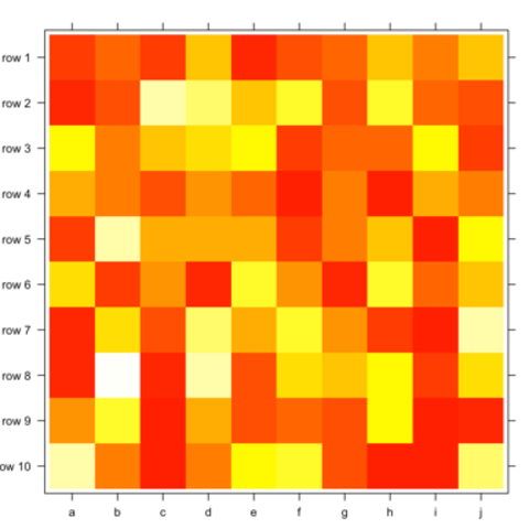
Using the
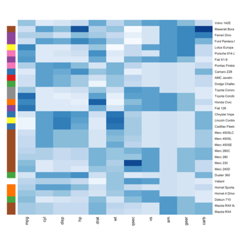
heatmap() functionThe heatmap() function is natively provided in R. It produces high quality matrix and offers statistical tools to normalize input data, run clustering algorithm and visualize the result with dendrograms. It is one of the very rare case where I prefer base R to ggplot2.
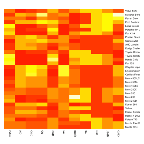
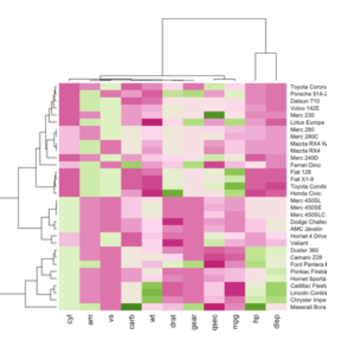
Using
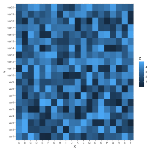
geom_tile() from ggplot2ggplot2 also allows to build heatmaps thanks to geom_tile(). However, I personally prefer the heatmap() function above since only it offers option for normalization, clustering and Dendrogram.
Interactive heatmaps from R
Three options exist to build an interactive heatmap from R:
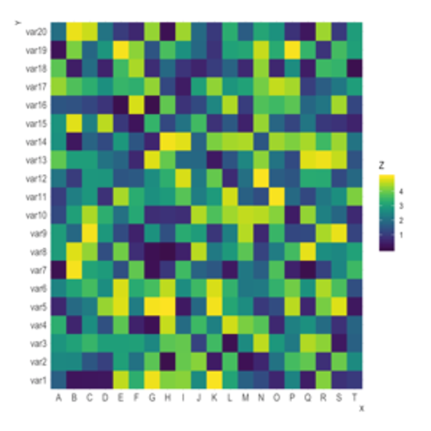
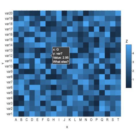
plotly: as described above, plotly allows to turn any heatmap made withggplot2interactive.d3heatmap: a package that uses the same syntax as the base R heatmap() function to make interactive version.heatmaply: the most flexible option, allowing many different kind of customization. See the code of the chart beside here.
Heatmap for time series
Heatmaps can be a very good alternative to visualize time series, especially when the time frame you study is repeating, like weeks. Here is a customized example, but visit the time series section for more.
Code Time series section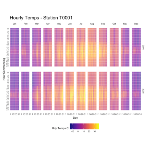
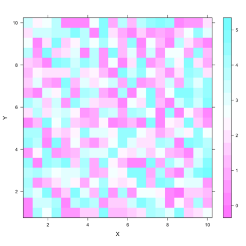
Using the
levelplot() function of lattice