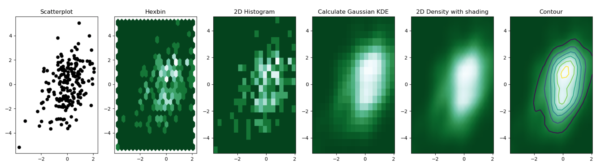
Different types of 2d density chart. Source
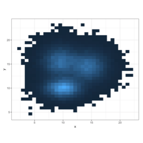
2d histogram with
geom_bin2d()This is the two dimension version of the classic histogram. The plot area is split in a multitude of small squares, the number of points in each square is represented by its color.
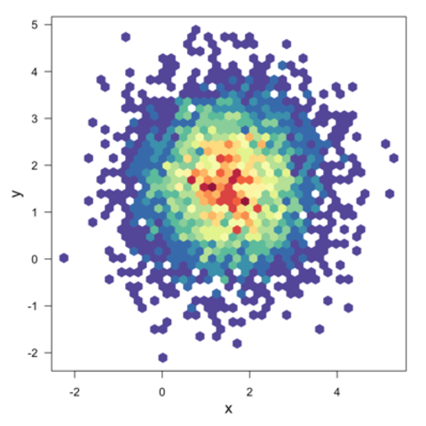
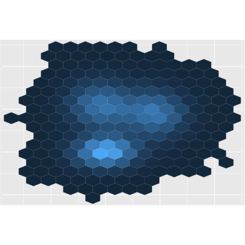
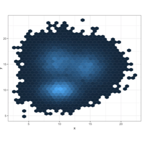
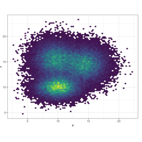
Hexbin chart with
geom_hex()Very similar to the 2d histogram above, but the plot area is split in a multitude of hexagons instead of squares.
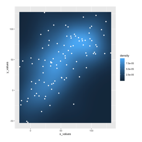
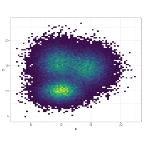
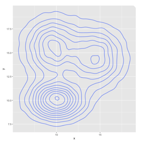
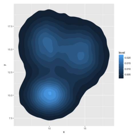
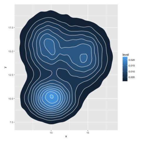
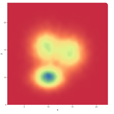
2d distribution with
stat_density_2dLike it is possible to plot a density chart instead of a histogram to represent a distribution, it is possible to make a 2d density plot. Several variations are available using ggplot2:
Other examples