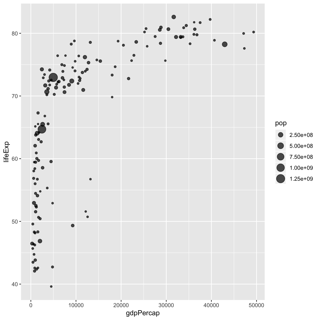
Most basic bubble chart with geom_point()
A bubble plot is a scatterplot where a third dimension is added: the value of an additional numeric variable is represented through the size of the dots. (source: data-to-viz).
With ggplot2, bubble chart are
built thanks to the geom_point() function. At least
three variable must be provided to aes(): x, y and
size. The legend will automatically be built by ggplot2.
Here, the relationship between life expectancy (y) and
gdp per capita (x) of world countries is represented.
The population of each country is represented through circle size.
# Libraries
library(ggplot2)
library(dplyr)

# The dataset is provided in the gapminder library
library(gapminder)
data <- gapminder %>% filter(year=="2007") %>% dplyr::select(-year)

# Most basic bubble plot
ggplot(data, aes(x=gdpPercap, y=lifeExp, size = pop)) +
    geom_point(alpha=0.7)
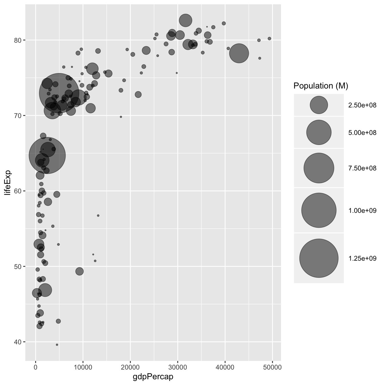
Control circle size with scale_size()
The first thing we need to improve on the previous chart is the
bubble size. scale_size() allows to set the size of the
smallest and the biggest circles using the
range argument. Note that you can customize the legend
name with name.
Note: circles often overlap. To avoid having big circles on top of the chart you have to reorder your dataset first, as in the code below.
ToDo: give more details about how to map a numeric variable
to circle size. Use of scale_radius,
scale_size and scale_size_area. See
this post.
# Libraries
library(ggplot2)
library(dplyr)

# The dataset is provided in the gapminder library
library(gapminder)
data <- gapminder %>% filter(year=="2007") %>% dplyr::select(-year)

# Most basic bubble plot
data %>%
  arrange(desc(pop)) %>%
  mutate(country = factor(country, country)) %>%
  ggplot(aes(x=gdpPercap, y=lifeExp, size = pop)) +
    geom_point(alpha=0.5) +
    scale_size(range = c(.1, 24), name="Population (M)")
Add a fourth dimension: color
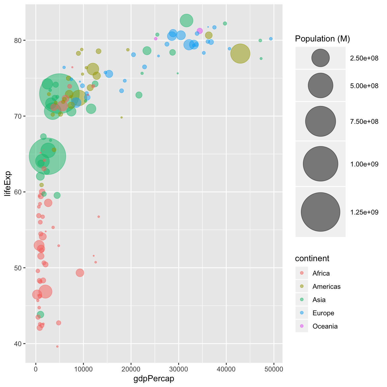
If you have one more variable in your dataset, why not showing it using circle color? Here, the continent of each country is used to control circle color:
# Libraries
library(ggplot2)
library(dplyr)

# The dataset is provided in the gapminder library
library(gapminder)
data <- gapminder %>% filter(year=="2007") %>% dplyr::select(-year)

# Most basic bubble plot
data %>%
  arrange(desc(pop)) %>%
  mutate(country = factor(country, country)) %>%
  ggplot(aes(x=gdpPercap, y=lifeExp, size=pop, color=continent)) +
    geom_point(alpha=0.5) +
    scale_size(range = c(.1, 24), name="Population (M)")
Make it pretty
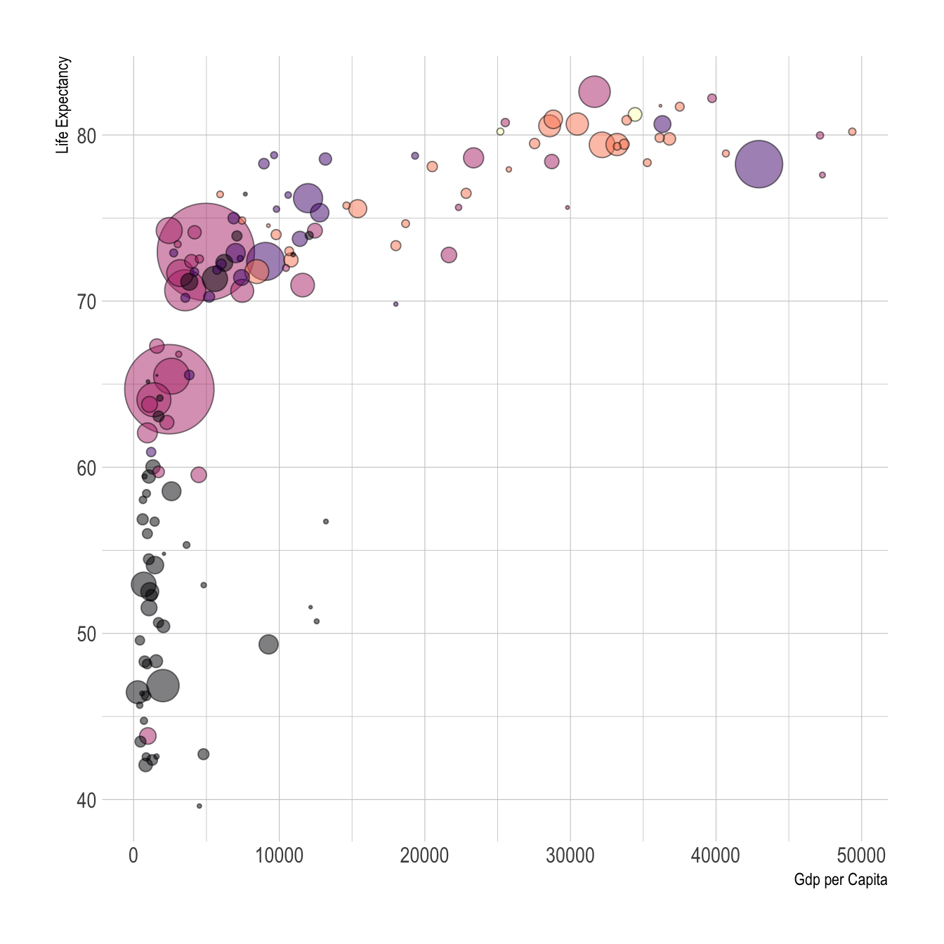
A few classic improvement:
-
use of the
viridispackage for nice color palette -
use of
theme_ipsum()of thehrbrthemespackage -
custom axis titles with
xlabandylab -
add stroke to circle: change
shapeto 21 and specifycolor(stroke) andfill
# Libraries
library(ggplot2)
library(dplyr)
library(hrbrthemes)
library(viridis)

# The dataset is provided in the gapminder library
library(gapminder)
data <- gapminder %>% filter(year=="2007") %>% dplyr::select(-year)

# Most basic bubble plot
data %>%
  arrange(desc(pop)) %>%
  mutate(country = factor(country, country)) %>%
  ggplot(aes(x=gdpPercap, y=lifeExp, size=pop, fill=continent)) +
    geom_point(alpha=0.5, shape=21, color="black") +
    scale_size(range = c(.1, 24), name="Population (M)") +
    scale_fill_viridis(discrete=TRUE, guide=FALSE, option="A") +
    theme_ipsum() +
    theme(legend.position="bottom") +
    ylab("Life Expectancy") +
    xlab("Gdp per Capita") +
    theme(legend.position = "none")
What’s next?
This chart could be much better with annotation, or with an interactive version. Don’t you think it is frustrating not to be able to access country name?
Visit the bubble chart section to see it.