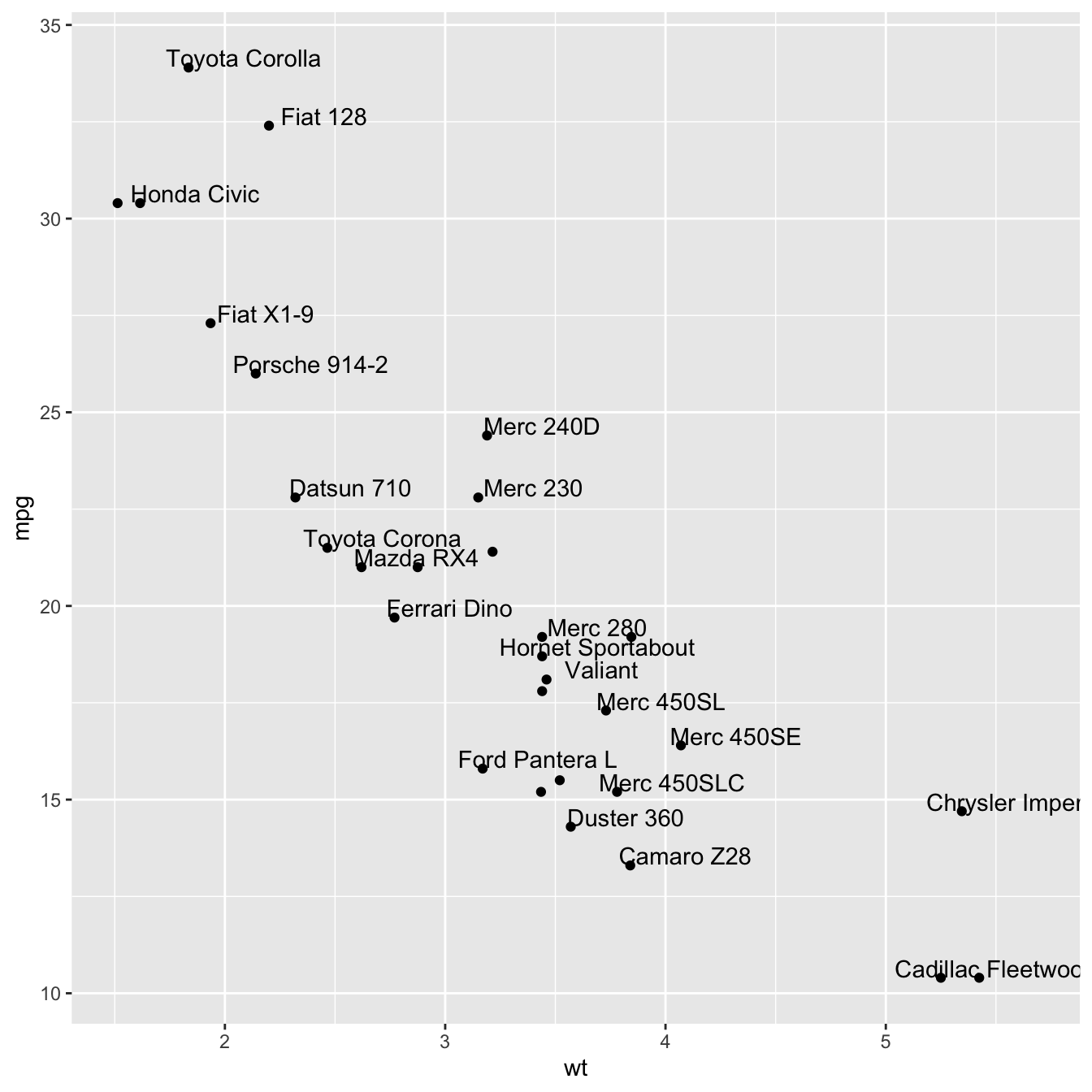
Adding text with geom_text()
This example demonstrates how to use geom_text() to add
text as markers. It works pretty much the same as
geom_point(), but add text instead of circles. A few
arguments must be provided:
label: what text you want to display-
nudge_xandnudge_y: shifts the text along X and Y axis -
check_overlaptries to avoid text overlap. Note that a package calledggrepelextends this concept further
# library
library(ggplot2)

# Keep 30 first rows in the mtcars natively available dataset
data=head(mtcars, 30)

# 1/ add text with geom_text, use nudge to nudge the text
ggplot(data, aes(x=wt, y=mpg)) +
  geom_point() + # Show dots
  geom_text(
    label=rownames(data),
    nudge_x = 0.25, nudge_y = 0.25,
    check_overlap = T
  )
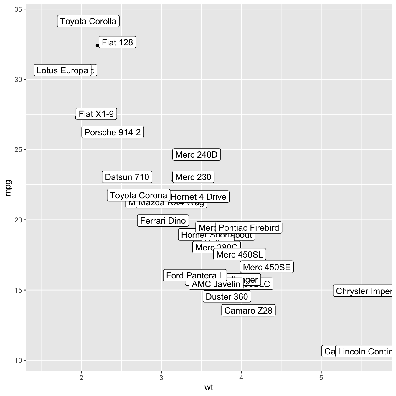
Add labels with geom_label()
geom_label() works pretty much the same way as
geom_text(). However, text is wrapped in a rectangle
that you can customize (see next example).
# library
library(ggplot2)
# Keep 30 first rows in the mtcars natively available dataset
data=head(mtcars, 30)
# 1/ add text with geom_text, use nudge to nudge the text
ggplot(data, aes(x=wt, y=mpg)) +
geom_point() + # Show dots
geom_label(
label=rownames(data),
nudge_x = 0.25, nudge_y = 0.25,
check_overlap = T
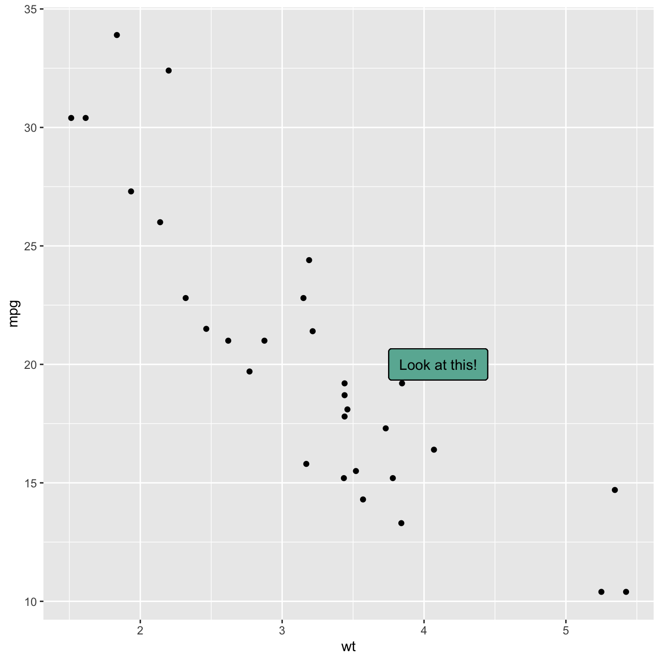
)Add one text label only
Of course, you don’t have to label all dots on the chart. You can
also add a piece of text on a specific position. Since we’re here,
note that you can custom the annotation of
geom_label with label.padding,
label.size, color and fill as
described below:
# library
library(ggplot2)
# Keep 30 first rows in the mtcars natively available dataset
data=head(mtcars, 30)
# Add one annotation
ggplot(data, aes(x=wt, y=mpg)) +
geom_point() + # Show dots
geom_label(
label="Look at this!",
x=4.1,
y=20,
label.padding = unit(0.55, "lines"), # Rectangle size around label
label.size = 0.35,
color = "black",
fill="#69b3a2"
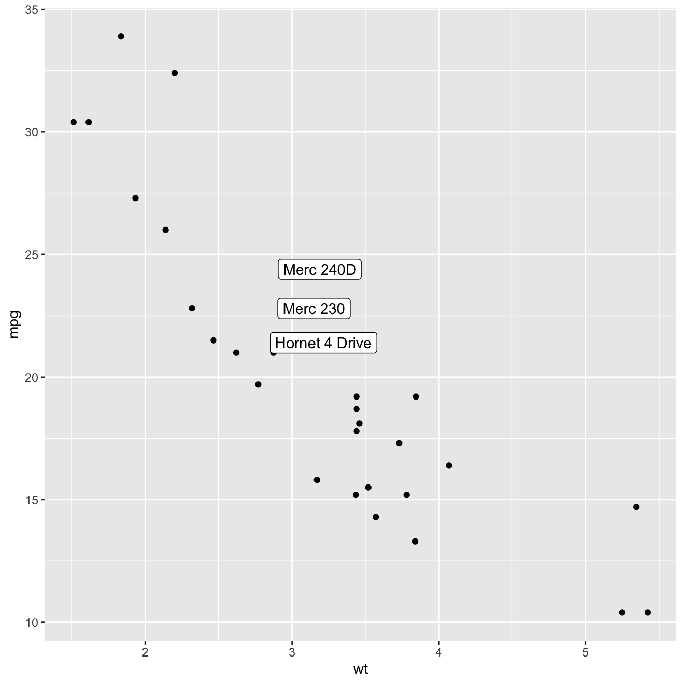
)Add labels for a selection of marker
Last but not least, you can also select a group of marker and
annotate them only. Here, only car with mpg > 20 and
wt > 3 are annotated thanks to a data filtering in
the geom_label() call.
# library
library(ggplot2)
library(dplyr)
library(tibble)

# Keep 30 first rows in the mtcars natively available dataset
data=head(mtcars, 30)

# Change data rownames as a real column called 'carName'
data <- data %>%
  rownames_to_column(var="carName")

# Plot
ggplot(data, aes(x=wt, y=mpg)) +
  geom_point() +
  geom_label(
    data=data %>% filter(mpg>20 & wt>3), # Filter data first
    aes(label=carName)
  )